
2026 | E-Commerce/Retail & Manufacturing
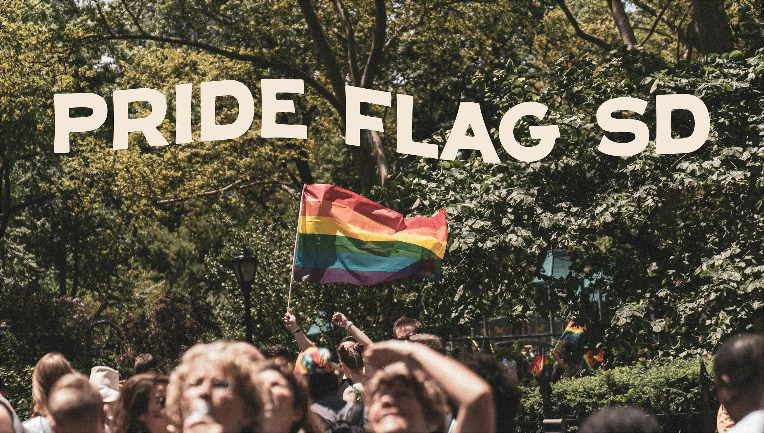
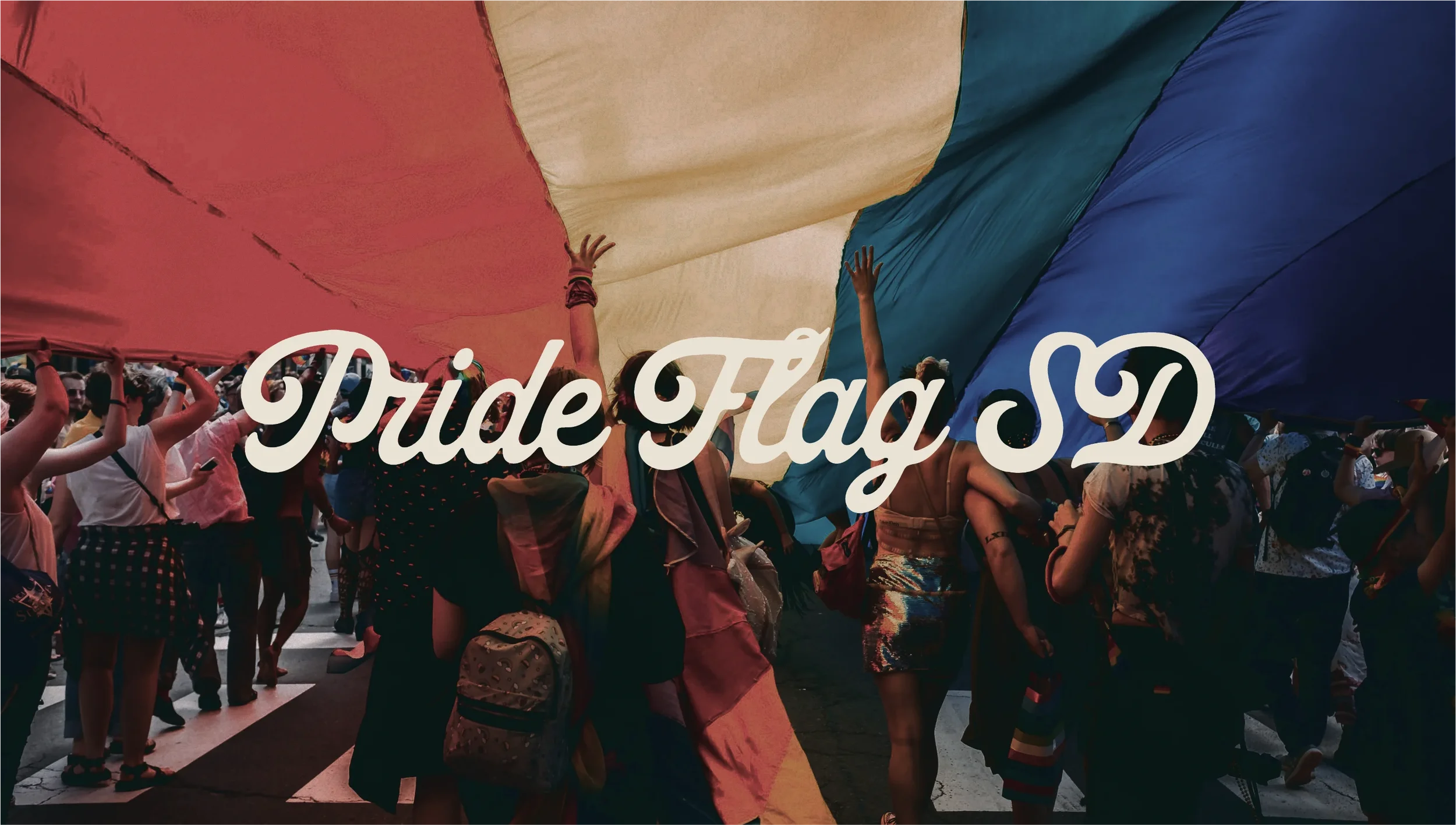
PRIDE FLAG SD:
BRAND IDENTITY DESIGN
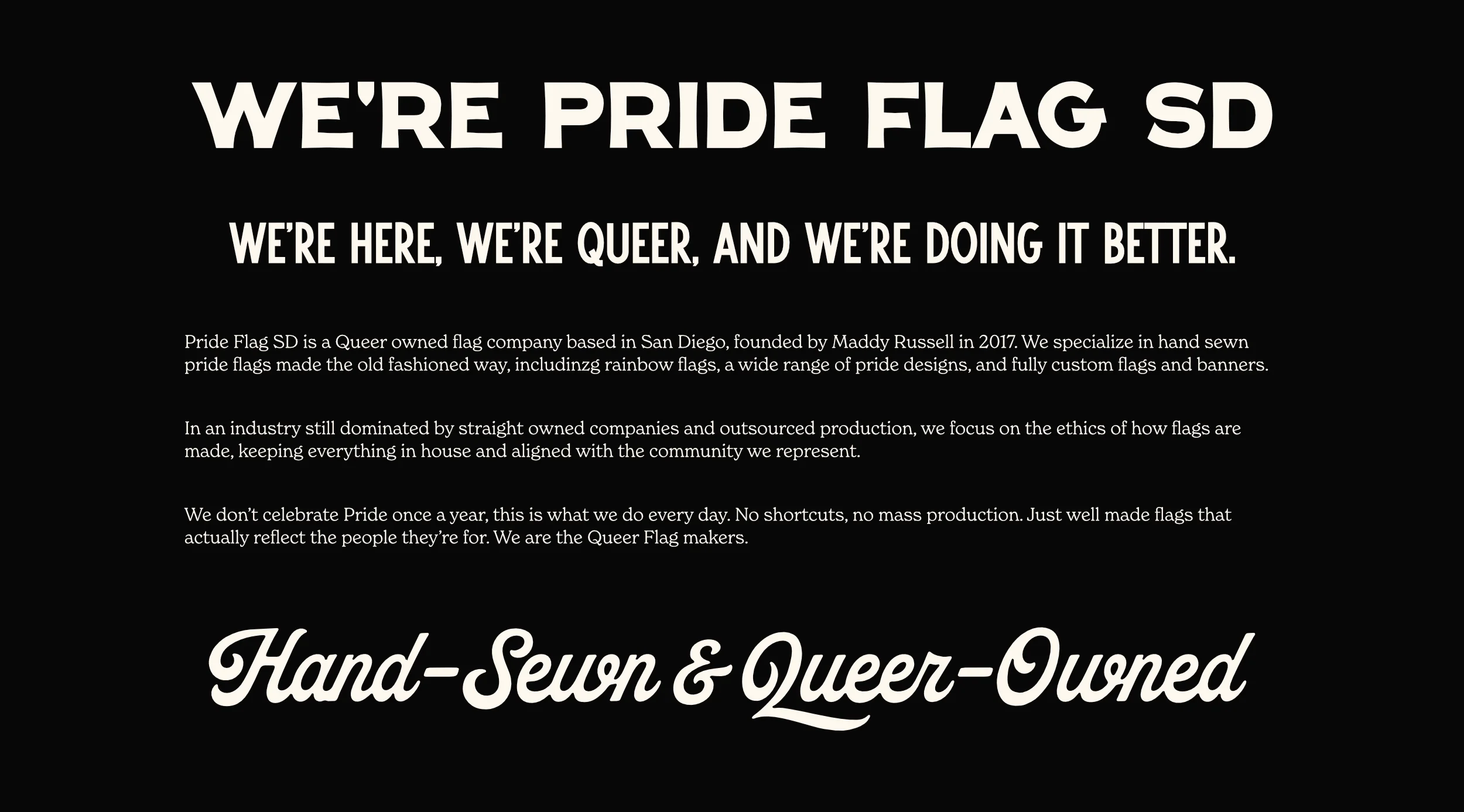
Pride Flag SD are the first and original queer-owned flag company in the US. Three people, one studio in San Diego, hand-sewing flags for the queer community since 2017.
They've made flags for the White House. They've partnered with the Gilbert Baker Foundation and with Daniel Quasar, designer of the Progress Pride flag. During busy season they're filling hundreds of orders a weekend.
The brief wasn't about visibility. They already had that. For Founder Maddy, it was about something harder: making sure the brand actually looked like what they were.
-
E-Commerce & Retail/Manufacturing
-
Logo Design
Brand Identity & Guidelines
Typographic Direction
Colour Direction
Print Design (Flyers, Brochures etc.)
-
2026
THE PROBLEM WITH THE OLD BRAND
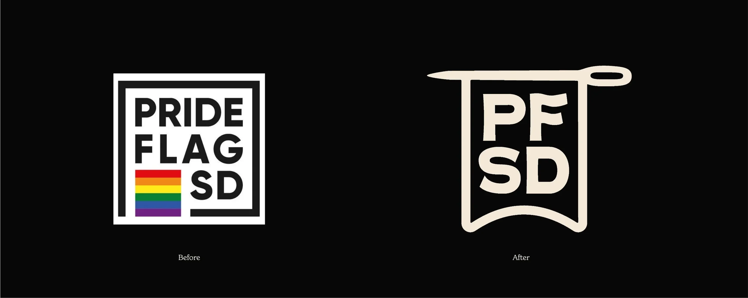
The previous logo was clean, square, designed through 99designs. It did its job - it printed well on tags and stickers, and it was recognisable enough. But it read corporate. It looked like something a city council would put on a lanyard at a civic event.
That's actually a real problem for Pride Flag SD. Because they already get mistaken for the San Diego Pride organisation rather than a flag manufacturer. Their competitors are either straight-owned companies importing flags from countries that criminalise homosexuality, or legacy US flag makers who bury pride products at the bottom of their websites. Pride Flag SD is neither of those things - and the brand wasn't making that clear.
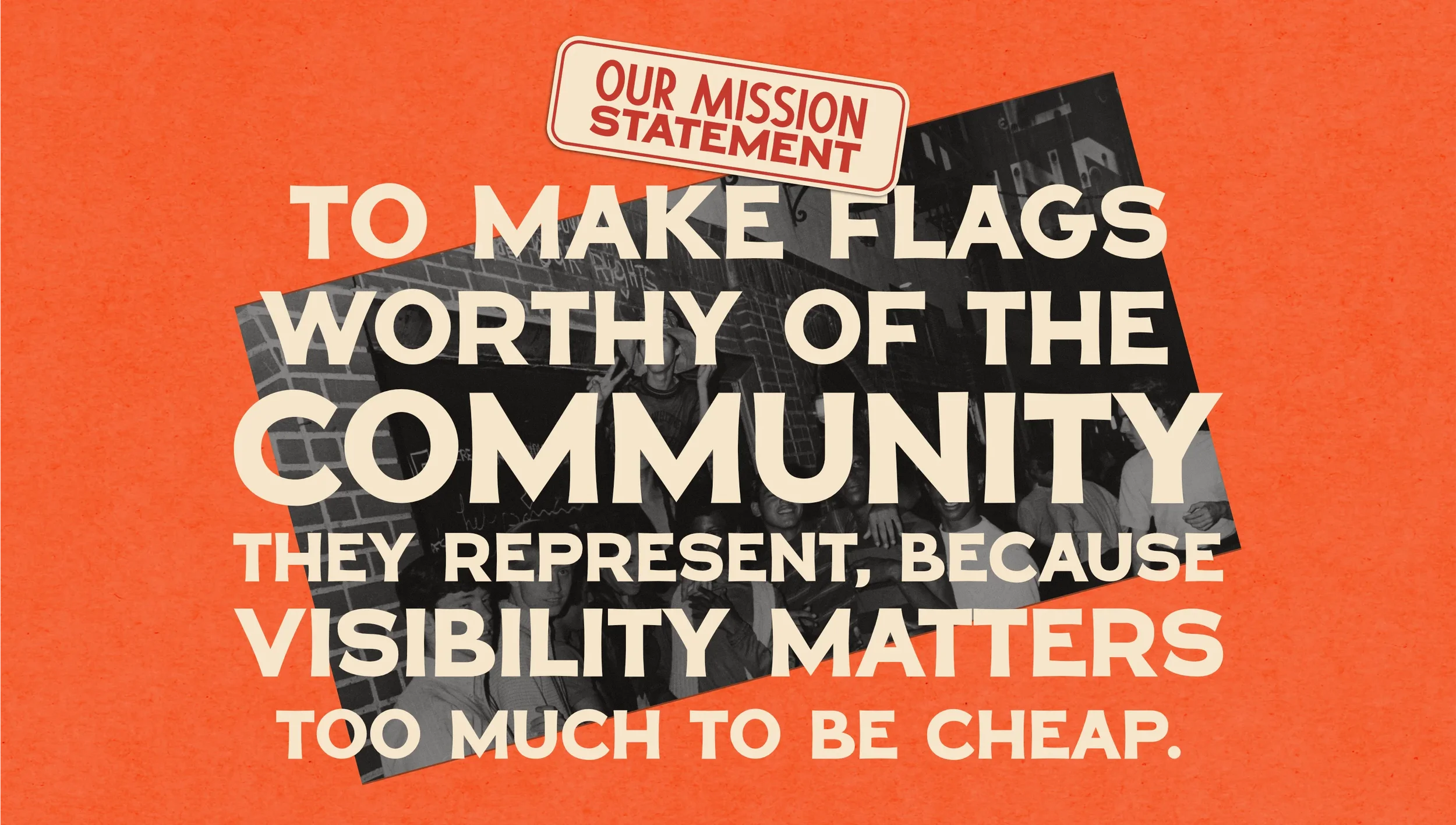
Before anything visual could change, that needed unpicking properly. So the first stage of the project was a discovery workshop - going deep on what Pride Flag SD actually stood for, and building the strategic foundation the visuals would need to sit on. Mission, vision, values, personality, tone of voice. Not as box-ticking exercises, but as genuine anchors to guide the visuals and the business moving forward.
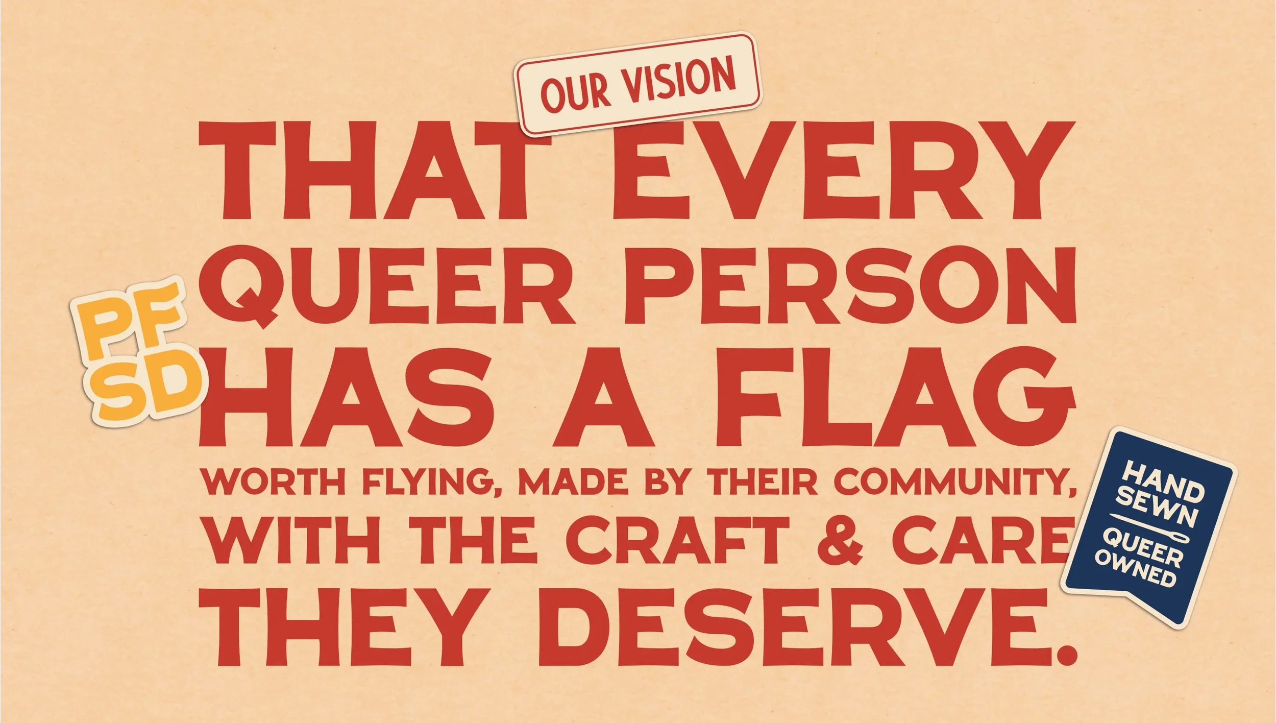
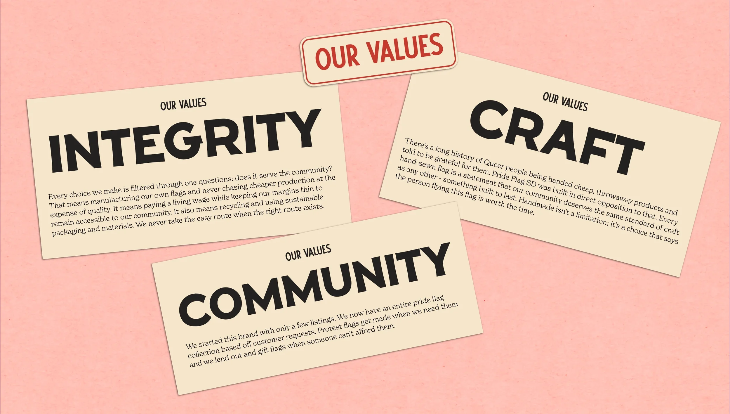
The mission came out sharp: to make flags worthy of the community they represent, because visibility matters too much to be cheap. The vision followed: that every queer person has a flag worth flying, made by their community, with the craft and care they deserve. And the values - integrity above everything, genuine collaboration with the community, authenticity at every level - gave the whole thing a backbone.
That kind of clarity matters because it tells you exactly what the brand has to do. A company with those values and that mission can't have a logo that looks like it came off a civic events checklist. It needs to feel like it was made by someone who gives a damn - because it was. Every visual decision that followed came back to that foundation. The typography, the colour palette, the badge system, the texture of the whole identity - all of it exists to make those values visible without having to spell them out.
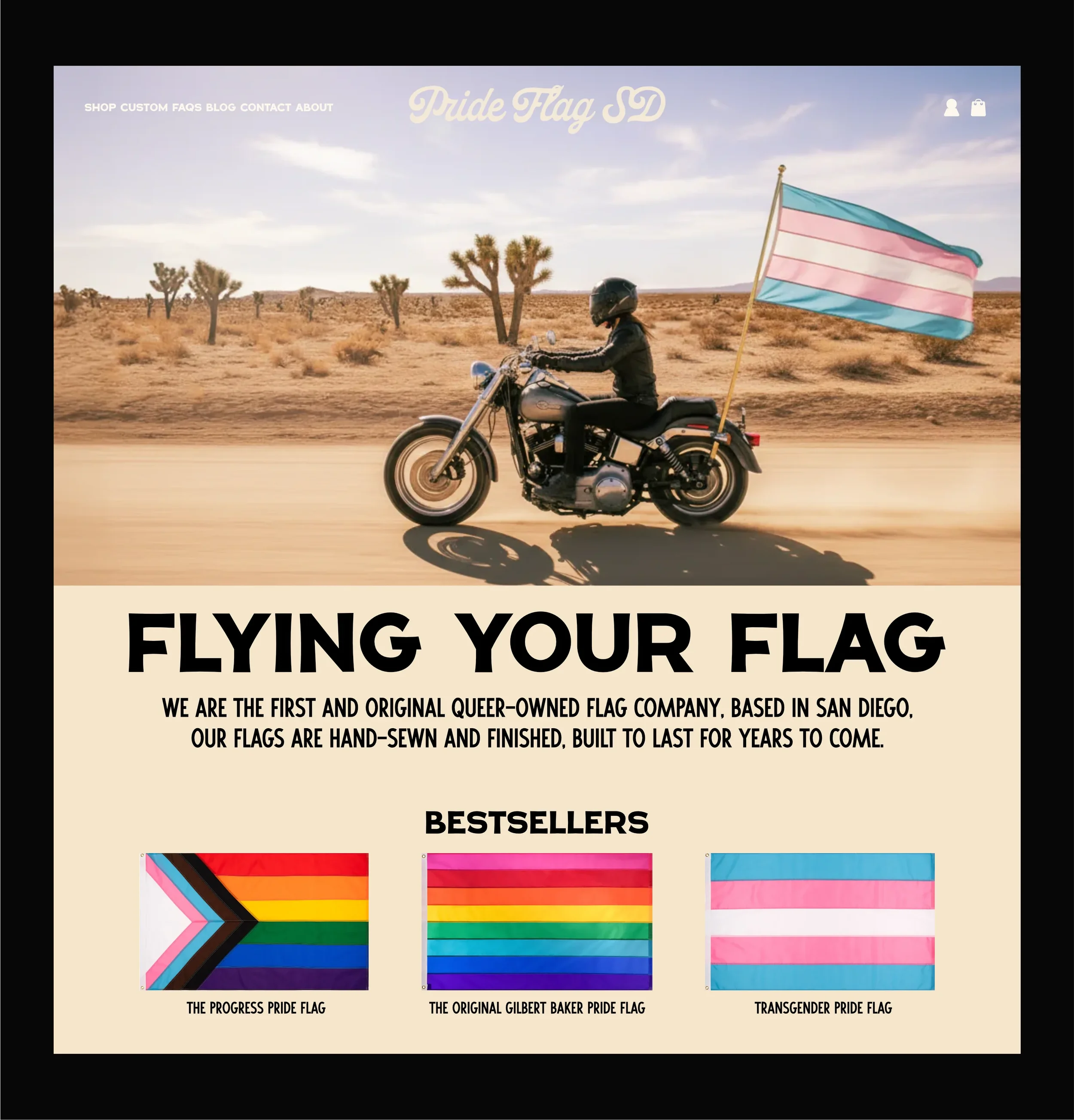
What Maddy and the team needed was an identity that said: queer-owned, hand-sewn, community-first, and built to last. Something with the same weight and permanence as the flags themselves.
FINDING THE RIGHT DIRECTION
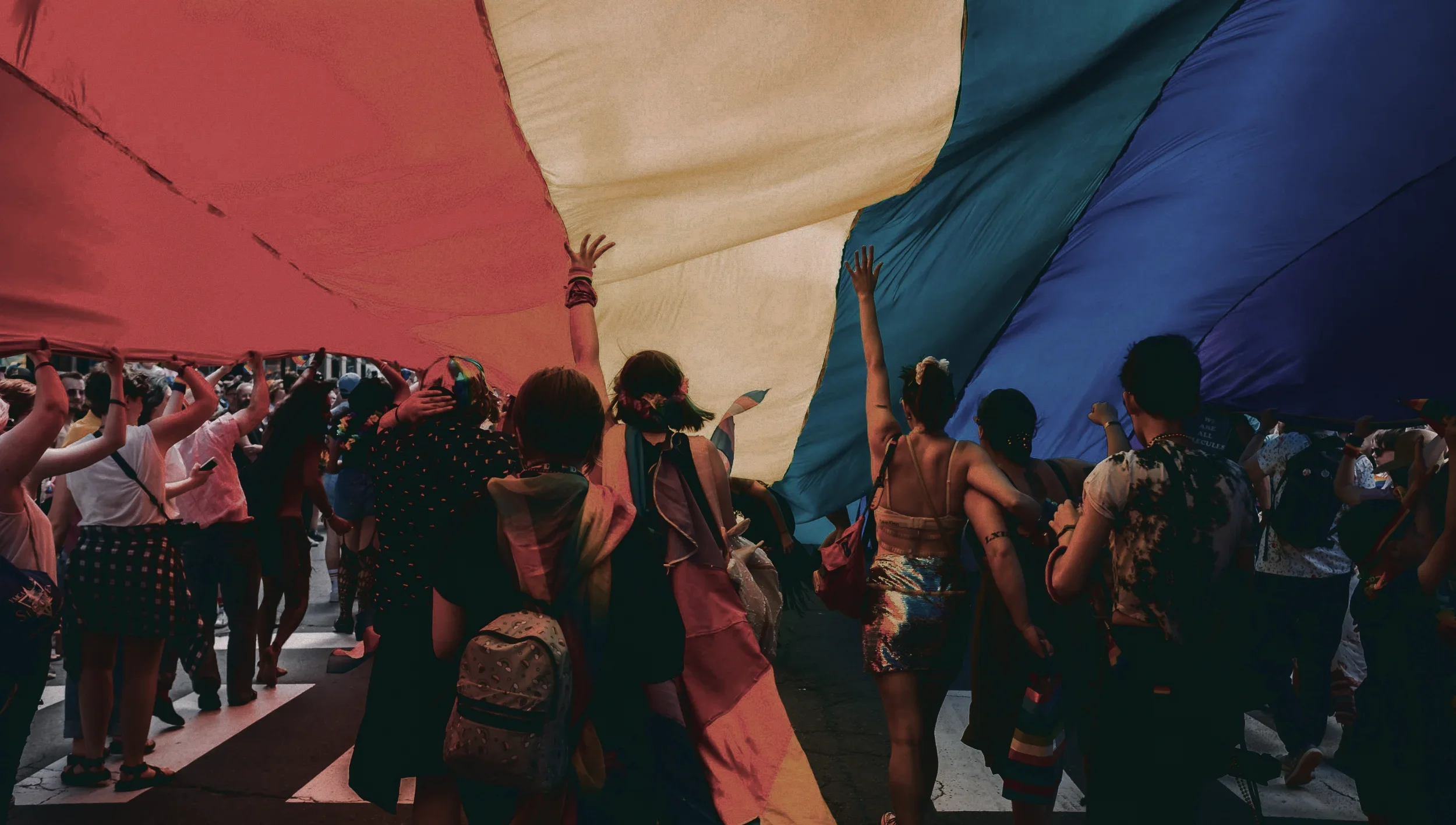
The anchor point came from history. In 1978, Gilbert Baker designed the original pride flag - eight stripes, including pink and teal - for the San Francisco Gay Freedom Day parade. That flag wasn't mass-produced. It was hand-sewn. It represented a community making something with care, for themselves, because they deserved it.
That's Pride Flag SD. Not a drop-shipper, not a fast-fashion producer, not a company with one eye on margin and one eye on a diversity calendar. A small team making flags by hand, building a community product one stitch at a time.
The vintage direction came directly out of that lineage. The Gilbert Baker era - late 70s, early 80s - is a genuinely rich visual period. Screen-printed lettering, bold but human type systems, logos that felt handmade because they were. That aesthetic also does something important for Pride Flag SD specifically: it differentiates them completely from the clean, corporate-rainbow aesthetic that dominates commercial pride branding today.

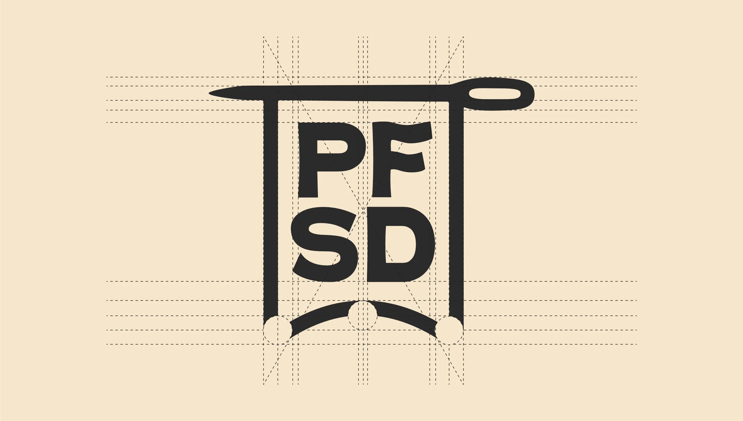
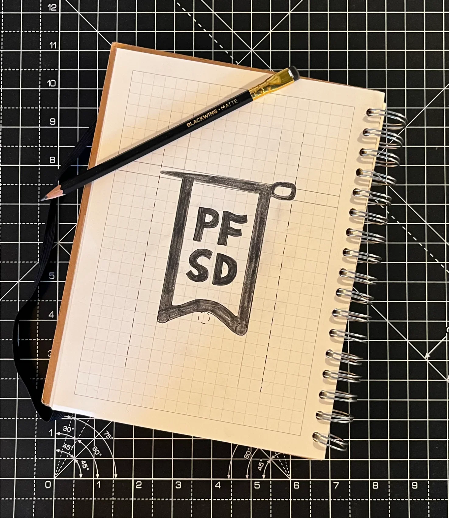
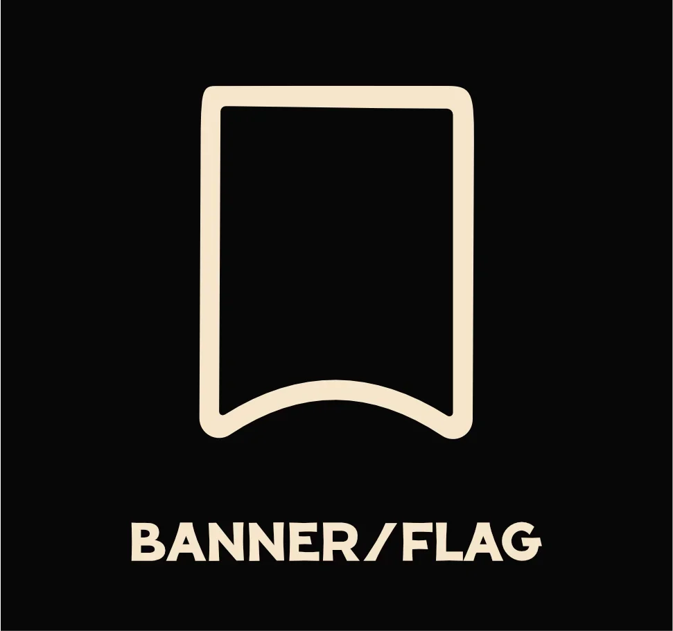
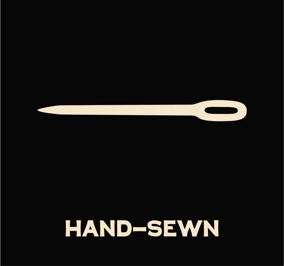
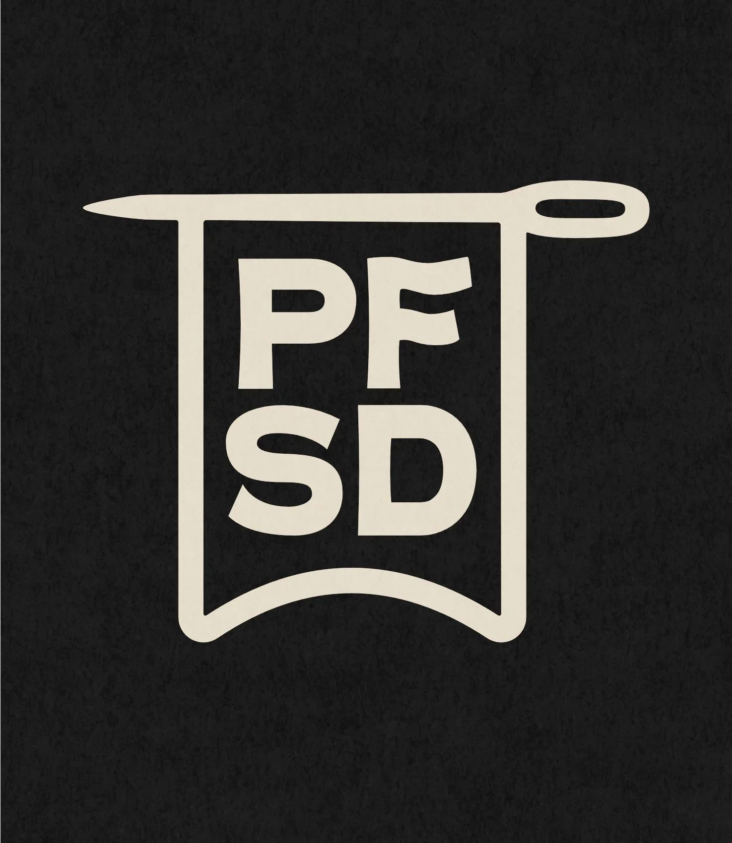
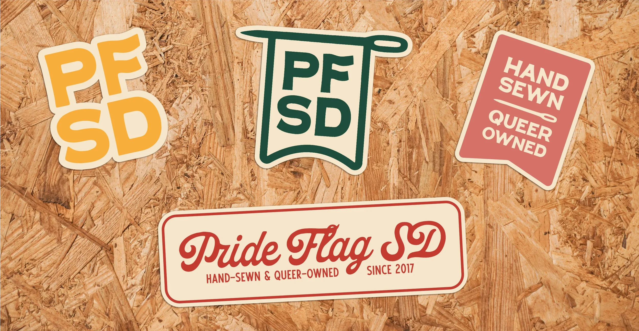
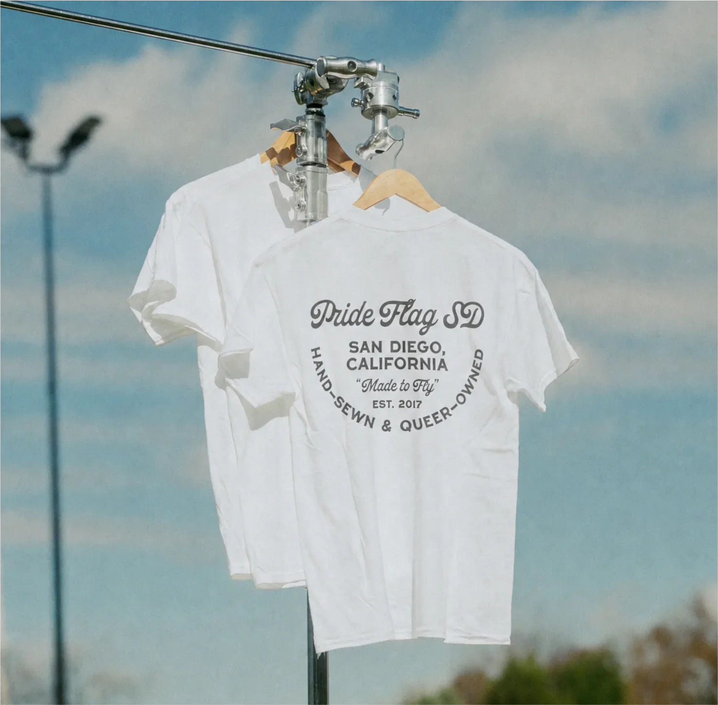
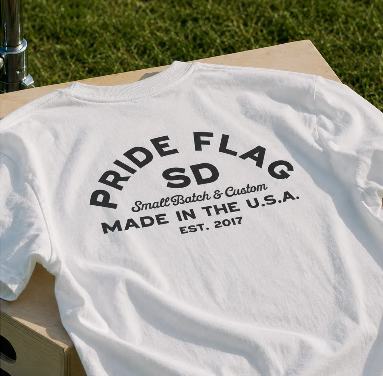
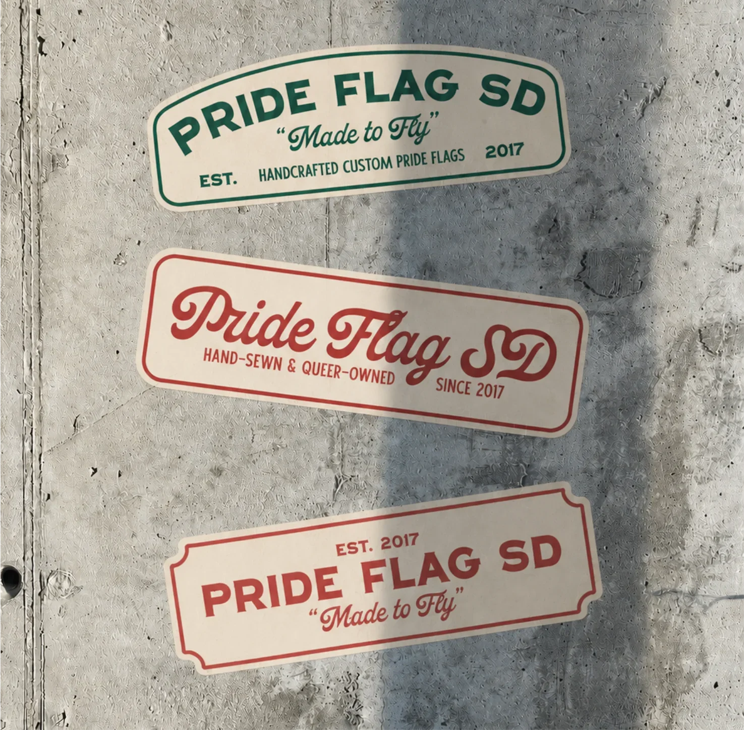
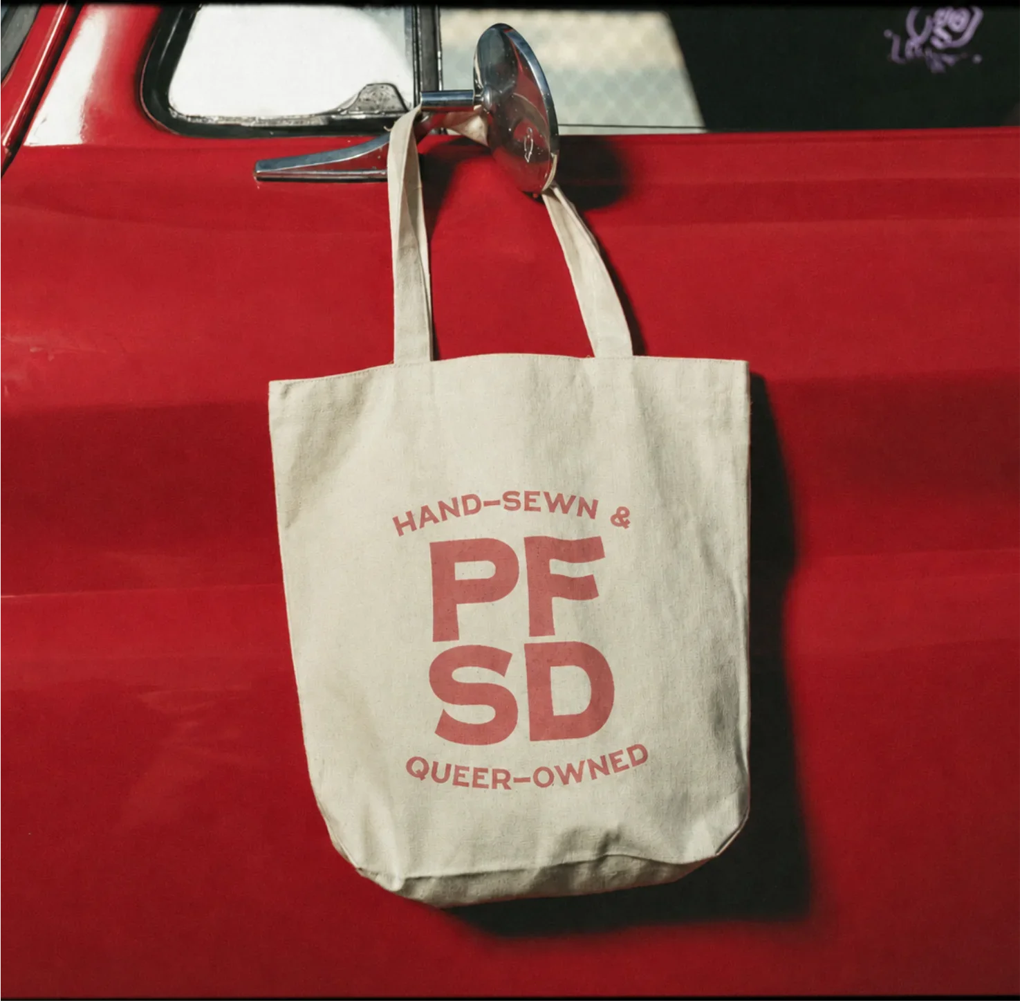
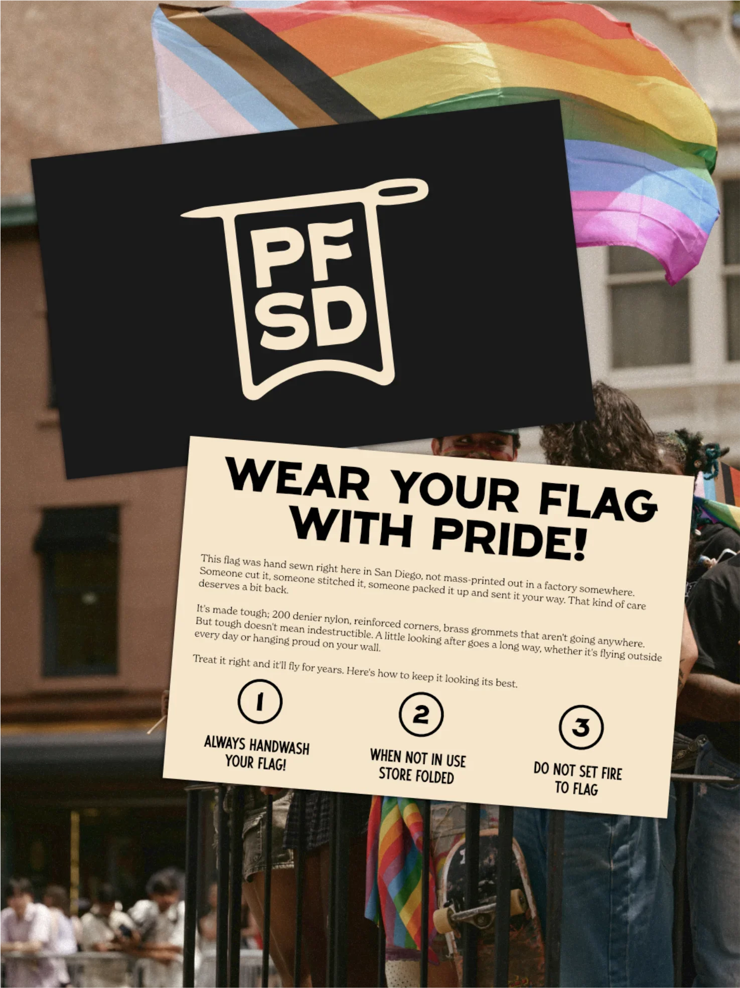
The primary logo centres on the PFSD letterform mark - a banner/flag device that contains the initials. It's the kind of mark that reads immediately as handmade manufacture. Not soft, not corporate, not trying to be charming - just direct and well-built. A needle device runs through the system as a secondary element, anchoring the "hand-sewn" story without having to spell it out every time.
The identity scales properly too. The full logo with the needle, PFSD without the banner/flag (in two layouts), a standalone F mark for small applications. That scalability matters for a company where the logo appears on everything from a 20x30ft community flag to a woven label on the inside of a hand-stitched rainbow.
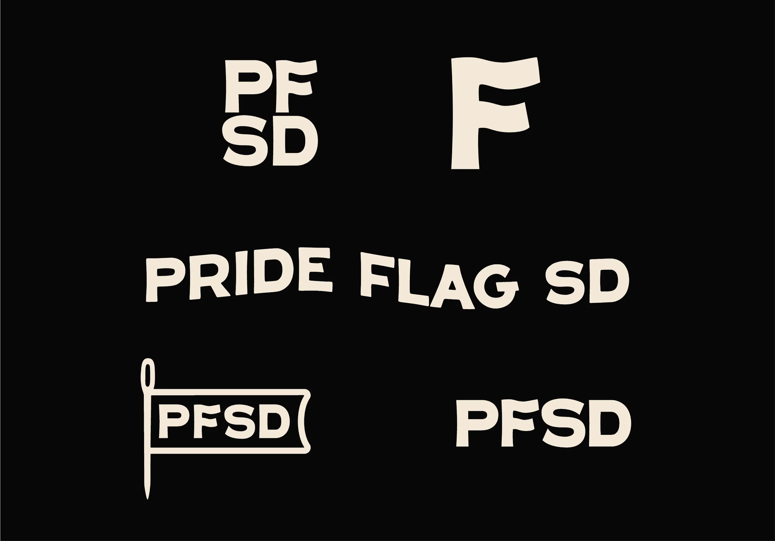
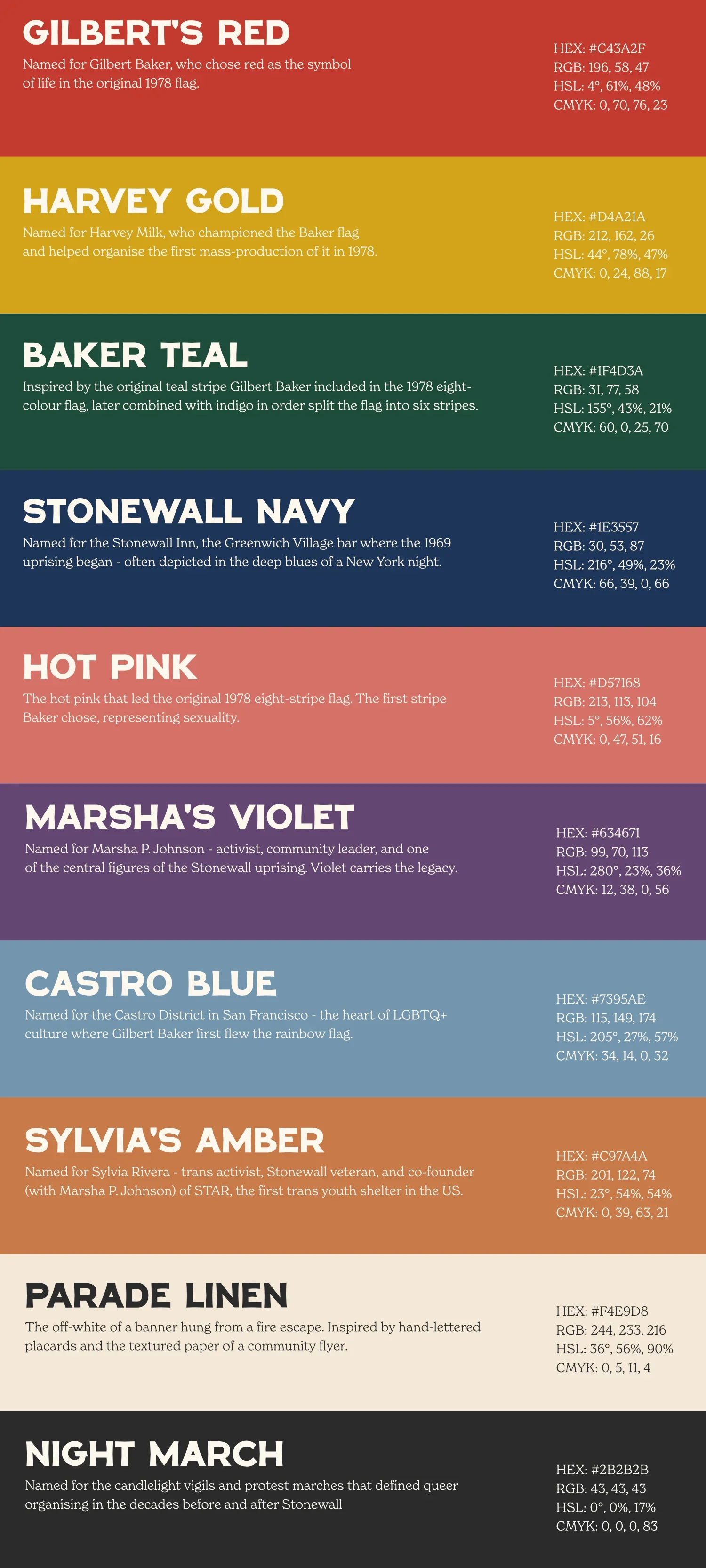
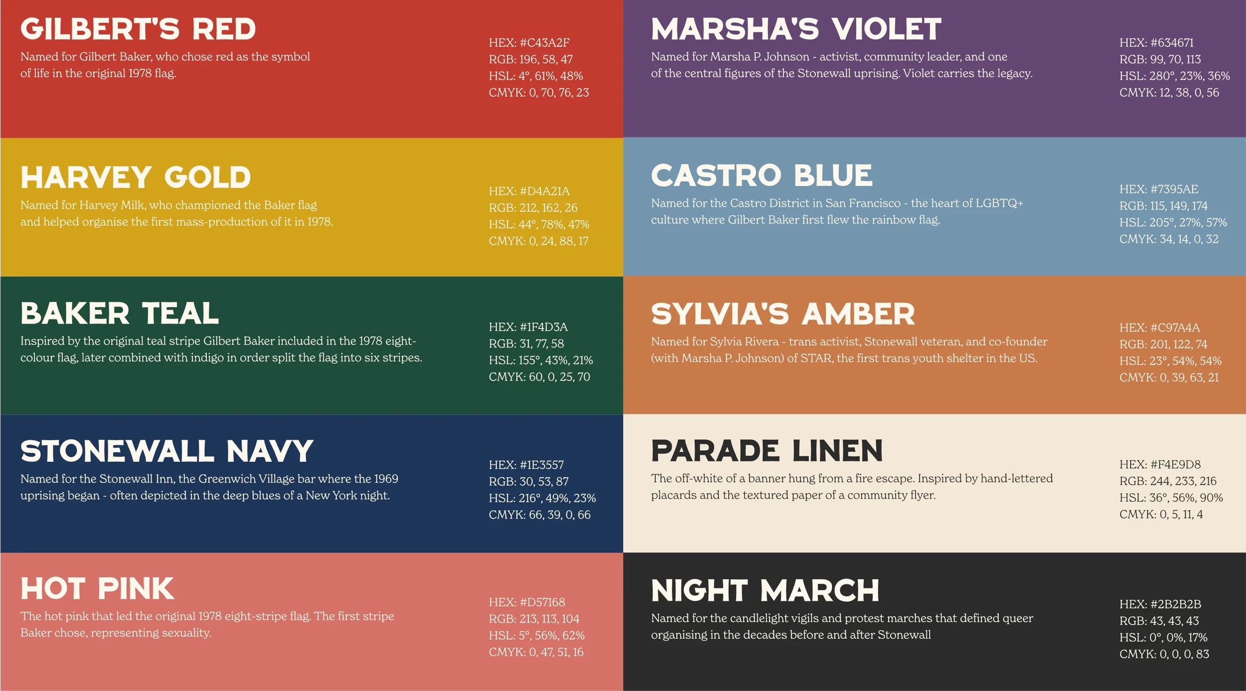
The colour palette was drawn from that same reference. Off-black, off-white, warm parchment - and then a range of colours picked to compliment and pay homage to the Gilbert Baker originals: that distinctive hot pink and the teal that got dropped from the flag in 1979 when the dye became commercially unavailable. Using those colours is a deliberate act of historical connection.
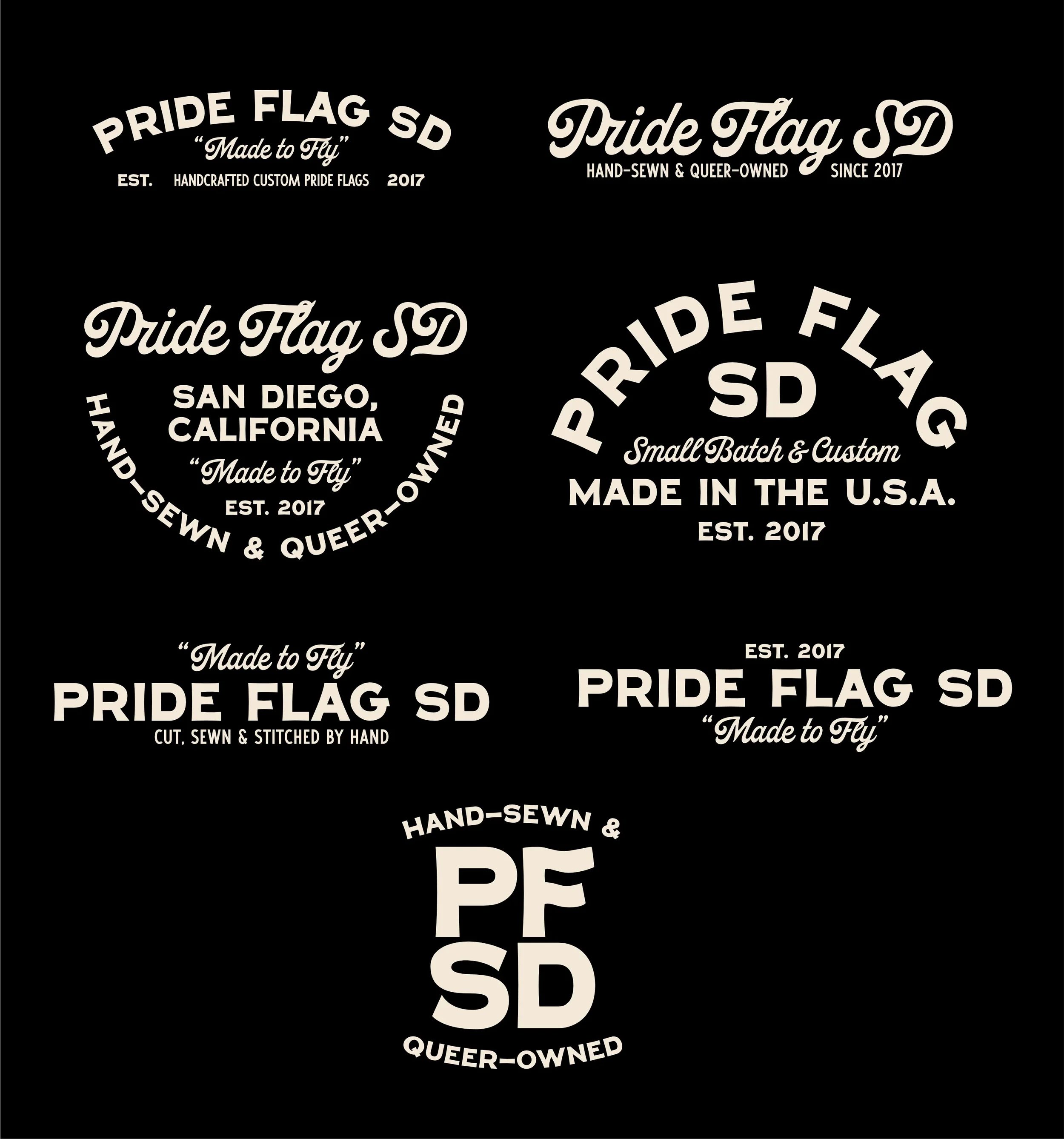
The historic ‘golden thread’ runs through the type system too. The typographic direction is built around four fonts, each doing a specific job.
YRT Shishito and YRT School No.9 anchor the display end of the system - the kind of bold, characterful type that carries the vintage handmade energy the brand needed. Strong enough to handle headlines, distinct enough to feel like they belong to something specific rather than something generic. Alongside them, New Spirit handles the body copy - warm, readable, with just enough personality to hold its own without competing. And Palmer Script drops in as the accent font: a stroke of handwritten warmth for callouts, pull quotes, and the moments where the brand needs to feel a little more human and a little less designed.
Together they build a type system that feels cohesive without feeling uniform - which is exactly right for a brand rooted in craft and community rather than corporate consistency.
BUILDING OUT THE BRAND
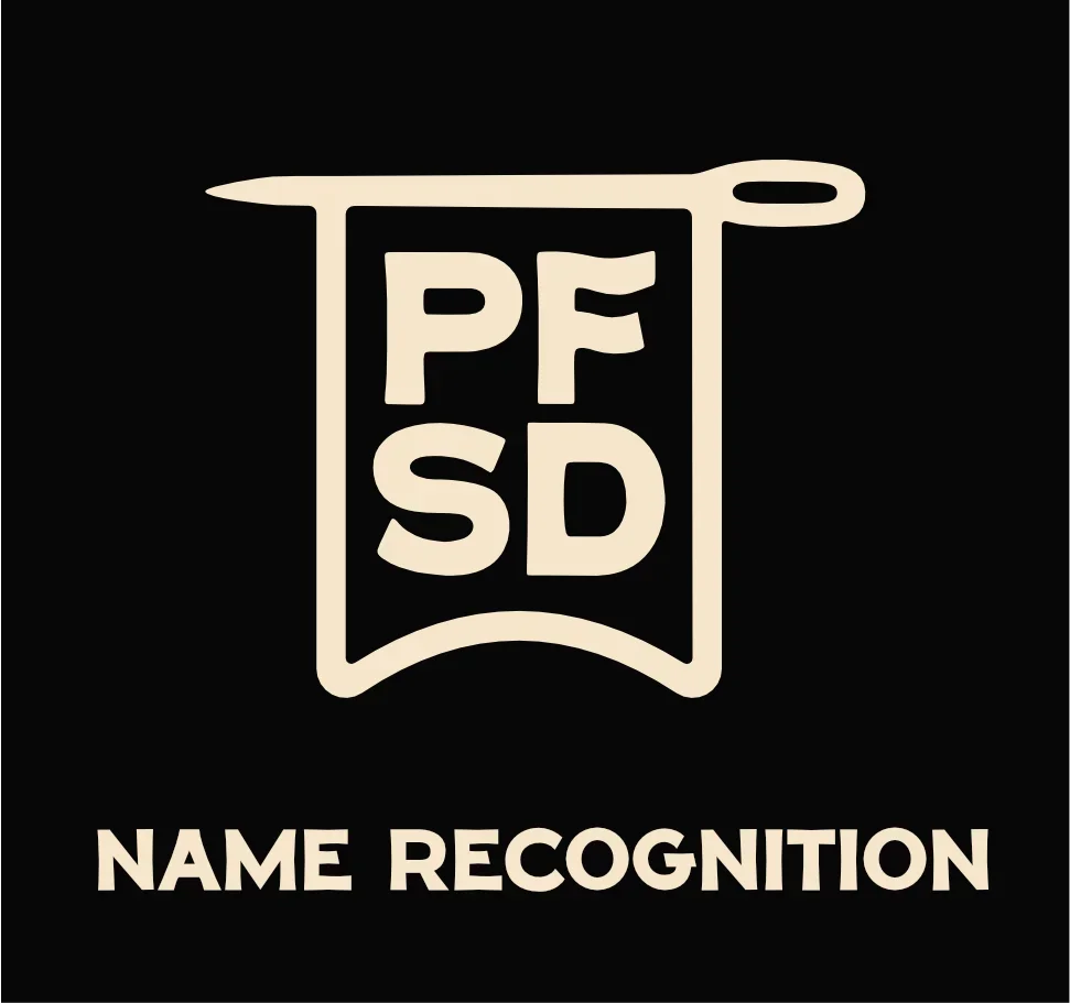
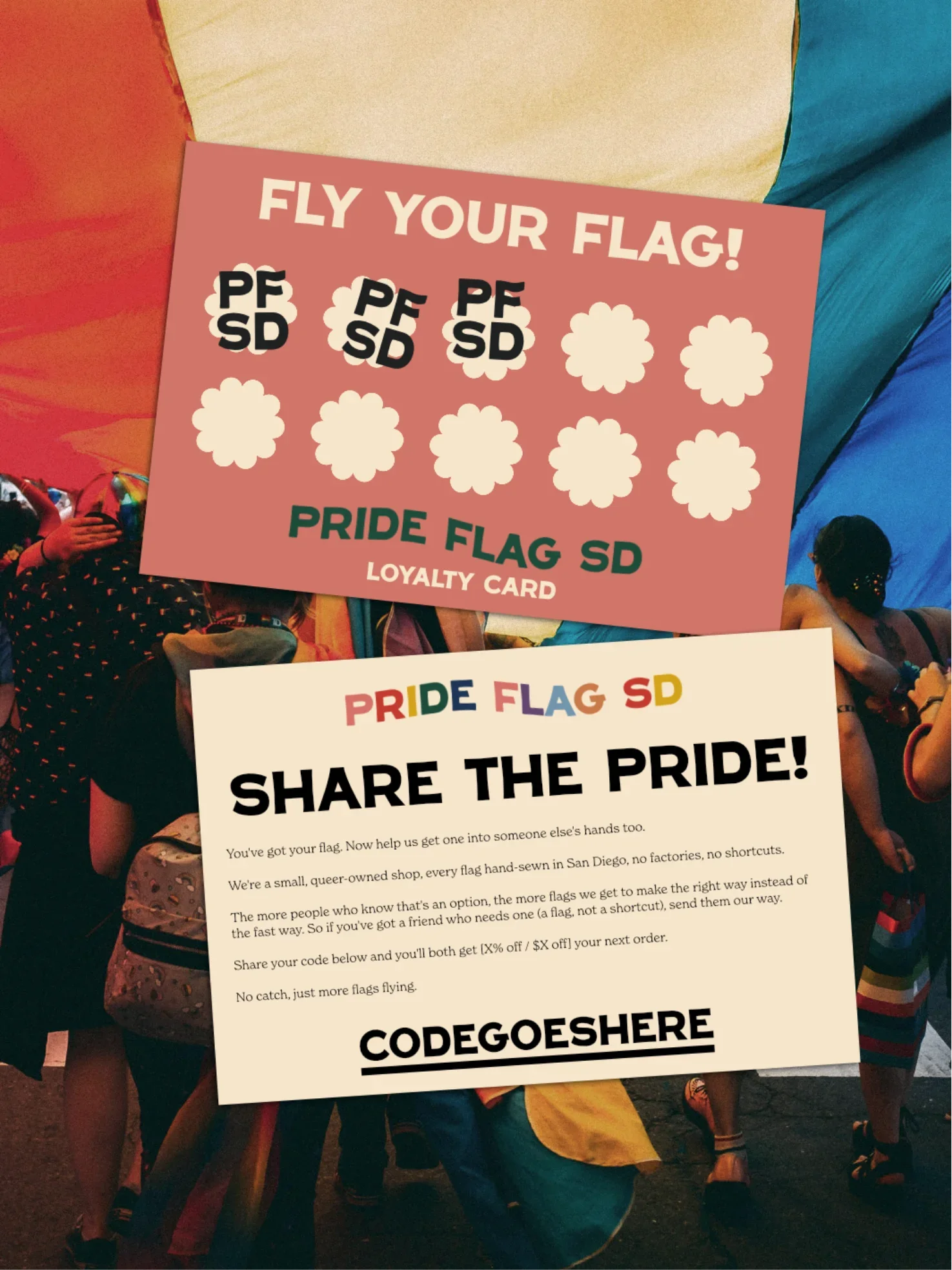
One of the most satisfying parts of this project was building out the wider visual identity, including a series of custom badges, icons and visuals. Pride Flag SD's story has multiple layers: the hand-sewn quality, the queer ownership, the San Diego roots, the Gilbert Baker lineage, the community mission. Badges are the right vehicle for that kind of layered storytelling - they carry information and credibility without needing a paragraph to do it.
The badge system includes marks centred on "Hand Sewn," "Queer Owned," and broader brand call-outs, all sitting in the same vintage typographic world as the primary mark. They work across packaging, labels, website, social - and give the brand the depth to show up differently in different contexts while still feeling coherent.
The Result
The new identity gives Pride Flag SD something their previous brand couldn't: a visual language that actually matches who they are. It's not corporate. It's not trying to compete with the colourful flag photography - it sits behind it, grounds it, gives it context. It says: this is a company with roots, with history, with craft. This is someone who gives a damn.
Because Pride Flag SD's whole argument is that the community deserves quality. Deserves flags made with care, by people who share the experience, not imported from somewhere that treats queer people as criminals. That argument deserves a brand that makes the same case visually - without having to say a word.
Want to transform your brand too?
Please fill out the form below with some brief details about your brand, project, timeline, and budget.
I aim to respond to all enquiries within 24 hours.
Takes approx. 1 minute