

Goods In specialises in vintage industrial & salvaged furniture, homeware and accessories. Based in Leeds, UK, they source authentic vintage goods with a unique history. Having worked with me before on a project to redesign leaflets and packaging materials, David, the Founder of Goods In, approached me at the start of 2024 to completely revamp the visual identity for the brand and create a bold, memorable visual system that was in keeping with the brand values and story, and designed to grow with the business.
Goods In’s new branding system represents a balance - of the industrial, functional aspect of each piece, the hand-sourced nature of every item, and also their new life as a piece beautiful, practical home decor. Each brand asset is designed with clarity and purpose, along with a few intentional rough edges and perfect imperfections that are designed to mimic the story that each item has.
“Once again, David has been incredible to collaborate with. He redesigned my branding and created assets that absolutely nailed the brief. They capture the essence of our business and our values.”
-
Retail
-
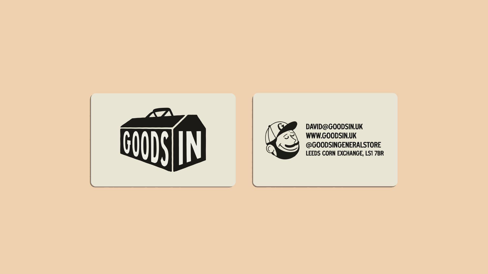
Logo Design
Brand Identity & Guidelines
Typographic Direction
Colour Direction
Print Design (Flyers, Brochures etc.)
Shop Signage
-
2024

Logo & Visual Identity
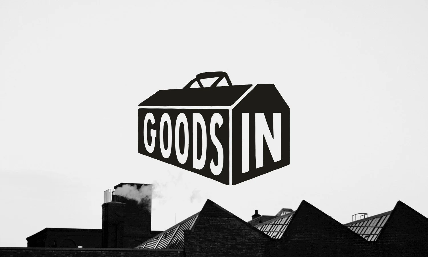
We anchored the identity with a toolbox-inspired logo - unpolished, rugged, emblematic of the brand’s industrial roots and hand-sourced heritage. Imperfections are intentional: a nod to each item's storied past.
The logo is inspired by a vintage cantilever toolbox, an emblem of both industrial functionality and craftsmanship. It incorporates intentionally rough edges and subtle imperfections, echoing the unique stories of each salvaged item and reinforcing the brand’s vintage-industrial aesthetic


Designing a brand with character
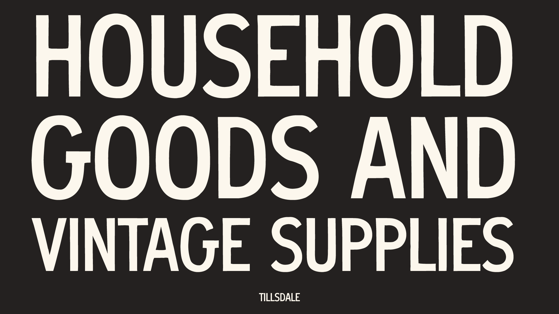
The visual system balances three core aspects: the industrial nature of each piece, the hands-on, sourced origins, and their transformation into beautiful, practical home decor. Every brand element, from the rough-edged primary font to printed materials and signage, is crafted for clarity, purpose, and lived-in authenticity, complete with texture and intentional roughness to reflect brand personality


Marketing collateral & brand assets
Flyers designed for multiple channels (Etsy, website, fairs) draw inspiration from 1930s–40s newspapers and telegrams - reviving nostalgic communication formats. Features include custom illustrations, inked stamps, weathered textures, and period-appropriate typography. On one side, sandwich-board style layouts and manicules highlight key messages; on the reverse, vintage-style illustrations advertise products, offers, and social media presence


Want to transform your brand too?
Please fill out the form below with some brief details about your brand, project, timeline, and budget.
I aim to respond to all enquiries within 24 hours.
Takes approx. 1 minute