

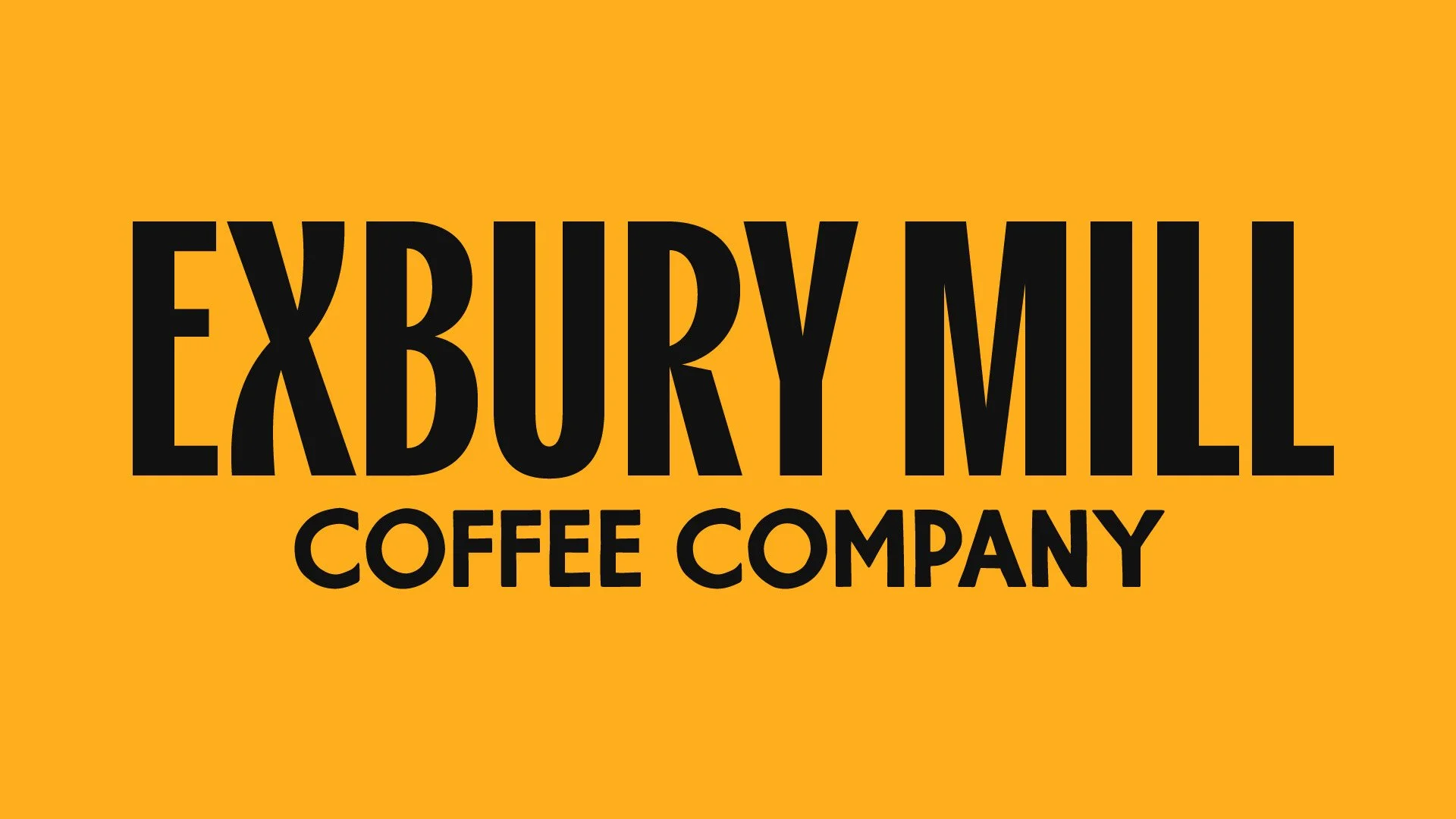
Exbury Mill Coffee Co.
Exbury Mill Coffee Company is a Suffolk-based coffee roaster specialising in ethically-sourced and fairly-paid coffee. The brief was to create a refreshed brand identity and packaging, building a system that felt bold and contemporary while still honouring their roots, and to build a design language that could work across multiple applications - from signage and merchandise through to packaging and digital assets.
The result is a brand identity built around clarity, consistency, and a recognisable mark that reflects both the craft of coffee and the character of the mill it’s named after.
-
Food & Drink/CPG
-
Logo Design
Brand Identity & Guidelines
Typographic Direction
Colour Direction
Print Design
Packaging Design
-
2025

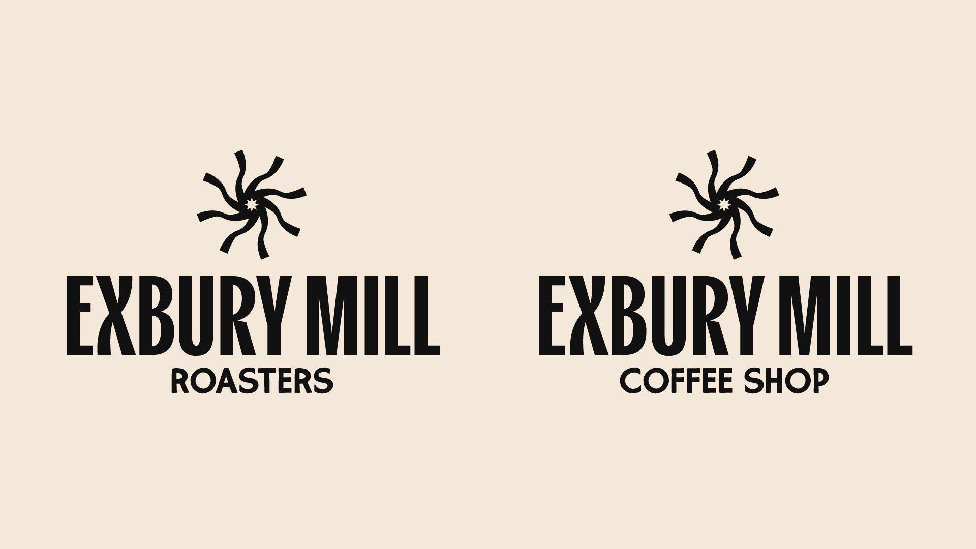
Logo & Visual Identity
The new logomark, wordmark and wider logo suite is confident, modern, and versatile. It pairs with a distinctive emblem inspired by the mill wheel - simplified into a dynamic radial motif that also hints at the movement of a burr grinder. This device acts as a core building block for the wider system, adaptable as a standalone icon, repeat pattern, or subtle background texture.


Just the type
Typography became a key part of expressing the brand’s voice. We developed a system built on a combination of typefaces, each chosen to serve a distinct role:
Kensington brings a touch of vintage charm with its condensed, characterful forms. It’s used sparingly for standout headlines, callouts, and hero copy, injecting personality without overwhelming.
Rockhill Sans provides the backbone of the system: clean, geometric, and highly legible. It handles key details and functional information across packaging and collateral. It also has a rough and outline version, provide versatility whilst remaining on-brand.
New Spirit introduces a crafted, expressive serif that ties the brand back to its Suffolk roots and heritage. Used in small subheads and body copy moments, it adds warmth and storytelling character.
Rawnster Script rounds out the set with versatile, characterful script accent font.


Brand colours
The colour system is designed to balance vintage character and warmth with bold contemporary energy. At its core, the palette draws on rich, off-black and a beige reminiscent of faded paper. This grounds the identity in a timeless, familiar feel. These colours evoke the tactile nature of vintage print and signage, aligning with the brand’s desired aesthetic.
To complement this, accent colours introduce a fresh, modern vibrancy. Brighter notes of mustard, mint, are coral are used consistently, ensuring contrast and energy. The palette is deliberately versatile, with key colour combinations set in stone. The use of contrasting tones allows the brand to shift seamlessly between bold, eye-catching layouts and refined, understated applications.


Visual language
A key part of the brand identity system lies in its bespoke iconography and supporting graphic elements. These small details act as connective tissue across applications, reinforcing the personality of the brand without overwhelming the core typography or colour palette.
The icons were designed with the same retro-inspired sensibility as the wider system, with rough edges and simplified forms. Each icon and lockup is designed to be legible, and versatile, ensuring they work just as effectively at small digital sizes as they do when scaled up for print.
To extend this system, a library of micro-graphics, such as arrows, stars, seals, and divider lines was developed. These elements not only aid navigation in digital interfaces but also add a layer of charm and tactility in printed materials.

Marketing collateral
Beyond the core identity and packaging, the brand needed a toolkit of marketing assets that would carry its voice across both digital and physical touchpoints. These assets were designed with flexibility in mind, able to adapt to different products and ranges, promotions, and community-focused storytelling without losing consistency.
Printed collateral includes business cards and loyalty cards, each using the brand’s bold typographic system and colour palette. On the digital side, templates for social media, newsletters, and promotional graphics were developed. These layouts balance striking imagery with modular text blocks and accents from the visual language system, ensuring a recognisable identity even when content is regularly refreshed.


Packaging design
The heart of the project was the creation of a new packaging system for Exbury Mill’s signature roasts. We designed a set of 500g and 1.2Kg coffee pouches for three products - Sunbird Kenyan Light Roast, Kaldi’s Tale Ethiopian Medium Roast, and Andean Nights Colombian Dark Roast - each available in both whole bean and ground formats.
Each roast is distinguished by a dedicated colourway:
Sunbird Kenyan Light Roast - Sunburst yellow, echoing brightness and citrus notes.
Kaldi’s Tale Ethiopian Medium Roast - Coral pink, referencing honey and stone fruit sweetness.
Andean Nights Colombian Dark Roast - Off-Black, a nod to chocolate, spice and richness.
Front-of-pack design prioritises clarity: product name, roast level, flavour highlights. A roast strength meter and simple icon system (using the bespoke icons) help customers navigate quickly.
The use of repeating motifs, contrasting borders, and bold typography give the pouches strong shelf presence, while still feeling crafted and tied to the wider identity.


Want to transform your brand too?
Please fill out the form below with some brief details about your brand, project, timeline, and budget.
I aim to respond to all enquiries within 24 hours.
Takes approx. 1 minute