

LIGHTHOUSE BREW CO. BRAND & PACKAGING DESIGN
Lighthouse Brewing Company is a small, independent micro brewery based on the Suffolk/Norfolk border, producing beers inspired by the coast, local landmarks, and traditional British brewing styles.
They needed a complete brewery branding design system that could scale: something bold enough to stand out on a crowded shelf, but rooted in heritage rather than chasing trends. The brief was clear: create a brand identity and beer packaging design that felt confident and full of character, yet timeless, and in keeping with the local communities.
This project covered the full visual identity, from logo design through to a flexible packaging system for multiple SKUs.
-
Food & Drink
-
Logo Design
Brand Identity & Guidelines
Typographic Direction
Colour Direction
Packaging Design
-
2025
THE CHALLENGE
Most micro brewery branding falls into one of two traps: overly modern minimalism, or chasing trends that creates inconsistent packaging. Lighthouse needed neither.
The challenge was to design a brewery brand that:
Felt established, not experimental
Worked across multiple SKUs without constant in-depth redesign
Reflected its coastal Suffolk roots without leaning on clichés
Held its own visually against much larger breweries
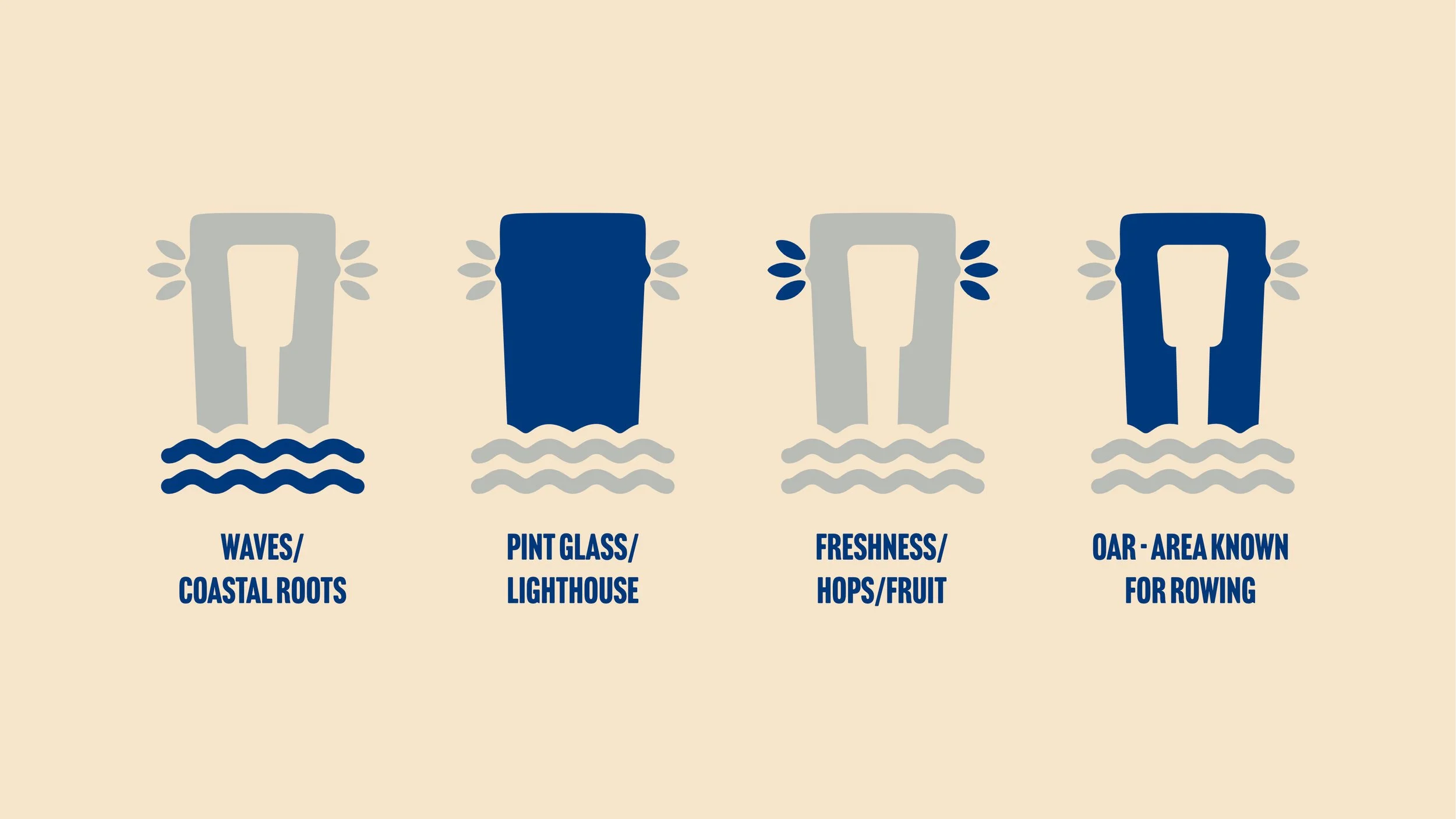
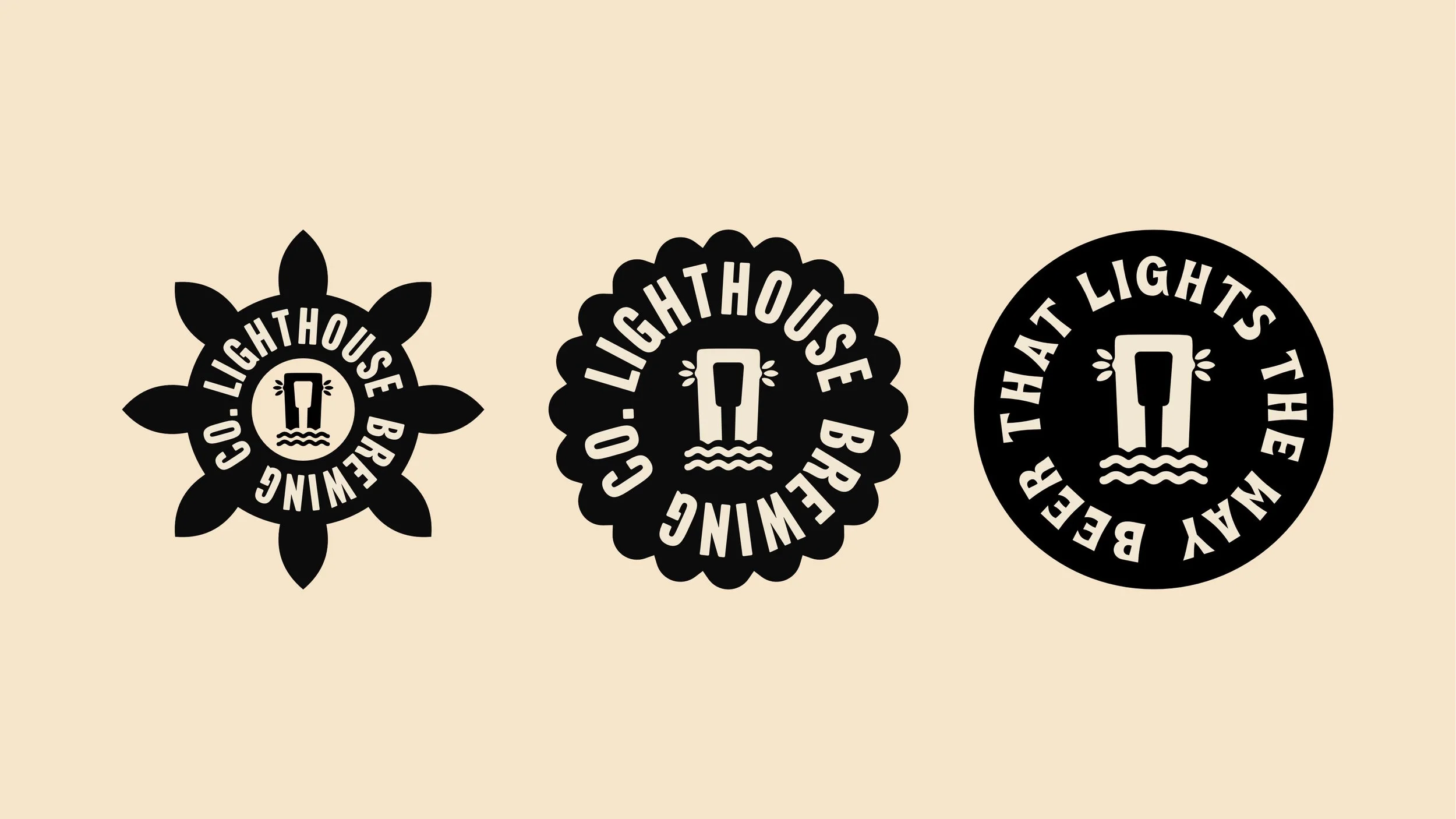
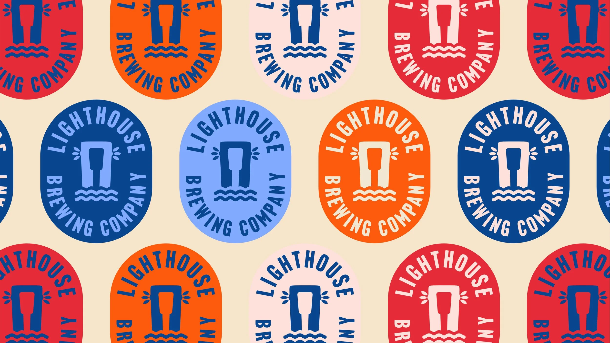
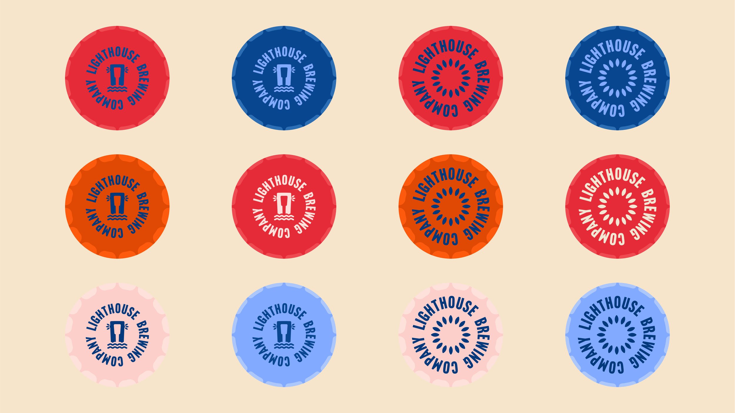
To solve this challenge, the concept was built around a single, recognisable visual anchor: the lighthouse logo.
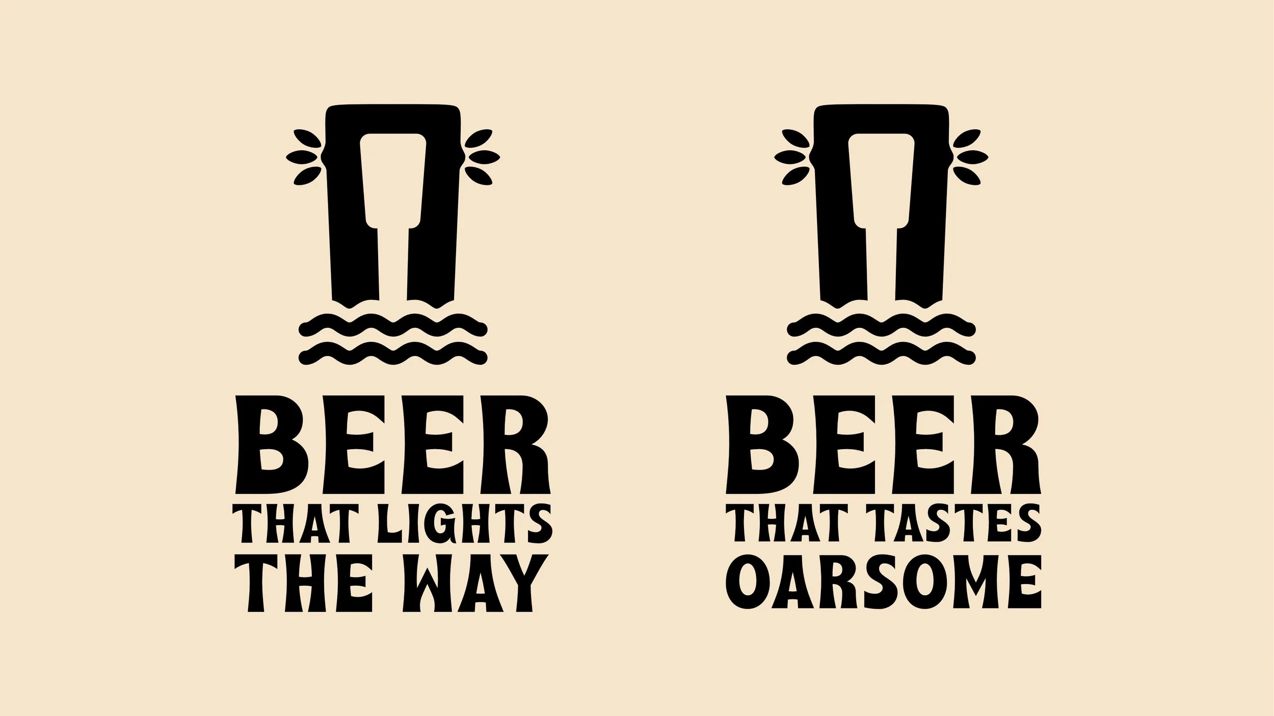
A lighthouse is practical, symbolic, and historically loaded. It guides. It welcomes. It stands still while everything else moves. That made it the perfect metaphor for a dependable, quality-first micro brewery. Also worked into the logo are an oar, symbolic of the local popularity of rowing, canoeing and watersports, and waves, solidifying the brands coastal roots.
The branding leans heavily on traditional beer label design, bold typography, limited colour palettes, and simple graphic devices. Nothing ornamental for the sake of it. Every element has its place. This approach allowed the brand to feel classic without becoming old-fashioned.
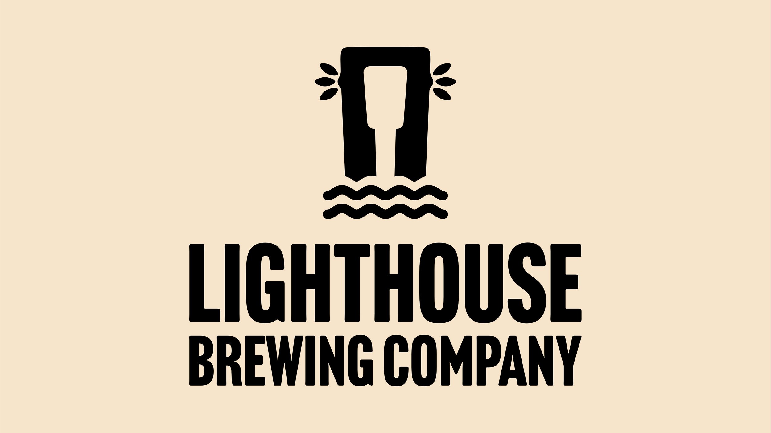
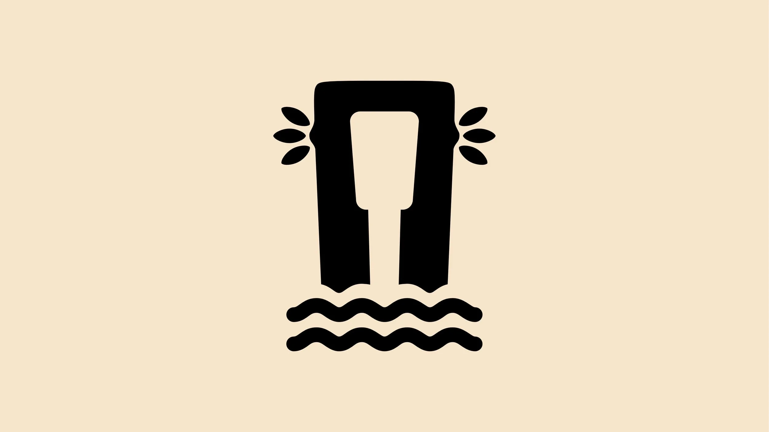
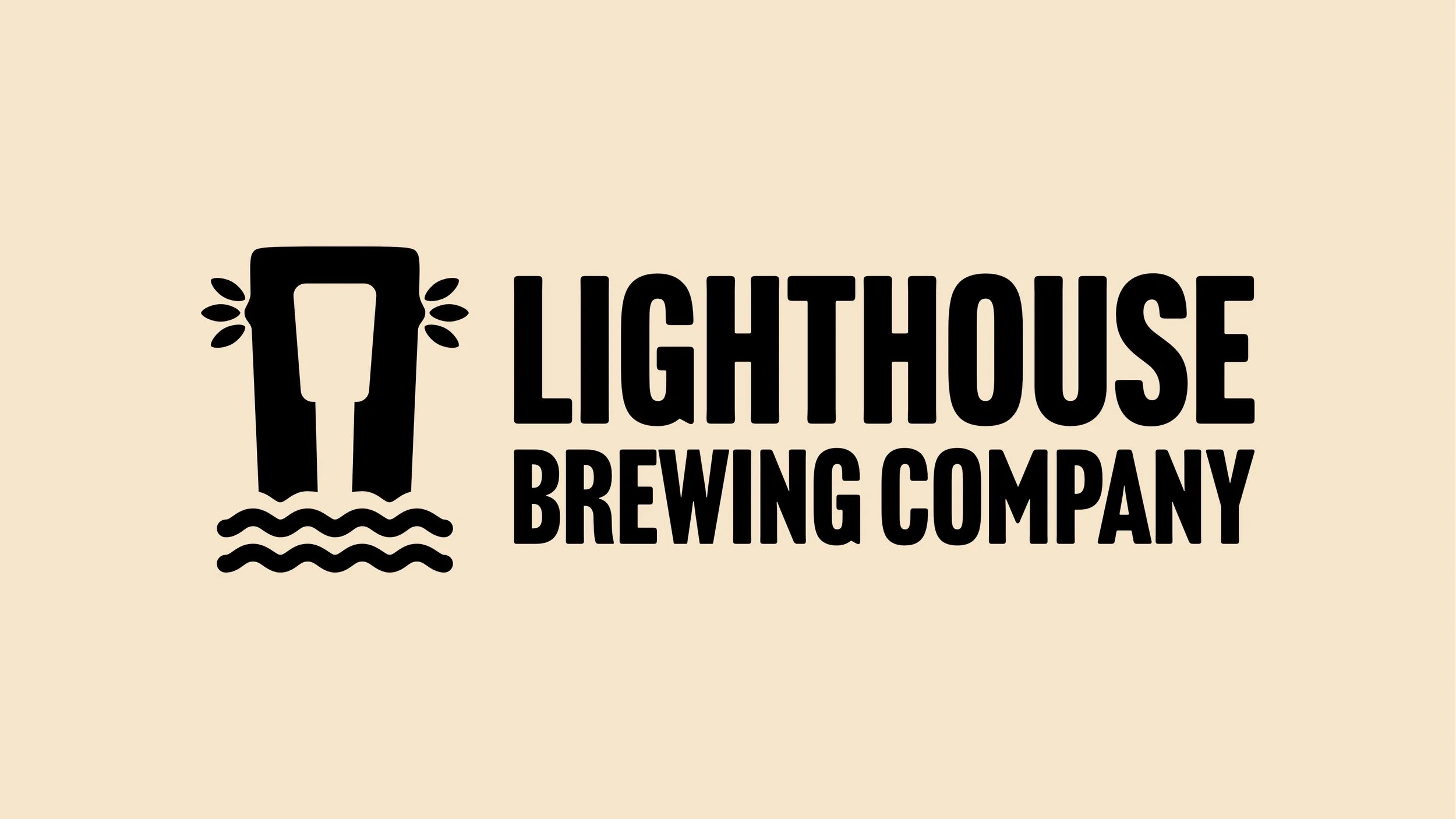
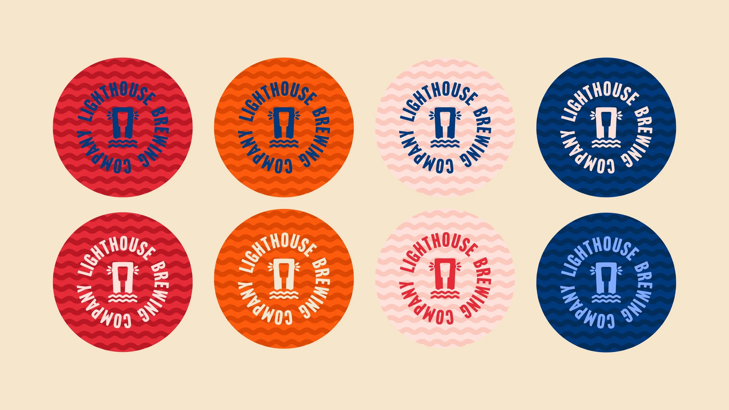
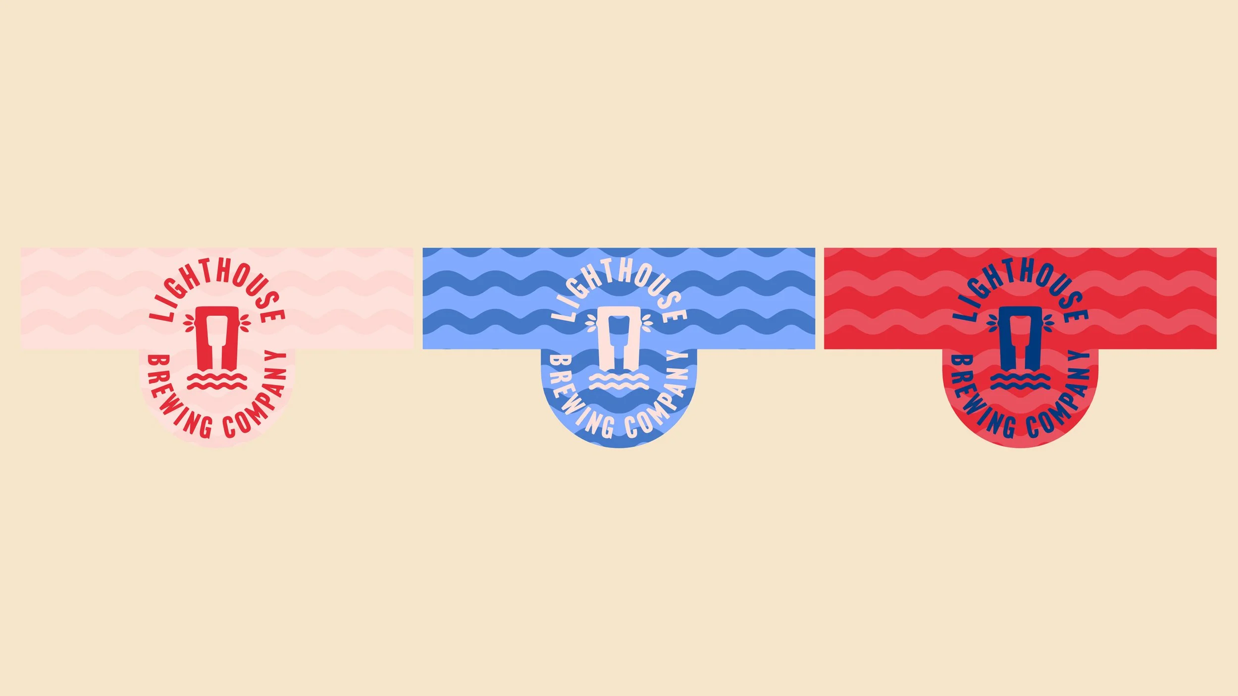
At the heart of the Lighthouse Brewery branding is a strong, simplified lighthouse mark. It’s designed to work hard in all contexts: packaging, merchandise, social media, and print.
The logo system includes:
A primary wordmark for formal applications
A simplified icon for small formats
Circular stamp-style badges for packaging and merchandise
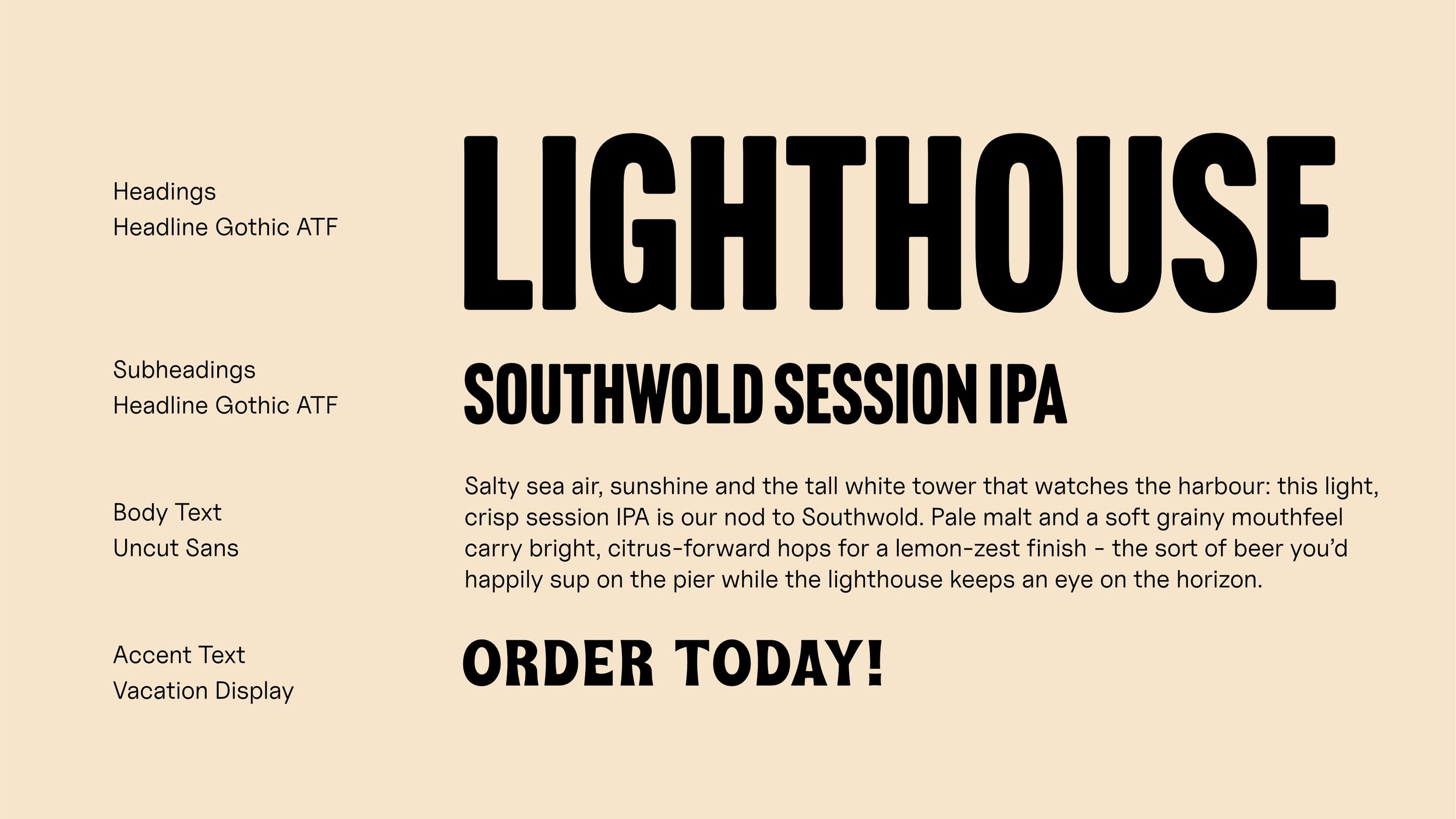
Typography is bold, condensed, and legible from a distance. This was a deliberate choice to prioritise clarity and shelf presence over decorative type.
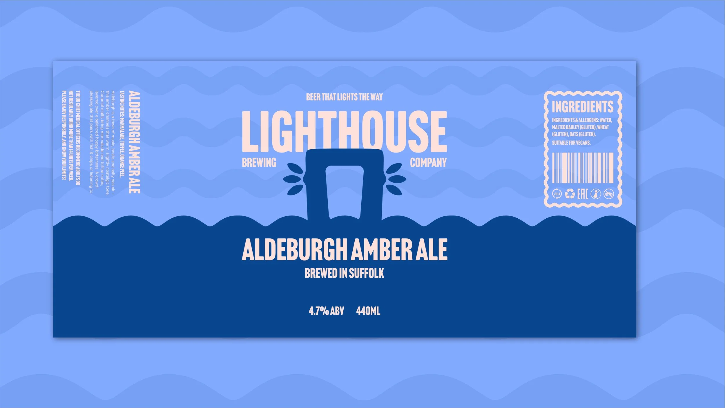
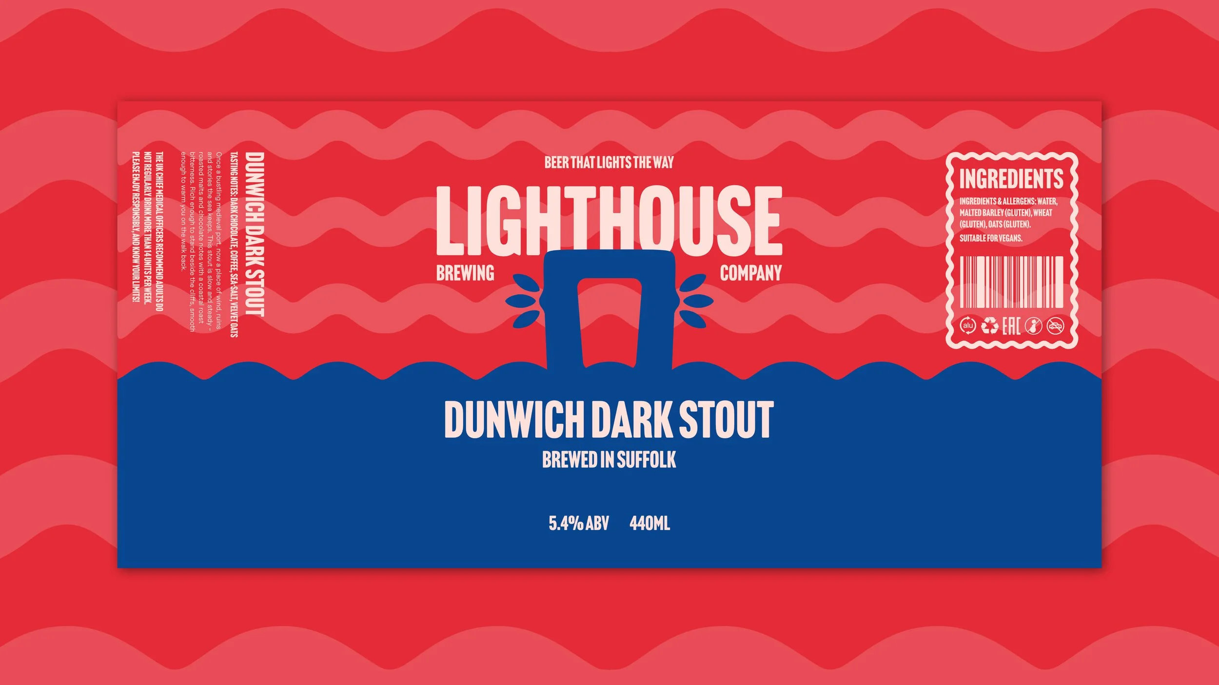
The colour palette draws from coastal references: navy, red, sunset orange, and pale blue, supported by warm neutrals. Each beer style is colour-coded, creating instant recognition while keeping the overall brewery branding consistent.

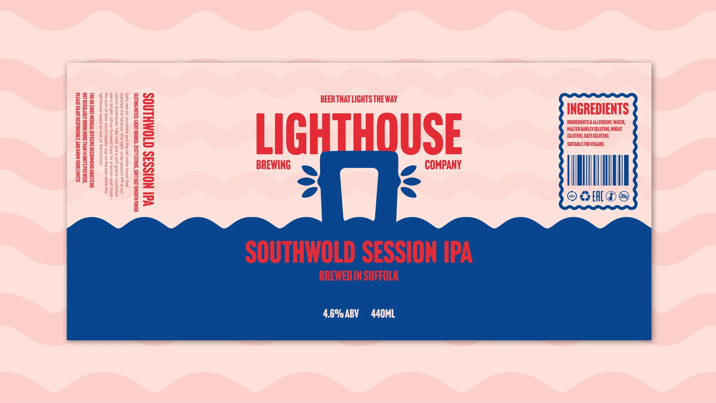
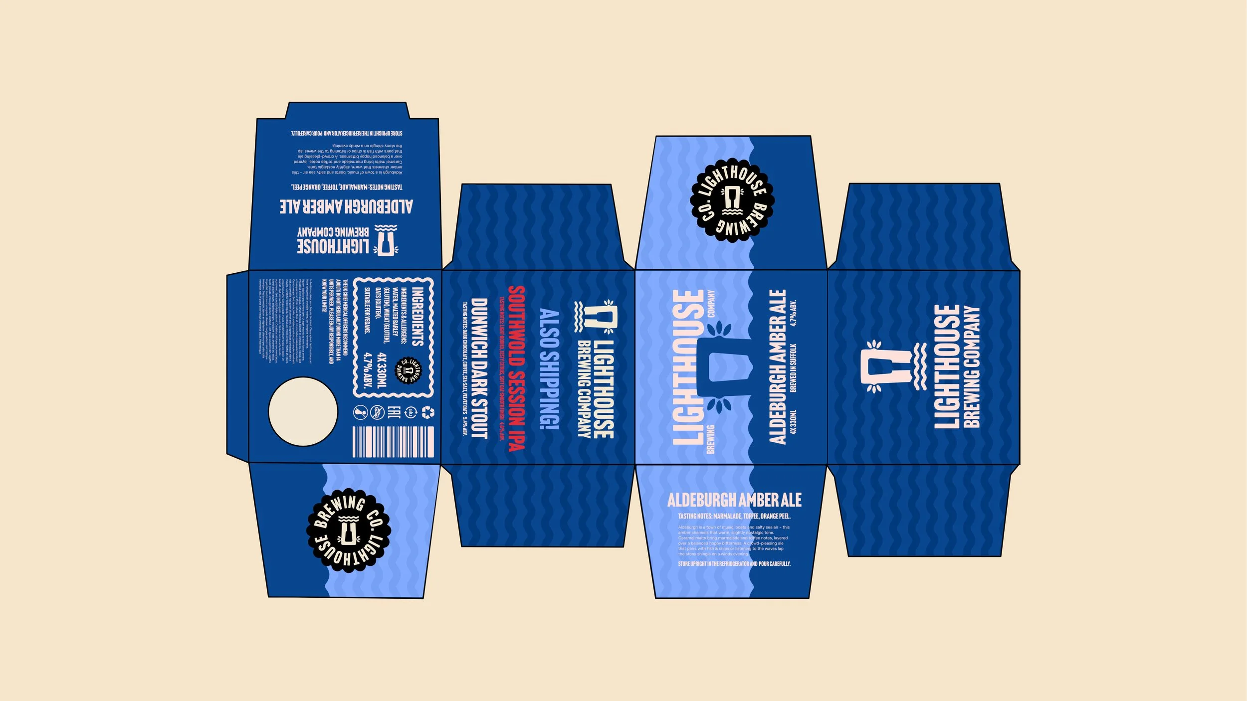
Packaging Design
The beer can packaging design was built as a modular system rather than a one-off label.
Each can features:
The lighthouse icon as the central visual element
Bold colour blocking to differentiate styles
Subtle wave patterns to reinforce the coastal theme
Clear, traditional hierarchy for beer name, style, and ABV
This system allows Lighthouse Brewing Company to release new beers without reinventing the wheel. The branding stays recognisable, while the packaging still feels fresh across the range.
From Southwold Session IPA to Dunwich Dark Stout and Aldeburgh Amber Ale, the cans, bottles and boxes sit together as a family, not competing products.
WHY IT WORKS
For small and independent breweries like Lighthouse Brewing Company, branding has to do more work with fewer resources.
This identity succeeds because it:
Prioritises consistency and familiarity over novelty and trends
Uses simple, repeatable design elements that mean the business doesn’t need to hire a new designer for each product.
Scales easily across packaging formats, ensuring different SKUs within the range look consistent.
It’s brewery branding designed for longevity and brand recognition.
The final branding and packaging system gives Lighthouse Brewing Company a confident, characterful presence that punches above its size.
The brand now:
Stands out clearly on shelf and online
Feels established despite being a small brewery
Has a flexible system for future beer releases
Most importantly, it looks like a brewery that knows exactly who it is.
Want to transform your brand too?
Please fill out the form below with some brief details about your brand, project, timeline, and budget.
I aim to respond to all enquiries within 24 hours.
Takes approx. 1 minute