

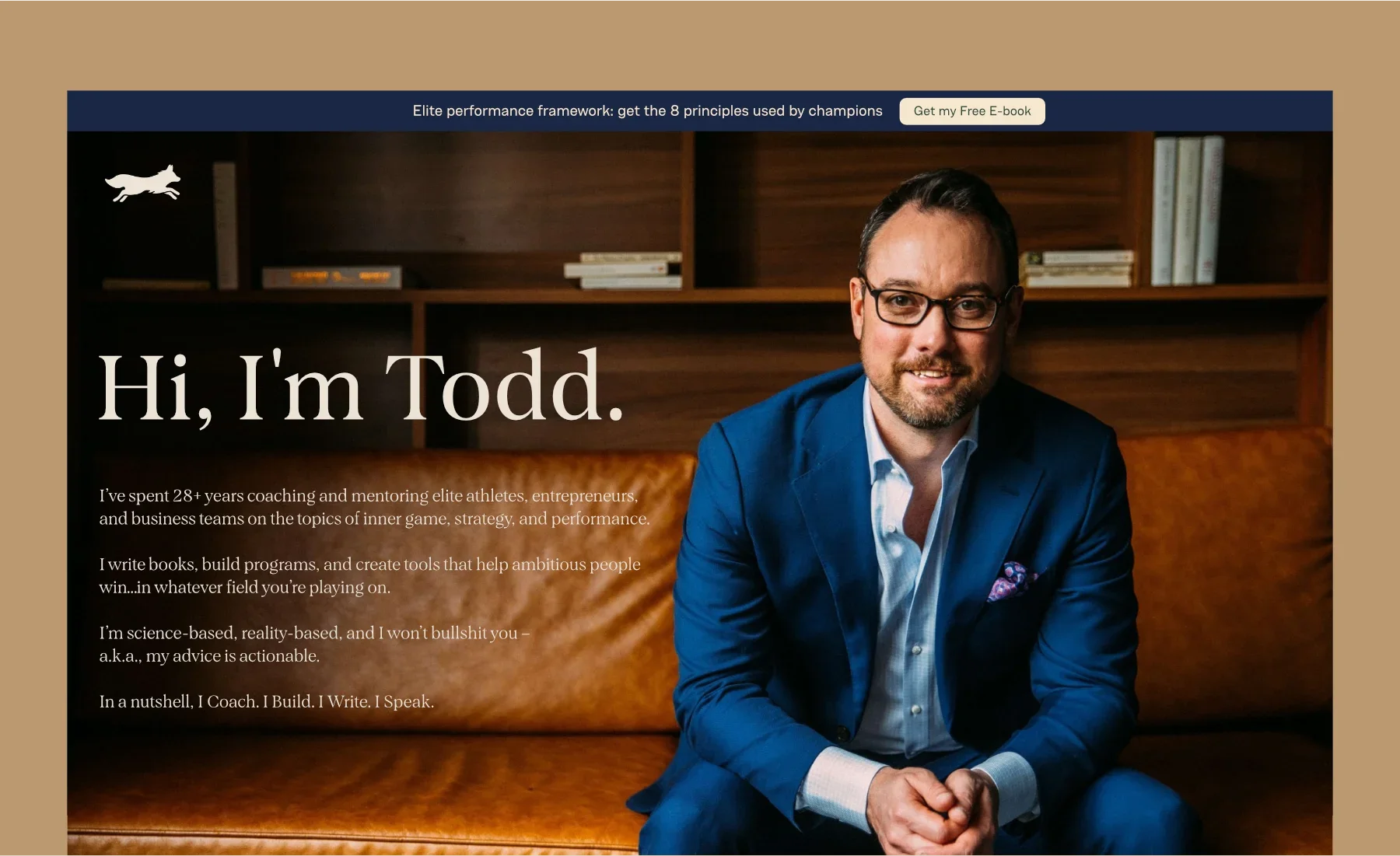
Todd Herman is one of the most recognised names in peak performance. Creator of the 90 Day Year, author of the Wall Street Journal bestselling book The Alter Ego Effect, and a coach whose programs reach over 200,000 professionals across 73 countries - his is a personal brand with serious weight behind it.
The brief was to translate that weight into a visual identity that actually matched it.
His existing brand had done its job. But Todd's world had grown - the book, the speaking, the coaching, the programs - and the identity hadn't kept pace. What was needed wasn't a cosmetic refresh. It was a full personal brand redesign, built around a clear philosophy: that the best brands don't chase trends. They build something that is timeless.
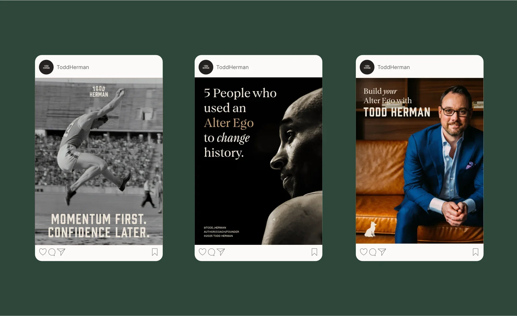
The direction came quickly. Inspired by heritage athletics and mid-century sporting culture, the new identity would feel timeless, intentional, and quietly confident. Classic collegiate typography. A colour palette drawn from vintage athletic visuals. And an ecosystem of marks, badges, pennants, seals and symbols that together build something more than a logo - a world.
-
Personal Brand/Coaching
-
Logo Design
Brand Identity & Guidelines
Typographic Direction
Colour Direction
-
2026
A Rebrand Built on History
Most coaches have a personal brand. Few have one that actually reflects the depth of what they do.
Todd's previous identity wasn't bad - it just wasn't him. Not the version of him that coaches Olympians, fills conference stages and provides support that Kobe Bryant credited for his dominance. There was a gap between the brand on screen and the brand in the room.
The starting point for this personal brand rebrand was understanding what Todd's approach actually stood for: rigour, authority, and a no-nonsense philosophy forged over three decades of real work with real performers. That's not a brand that should look like a startup. It should look like something that's been around long enough to know exactly what it's doing.
Heritage athletics gave us the right framework. The visual language of mid-century sport - university crests, athletic department insignia, pennant culture, hand-tweaked lettering - carries exactly that sense of earned credibility. Confident without being loud, and built to last.

The Visual Identity
The wordmark anchors the entire brand identity. Built around classic collegiate typography, it carries the weight of an established institution without feeling academic or stiff. Strong letterforms, carefully-considered spacing, and a balance between authority and warmth are key here.
Alongside the primary wordmark sits a suite of secondary marks: monograms, secondary lockups, and typographic treatments for different contexts. Every mark in the system is designed to work independently or together, giving the brand the flexibility it needs across a body of work as varied as Todd's.


TYPE & COLOURS
The typographic direction is deliberately restrained. Two Primary Fonts. Clear hierarchy, no gimmicks. Typography does the heavy lifting here - which is exactly as it should be for a brand built on the power of clear, direct communication. Cambridge and Figure from Fort Foundry anchor the type system with clear but characterful letterforms. Prohibition gives an immediate injection of vintage collegiate charm, whilst Belmonte gives Todd the ability to add “hand-written” annotations to content in order to draw attention and focus.
The colour palette draws from mid-century athletic visuals - the faded golds, deep navies, and earthy neutrals that defined the golden era of collegiate sport. Nothing trend-chasing. These are colours that have already proven they last, borrowed from a visual culture that's spent decades looking good. Together with the typography, they set the tone for everything else in the system: serious, warm, and entirely sure of itself.


BADGES, SEALS & PENNANTS
One of the most enjoyable parts of this project was building out the badge and seal system - and there's a lot of it.
Athletic department culture has always used layered marks to communicate history, achievement, and belonging. Varsity letters, championship crests, department seals - each one is a little piece of credibility made visible. For Todd's brand, that same logic applies: badges and seals aren't decoration. They're proof of something. They’re a way to define the various aspects of the brand.
The system includes a full family of badge treatments - circular, shield-form, pennant-shaped - each carrying typographic elements, visual devices, and programme-specific details. Every mark is rooted in the same mid-century athletic aesthetic, and works across digital and print, scale up for presentations and down for social avatars, and gives the brand a depth that a single logo never could.


Mascots & Monograms
Brand mascots are easy to get wrong. They tip into gimmick territory the moment they become the main event or start trying too hard to be charming. Todd’s name association with the fox was an obvious starter here, but it works on multiple levels.
Todd's brand is built around cunning, agility, and the kind of strategic intelligence that separates elite performers from everyone else. A fox - sharp, composed, perceptive - is the natural embodiment of that. It's the right animal for the right brand.
The execution leans fully into the vintage athletics world: hand-rendered in a style that references sporting illustration, with confident linework, subtle texture, and a personality that feels assured rather than cute. It works as a standalone mark, as a badge element, and woven throughout the wider visual system. Present enough to add character but also restrained enough to not overshadow the main wordmarks.
The monograms work in a similar spirit. Where the fox brings personality, the monograms bring precision - tightly constructed letterform marks that distil the identity down to its most compact form. In the heritage athletics world, the monogram is a classic device: the varsity letter, the athletic initial, the mark that says everything without saying really anything. Here they serve the same purpose, giving the brand a family of compact marks for moments where the full wordmark isn't needed but the identity still needs to show up.


THE VISUAL LANGUAGE SYSTEM
Beyond the logos and marks, the real depth of this identity lives in the visual language system - and it's extensive.
A full library of hand-drawn symbols, icons, decorative elements, background patterns, textures, and template layouts, all designed from scratch and all rooted in the same heritage athletics visual world. Hand-drawn arrows and lines field markings, vintage typographic devices, stylised imagery - every element has been drawn with the same hand, so nothing feels borrowed or inconsistent with everything else.
The system gives Todd and his team a genuine design toolkit. Not a brand guidelines PDF that lives in a folder and never gets opened - a working library of assets they can actually use. Whether it's a course slide deck, a social post, a workshop handout, or a stage backdrop, everything pulls from the same visual vocabulary. That's what separates a brand identity from a logo. The logo is the anchor. The system is what makes it live.

This project is a great example of what vintage-inspired brand design can do when it's approached with the right philosophy.
Todd Herman's world is built on the idea that peak performance isn't accidental - it's the result of a clear and cohesive (but also robust) system, consistently applied. The brand reflects exactly that. Every mark, every element, every typographic choice is there for a reason and is there to build the whole brand ecosystem.
The result is a personal brand identity that matches the person: confident, intentional, and valuable.
Want to transform your brand too?
Please fill out the form below with some brief details about your brand, project, timeline, and budget.
I aim to respond to all enquiries within 24 hours.
Takes approx. 1 minute