

Privacounsel is not your typical HR service.
They sit in the much-needed middle ground - not legal, not internal HR, and definitely not another faceless platform throwing generic advice at people already overwhelmed.
They exist to help employees navigate workplace issues with clarity, confidence, and proper support. Calm, impartial, and genuinely useful.
From the start, the client was drawn to a subtle Wes Anderson-style aesthetic - structured, considered, and full of character. But the key word here was subtle. This wasn’t about pastels, symmetry for the sake of it, or turning the brand into a film set.
The challenge was translating that influence into something appropriate for the space.
Taking the order, warmth, and intentionality of that style - and stripping away anything that felt cliché or overdone.
That’s where a more restrained approach to vintage branding and retro logo design came in. Not for nostalgia’s sake, but to build something with character, clarity, and credibility.
-
Technology/HR/Legal
-
Logo Design
Brand Identity & Guidelines
Typographic Direction
Colour Direction
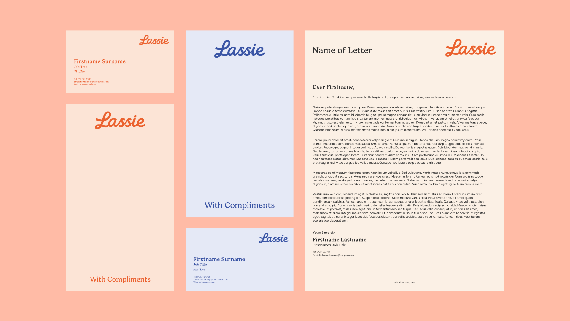
Print Collateral Design
Social Media Templates
-
2026
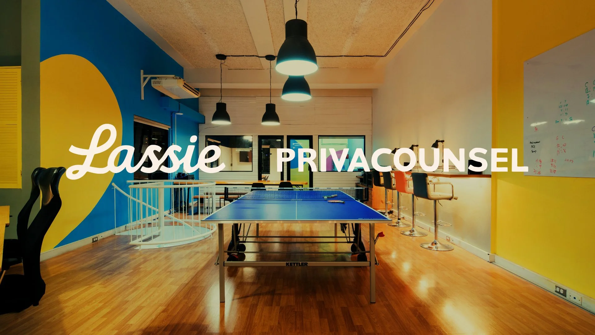
A Dual Brand System Built for Two Audiences
One of the more important parts of this project wasn’t just how it looked - it was how the whole thing was structured. Privacounsel and Lassie sit under the same umbrella, but they’re doing very different jobs for very different people.
Privacounsel is the B2B side. It’s built for organisations - leadership teams, HR, tech companies trying to sort their processes out properly. It needed to feel solid, considered, and credible. The kind of thing you trust to handle something serious.
Lassie is the other side of that coin. It’s for employees, usually at the point where something’s already gone wrong. They’re not browsing, they’re looking for answers. So the brand had to feel calmer, more human, easier to approach.
The two brands have the same values underneath - independence, loyalty, trustworthiness - but completely different context. The tricky bit was making sure they still felt like part of the same thing. Not two random brands stitched together, but not so similar that you couldn’t tell who they were for either.
So everything shares the same foundation - typography, colour thinking, tone - but the emphasis shifts depending on who it’s speaking to - Privacounsel focuses on structure, credibility and authority, whilst Lassie leans into understanding, clarity and reassurance.
The Approach
Rather than chasing trends, we leaned into something more timeless. A vintage-inspired branding direction gave us a foundation of:
Structure
Character
Familiarity
Restraint
Not the loud, startup-y “look at us!” kind of branding. More the quiet confidence of something that’s been around long enough to know what it’s doing. Because when someone’s dealing with workplace issues, the last thing they need is a brand trying to be clever and shouty.
The logo system is built entirely around typography - no gimmicks or confusing logos with hidden meanings.
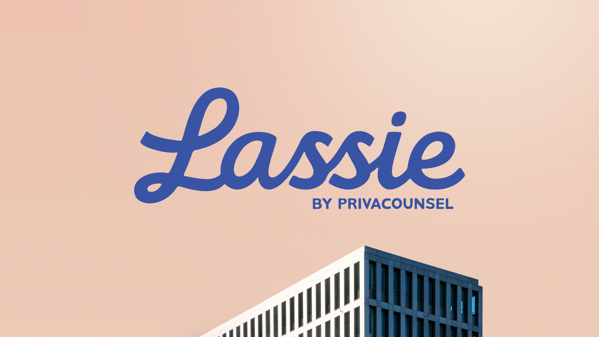
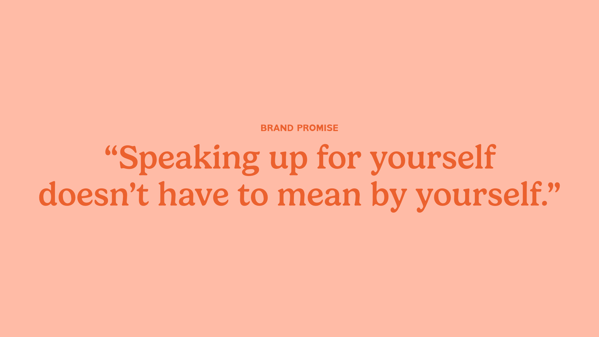
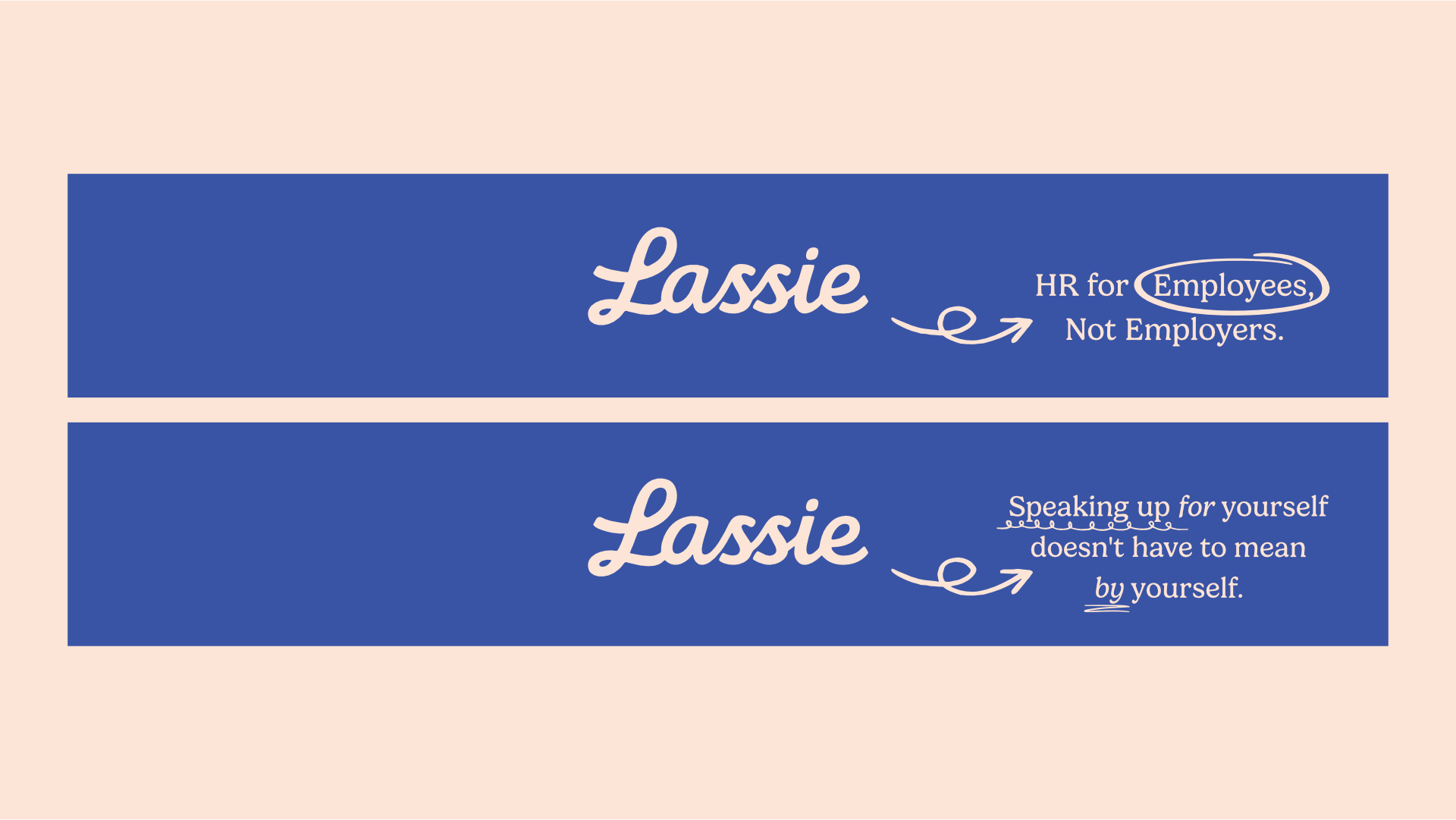
For Lassie, a hand-lettered script wordmark that oozes charm and warmth. With imperfect but structured letterforms, it gives subtle character, whilst the balanced spacing ensures clarity and readability at almost any scale.
Lassie is where most people first experience the brand - at the point where they’re dealing with something difficult, unclear, or overwhelming. So the logo had to meet them there - it needed to feel approachable without being soft, supportive without being patronising, and clear without feeling clinical. This isn’t a product people browse casually - it’s something they turn to when they need proper guidance.
The direction draws on retro script logo design principles - strong letterforms, clear hierarchy, and balanced proportions - but with a slightly more human edge. It’s intentionally less rigid than the parent brand, designed to feel like a steady, supportive presence rather than an authority figure.
If Lassie is the human side of the experience, Privacounsel is the sensible big brother behind it.
This is the B2B arm - working with organisations, helping to shape policy, and operating in more formal, high-stakes environments. The logo needed to reflect that shift immediately.
Here, the approach leans further into a restrained vintage logo design style - more structured, more formal, and more deliberate in its execution, whilst retaining that human character and charm
Typography does the heavy lifting:
Consistent weight and spacing with impact
Subtle imperfection and rounded corners
A sense of balance and authority
The result is a wordmark that feels established, credible, and dependable, whilst standing out - reinforcing the idea that behind the supportive front of Lassie is a serious, considered system.
Colour & Tone
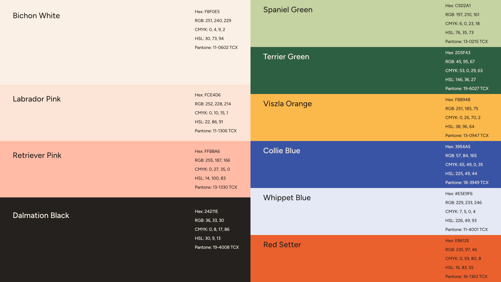
The colour palette is where the subtle Wes Anderson influence really starts to show - not in an obvious or stylised way, but in how carefully everything has been balanced. You’ve got those softer, almost paper-like neutrals like Bichon White and Labrador Pink setting the foundation. They take the edge off the brand straight away, stopping it from drifting into that cold, corporate HR territory.
Then layered over the top are more confident accents - Viszla Orange, Red Setter. They bring just enough contrast and personality without tipping into anything loud or attention-seeking. Collie Blue and Whippet Blue are used exclusively as part of the Lassie brand, whilst Spaniel Green and Terrier Green are used for Privacounsel - ensuring that the two brands are clearly differentiated, whilst having the same underpinning colour theory and structure. And tying it all together is Dalmatian Black, which keeps everything anchored and readable without the harshness of a pure black.
The overall effect is controlled but not rigid. Warm, but not soft. It’s that same Wes Anderson-like balance - where every colour feels like it’s been placed on purpose, not just picked because it looks nice.
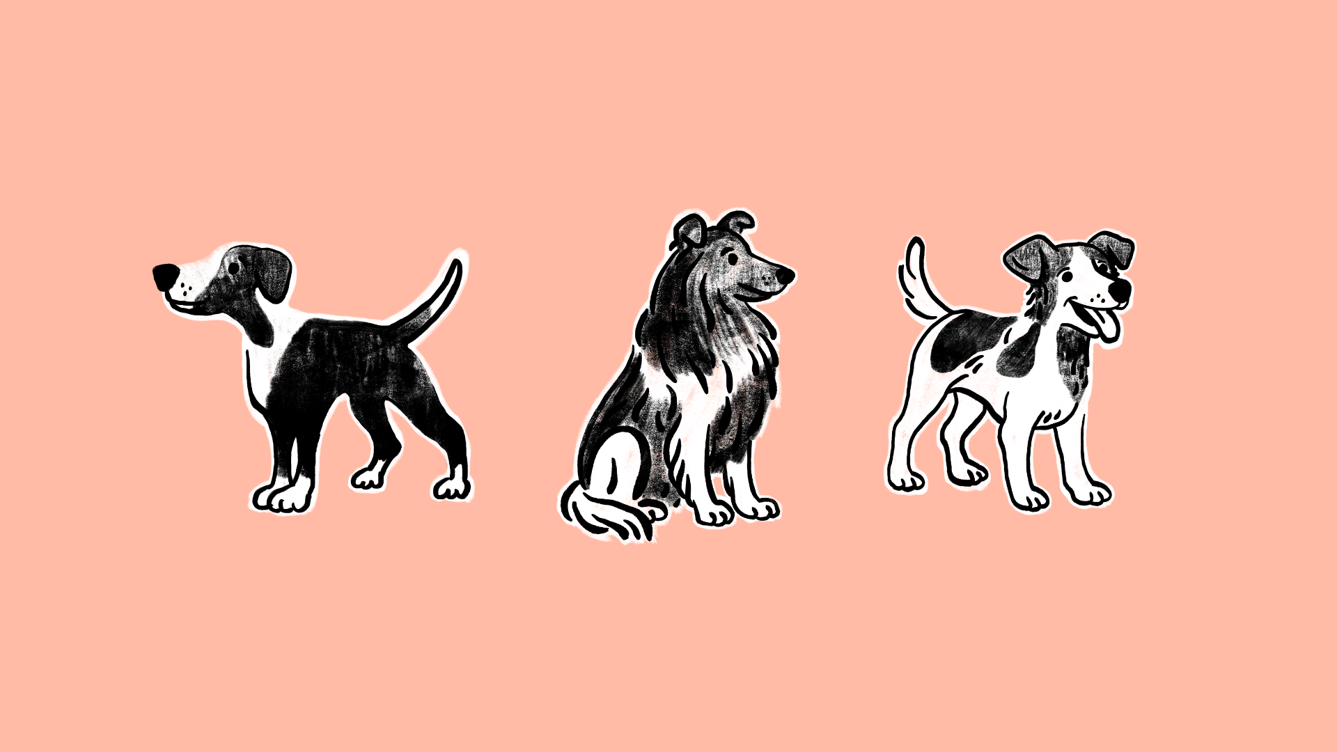
BRand Mascots
One of the key things that stood out from the brief and from our discovery call was how important dogs are as a metaphorical symbol for the brand - loyalty, trustworthiness and we decided to incorporate this in the form of Brand Mascots.
On paper, adding characters into something dealing with workplace misconduct, burnout, and pretty heavy conversations sounds like a terrible idea. It risks making the whole thing feel trivial or gimmicky. But used properly, they do the opposite.
They bring a bit of warmth into a space that’s usually cold, rigid, and frankly a bit intimidating. They help take the edge off without undermining what the brand is actually there to do.
The key was restraint. They’re not the main event, they’re not stuck on everything, and they’re definitely not trying to be too clever. They sit in the background, with subtle texture, hand-drawn lines and imperfections, whilst the happy, loyal faces of a trusty pet dog reinforce the the brand promise of support and loyalty in a way that feels natural rather than forced. It’s a small detail, but it makes the brand feel more human. And in this context, that goes a long way.
Designing for real people
A lot of this project came down to thinking about how people actually behave when they’re stressed, not how we’d like them to behave.
Privacounsel’s audience isn’t casually clicking around. They’re usually overwhelmed, trying to make sense of something complicated, and often second-guessing themselves at the same time.
So the design had to get out of the way.
That meant keeping things structured and predictable. Clear hierarchy, consistent layouts, nothing jumping around or trying to be too clever. The kind of system where you don’t have to think about how to use it — you just can.
There’s also a big consideration around neurodivergent users here. A lot of people coming to the platform need information presented in a way that’s easy to process, not buried in fluff or vague language.
So everything leans towards clarity. Straightforward layouts, logical flow, and just enough breathing room so it doesn’t feel overwhelming.
No surprises. No friction. No unnecessary noise.
Just information, presented properly, when people actually need it.
Wrapping Up
In the end, this project wasn’t about making something look “nice” - it was about making something work properly in a space where most brands either overcomplicate things or strip them back until they’re forgettable.
By leaning into a more considered, characterful, vintage-inspired approach, and balancing that with a clear structure across two distinct audiences, the result is a brand that feels steady, human, and genuinely useful. Privacounsel brings the authority and backbone (with a touch of character) for its B2B audience. Lassie brings the accessibility, loyalty, trustworthiness and support.
Together, they do what they’re supposed to do - help people think clearly in situations where that’s usually the hardest part.
Want to transform your brand too?
Please fill out the form below with some brief details about your brand, project, timeline, and budget.
I aim to respond to all enquiries within 24 hours.
Takes approx. 1 minute