Northern Mushroom Club branding, packaging & website design
Northern Mushroom Club grow gourmet mushrooms in a 300-year-old barn just outside Thirsk in North Yorkshire. Carly and Ellie supply restaurants across the north, including Michelin-star Restaurants, run stalls at weekend farmers' markets and sell grow-at-home kits for anyone who fancies having a go themselves.
They both came out of the brewing industry, so they know how a small brand gets bigger. That's partly why they got in touch after their first year with a problem a lot of food producers will recognise. The business was working and the brand wasn't keeping up. They were trading as Wild Spore Co at the time, and what started as a grow kit packaging job turned into food branding in the full sense: a new name, a new identity, packaging and a brand new website.
The brief was to look a lot more complete, eye-catching and bold, without losing the personal side of the brand their customers liked.
You had to be stood at the stall to get it
Year one was done the quick, cheap way, which is what year one should look like. Ellie's sister drew the original logo. The dried range went into pouches that were hand stamped, and the labels were printed onto sticker sheets and cut out with a craft knife. A back-of-pack sticker told their story, but only to someone who picked the pack up and turned it over.
The grow kits were a plain cardboard box with stickers on. Nobody was going to pick one up walking past because they had no idea what it was. Carly said that until you were very close to the stall you couldn't really tell what they sold, and people regularly asked if they'd actually grown the mushrooms themselves. Or if they were real. At one point they had a sign up answering both.
So the story only landed when one of them was there to tell it, and with both of them doing three or four markets every weekend, separately, that was the ceiling. The brand wasn't selling anything on its own.
But customers loved them and said so, and Carly didn't want anything supermarket ready. The job was to get the brand doing the talking while keeping it a bit rough round the edges.
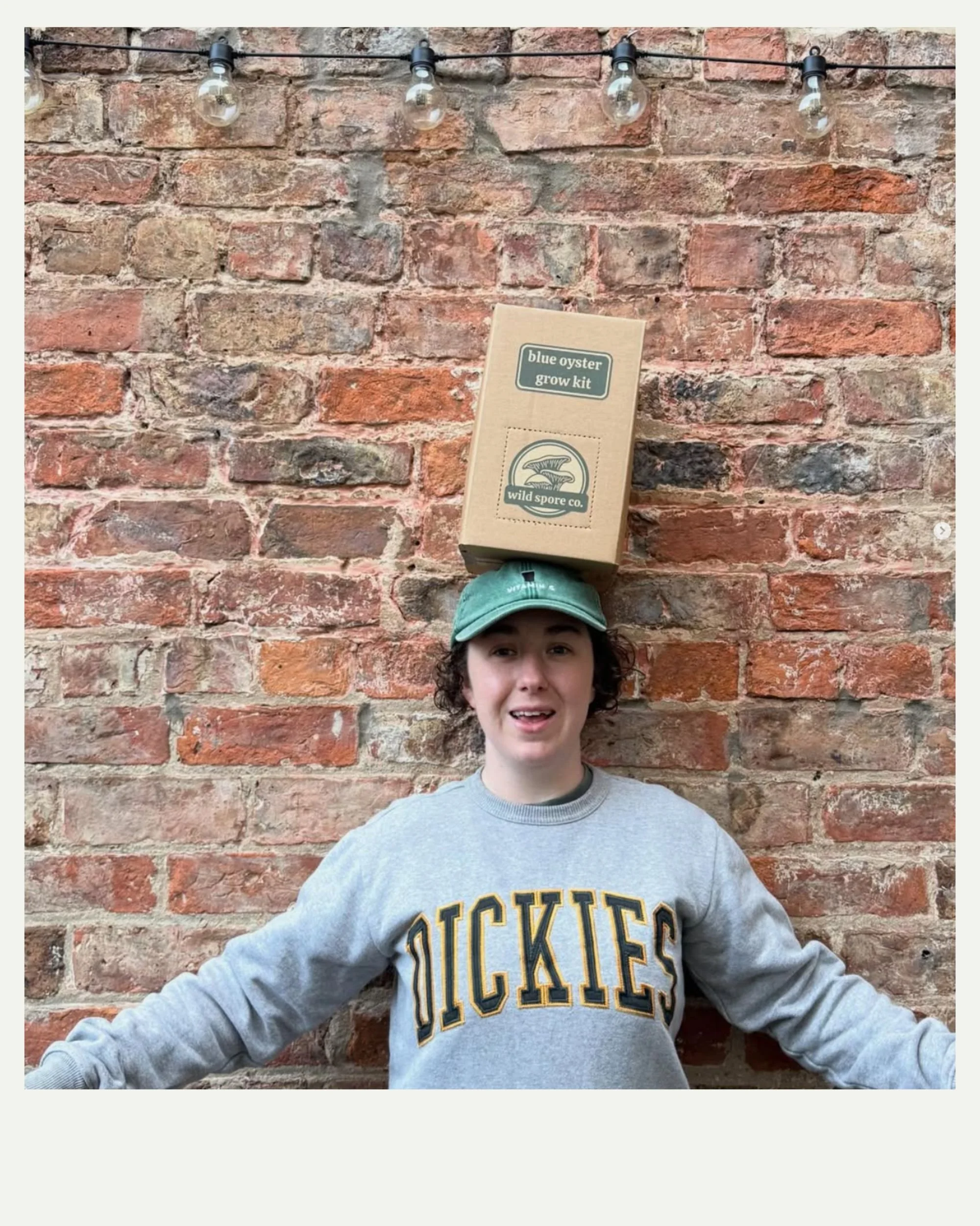
Wild Spore Had to go.
With every shaker package project, we run an in-depth Brand Strategy Workshop with the client. A week or so before the strategy workshop we’d discussed the name. Then it came up in the workshop and the case against it piled up fast.
Their mushrooms aren't wild, they're grown indoors in a barn. "Spore" makes plenty of people think of mould. Restaurants write "Wild Spore mushrooms" on their menus, which reads like a variety rather than a farm. And if they ever grow something other than mushrooms, the name has nowhere to go. The equity was in Carly and Ellie, not the word, and changing it was only going to get harder.
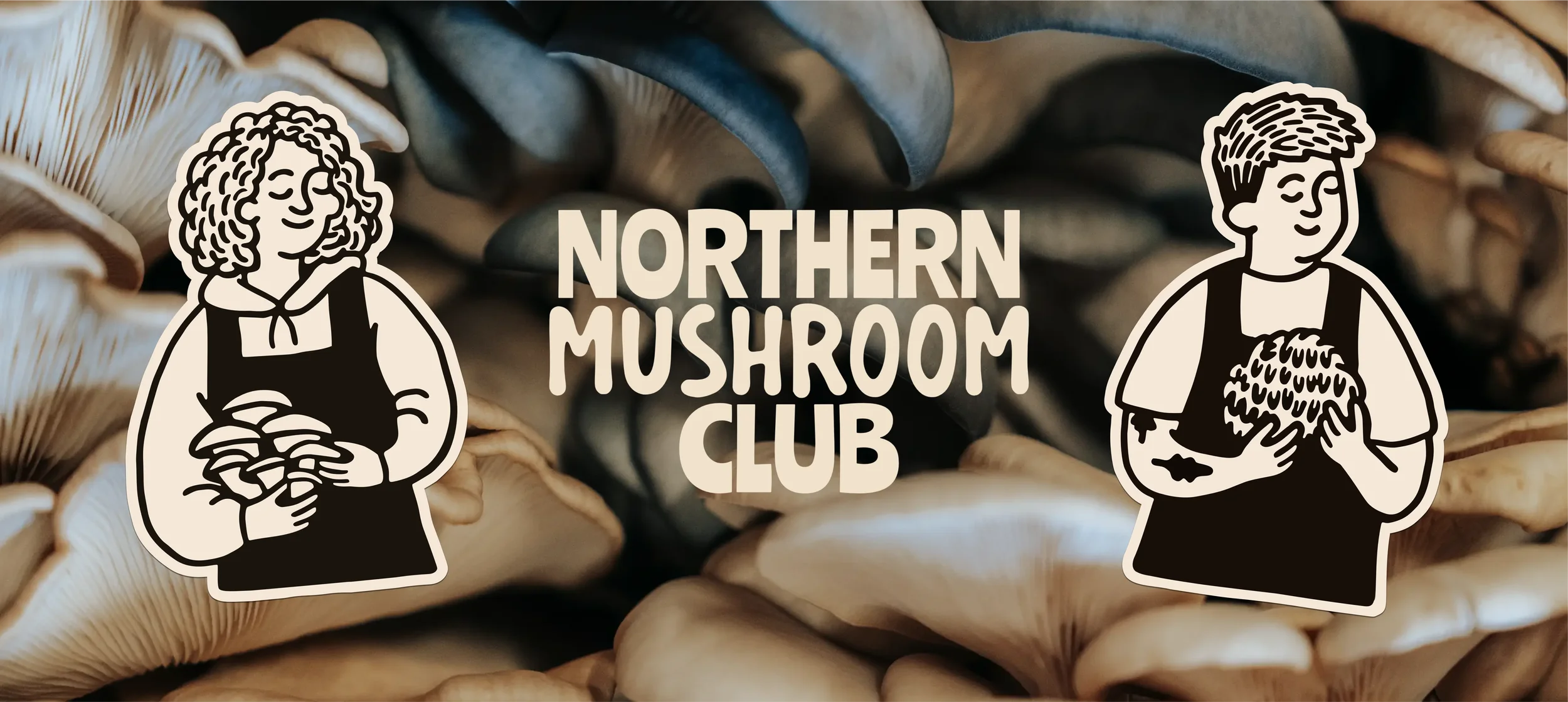
So we ran a naming workshop. Shroom was out straight away (too many people think of drugs). Anything with Mycology in the name was out the door. Northern Mushroom Club stuck because of what came out of the workshop about their customers. They want to feel part of something, and they like being seen to back a local grower. Enter Northern Mushroom Club.
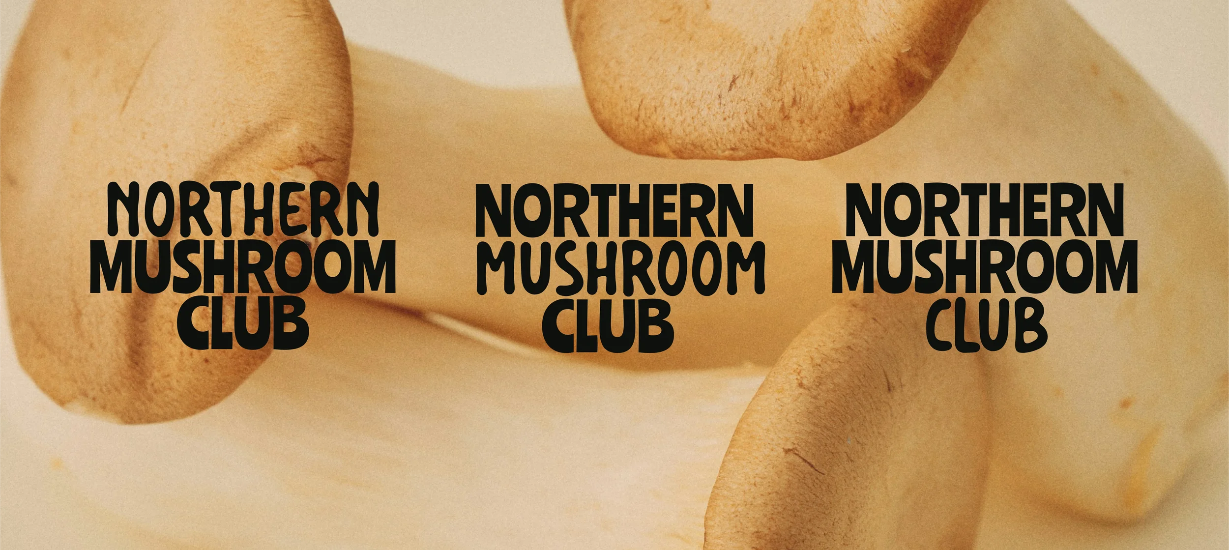
ONE NAME, THREE LOGOS.
Northern Mushroom Club is three words, and depending on where the logo's sitting you don't always want the same one doing the shouting.
So the wordmark comes in three versions. Each uses the same pairing of typefaces, but swaps which word gets the big treatment. Northern leads in one, Mushroom in another and Club in the third.
Club up front leans into the membership idea, which suits social media, customer retention marketing and the market stall. Northern is the one for restaurant menus and anywhere provenance matters. Mushroom does the plainest job of the lot, telling a stranger what's actually on the table. Same name, same type, but Carly and Ellie can pick the version that fits the moment.
REGULARS GOT A SAY too.
Before anything was signed off, Carly and Ellie took the work to the people who'd actually be buying it. Friends, family, regulars from the markets. I always push for this. Some designers get twitchy about clients showing work around early, but otherwise you're designing in a vacuum.
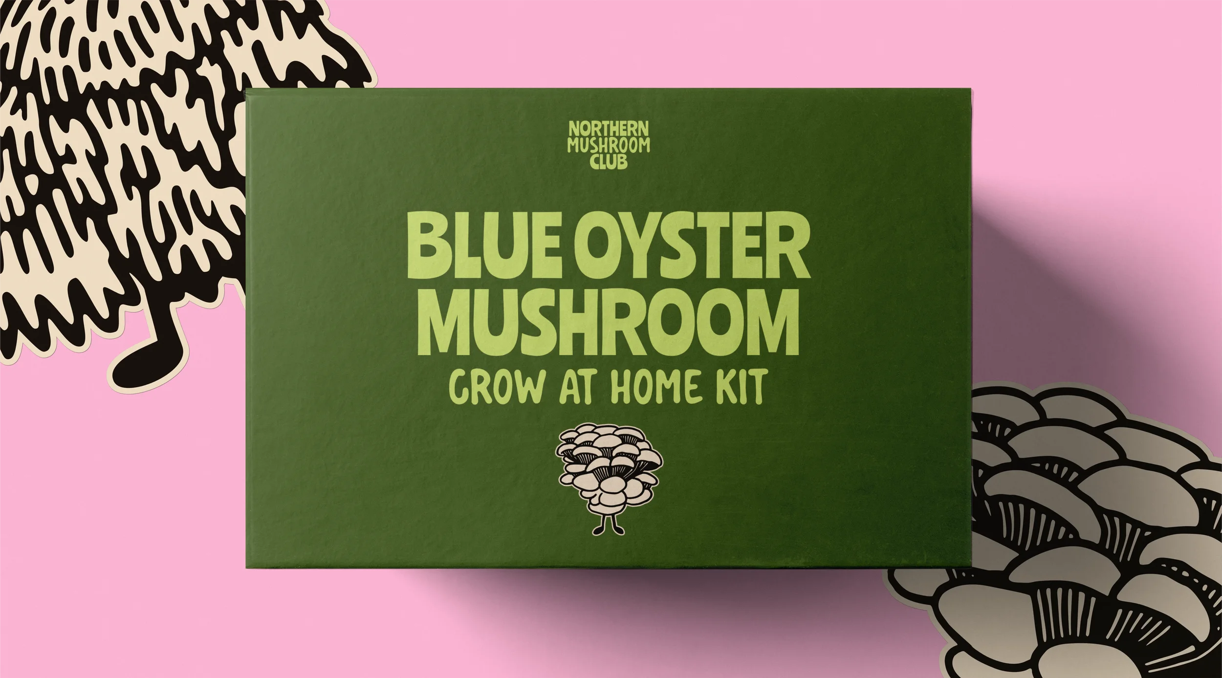
It paid off. The feedback was clear that the biggest thing missing from the stall was colour, something that grabs you from across a market. So the identity leans right into it, with bright colour, wavy characterful type and mushroom characters that have a bit of personality.
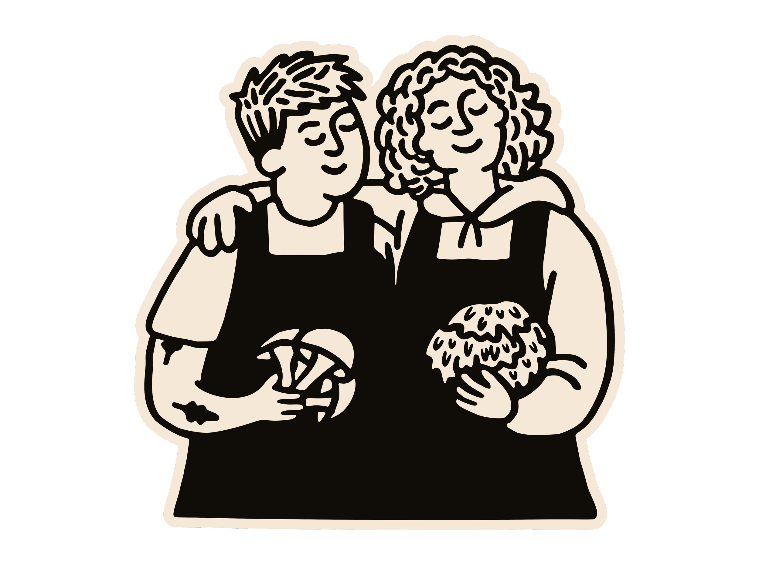
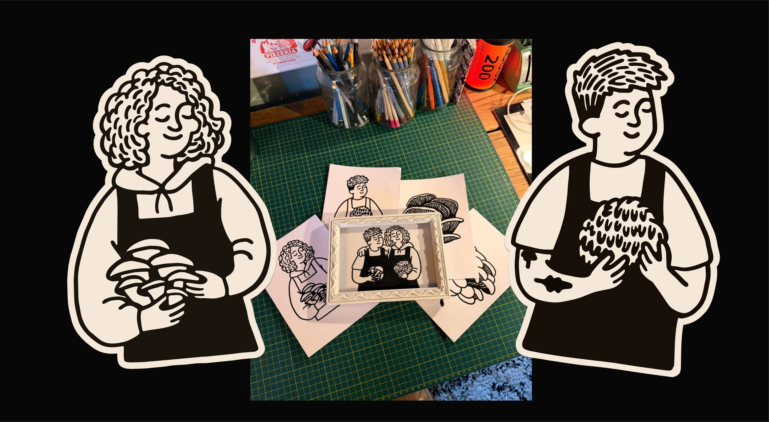
Everyone picked out the illustration of Carly and Ellie, so that became a centrepiece. If they take on staff later, the two people the business is built around are still on every box.
And one comment ended up shaping the whole colour system. Grow kits get bought as Christmas presents, a lot of them for parents and grandparents, so the packaging has to feel like a good gift to someone in their seventies as much as someone in their twenties. I'd much rather find that out in September than at a market stall in December.
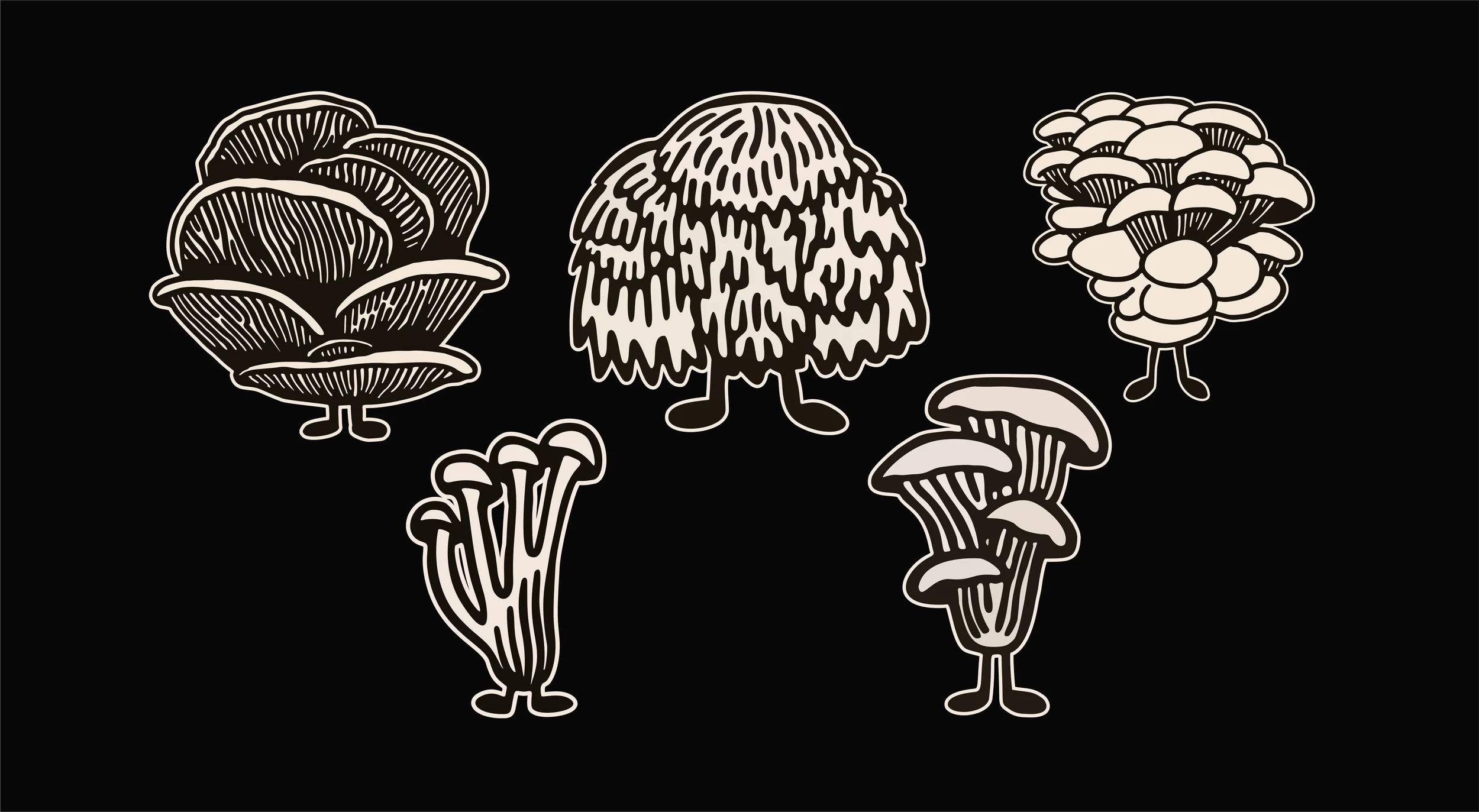
MUSHROOMS WITH FEET.
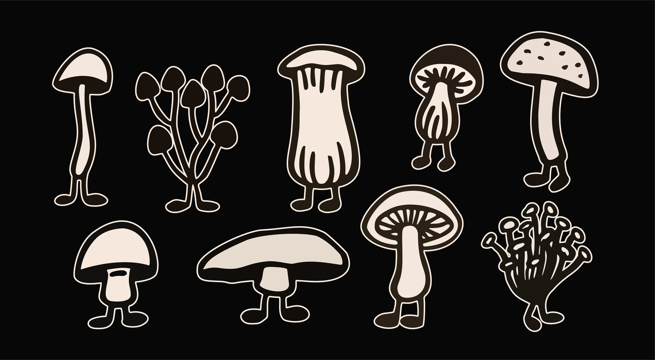
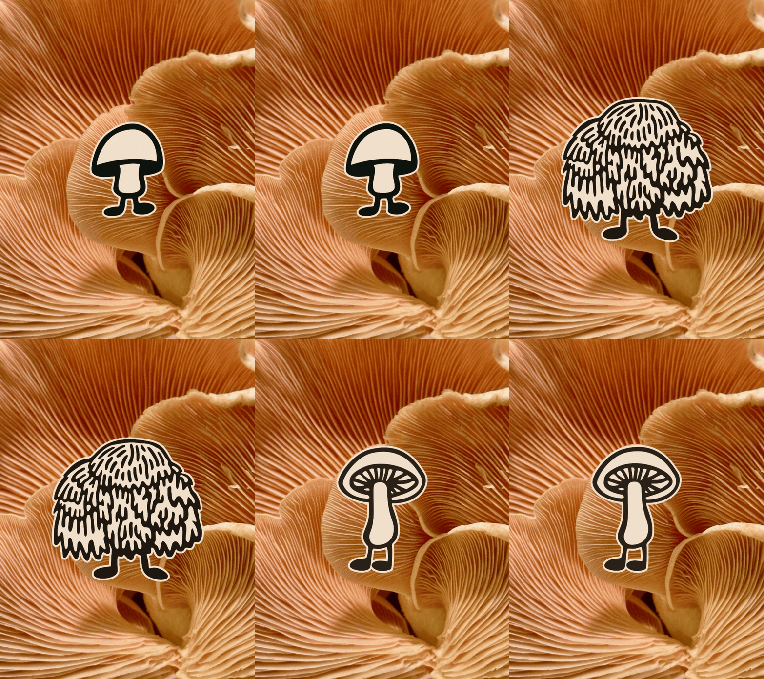
To bring life to the brand without these illustrations being used all the time, I illustrated a range of mushroom characters to visually communicate the range and diversity of fresh mushrooms outside of the ones you see all the time in supermarkets.
Every mushroom illustration was drawn by hand with Posca markers, on paper, and the characters have little legs. The feet got more comments than anything else, which I'm taking as a compliment. Illustration made more sense than photography here anyway. No two mushrooms come out the same, and drawing them celebrates that rather than hiding it.
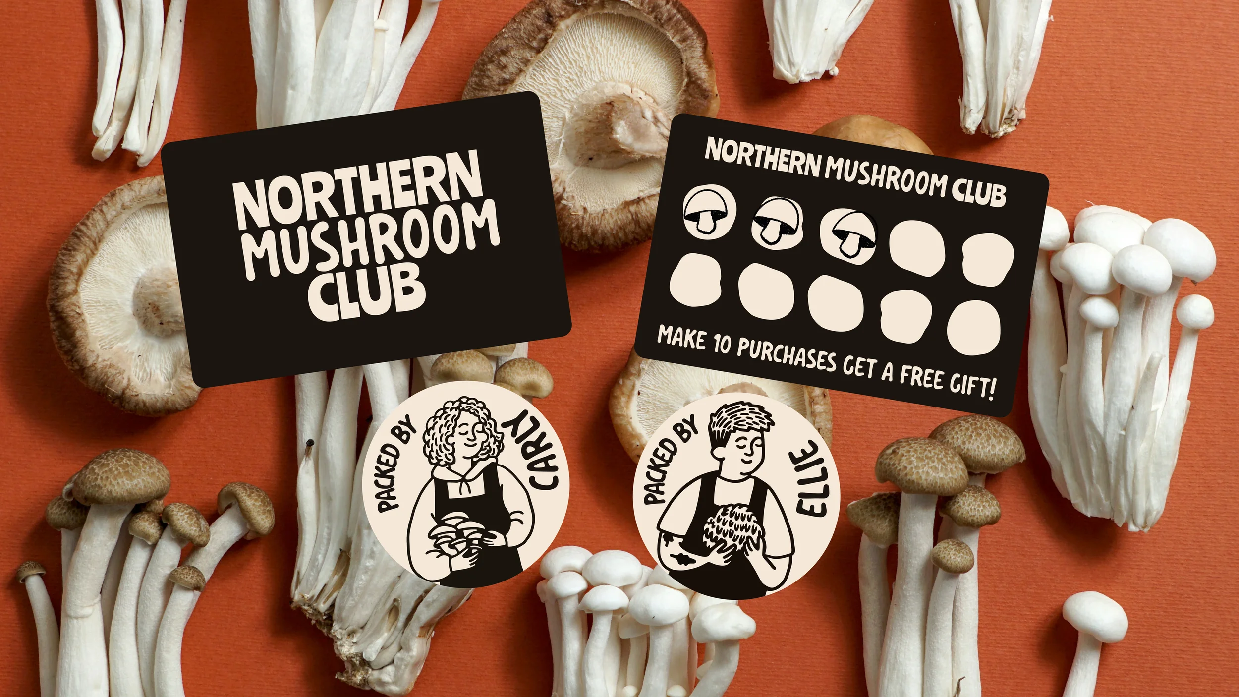
I redrew the illustration of Carly and Ellie in the same bold Posca line so it sat with the mushrooms. It goes on the grow kits and the website, and there's a "Packed by" sticker for the dried range in a hand-drawn accent font, so it still feels like a person packed it once there's a team doing it.

Food producer branding that works from across a market
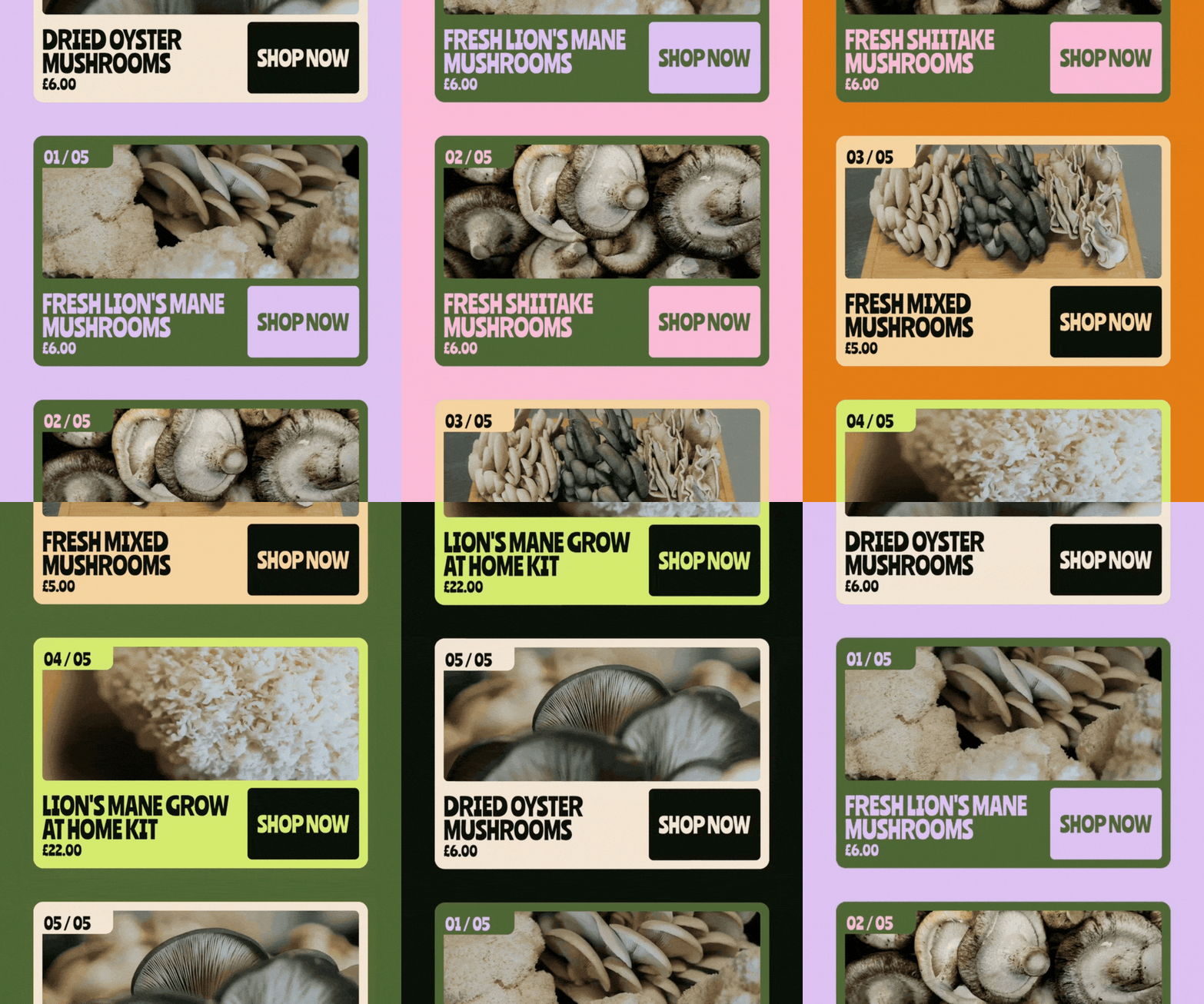
The type and colour system is the bit I'm most pleased with because it does a job on the stall. Anything that is mushrooms, fresh or dried, is green. Anything that isn't - grow kits, tins of mushroom salt, is orange and cream. A customer can read the table from a few metres away.
The dark forest green and the orange were already theirs, so keeping them means regulars still recognise them in the middle of a name change. Lime green, purple and pink bring the colour Carly and Ellie were after. And as their range grows, the type and colour system is versatile enough to expand without confusing customers.
A lot of organic food branding goes earthy and beige for this kind of customer, the sort who already has a veg box on the doorstep. Their stall was already all brown craft paper and they wanted out of it.
A GROW KIT BOX THAT DOES MORE THAN JUST STAND OUT
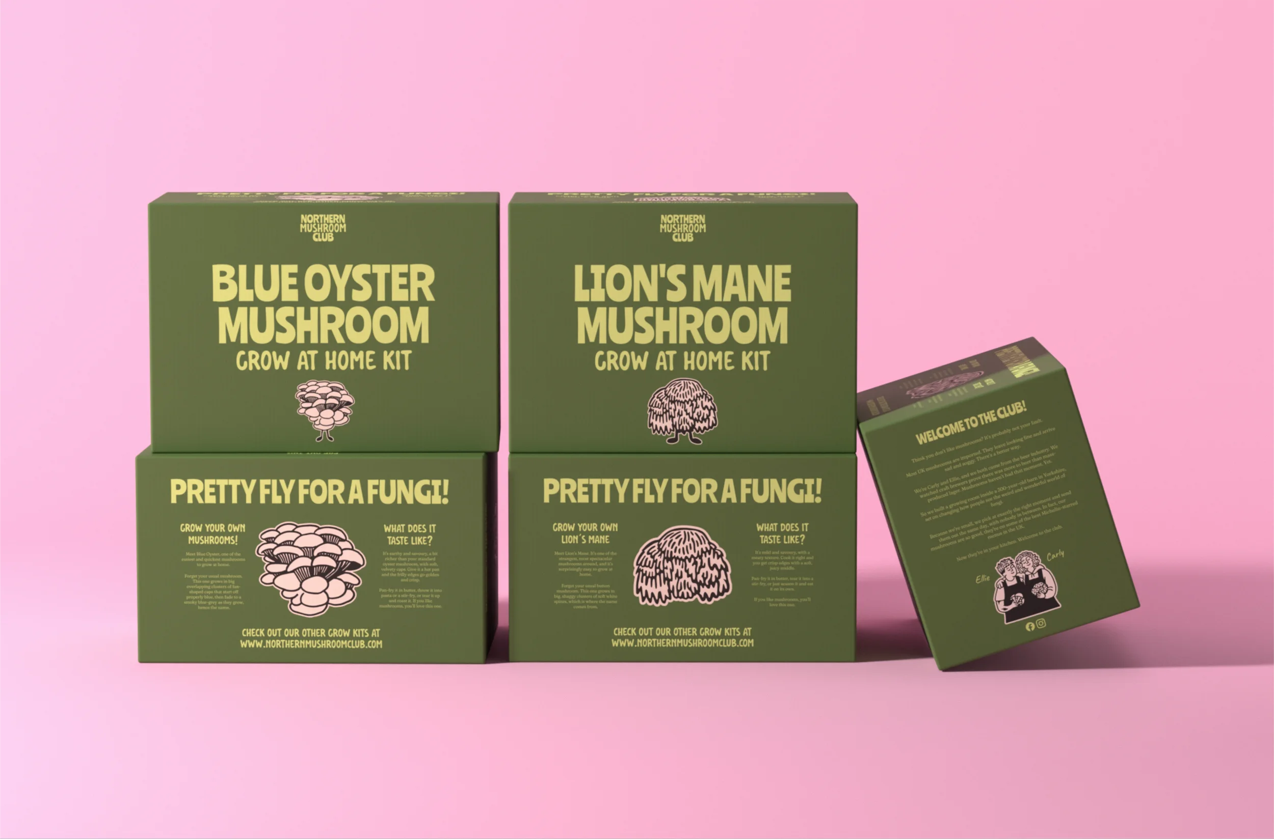
The grow kits were the reason the project started, after a year of hand-printing boxes and cutting them out to keep up.
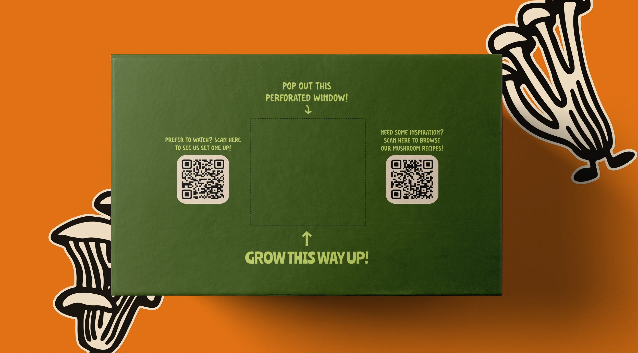
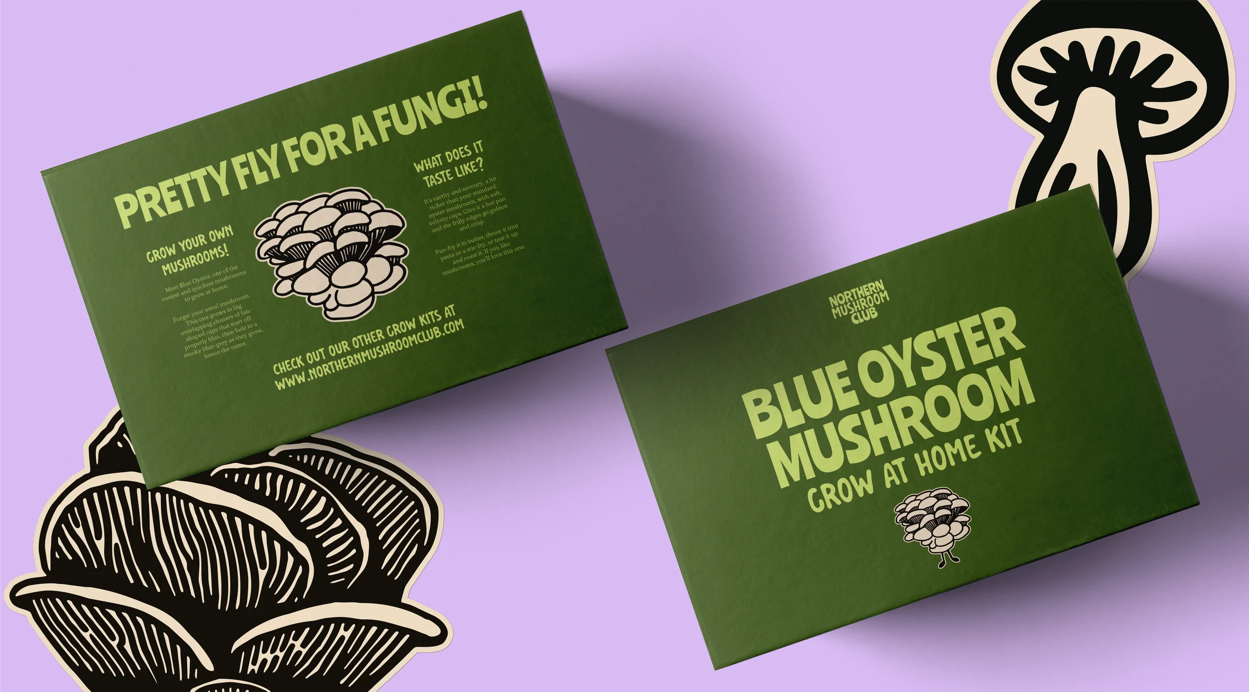
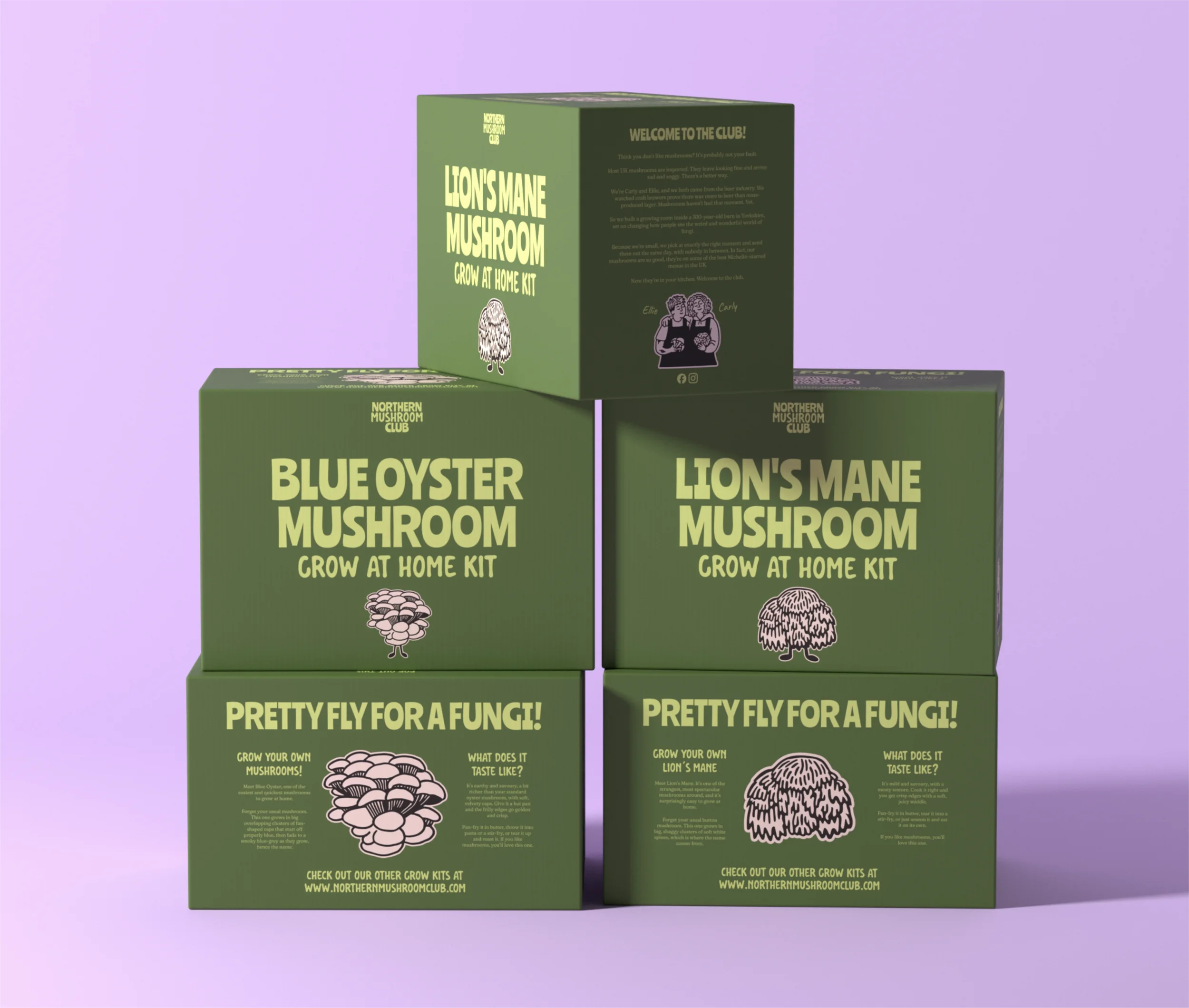
The new box is full-colour printed and pre-perforated, with the mushrooms growing out of the side. The instructions sit on a panel on the side, saving Carly & Ellie money on printing inserts and meaning one less thing to pack. It has to sell itself on a stall with nobody talking, and work as a gift for someone who's never grown anything.
The box features their story, helping them to grow their loyal customer base, along with QR codes to an instructional video on how to set up a grow kit and a recipes section on their website so customers can easily find a recipe for the new, fresh mushrooms.
BUILDING OUT THE BRAND WORLD.
For any Food & Drink Brand in the modern age, it’s not enough to have cool packaging and a great brand identity. You have to build out the brand world.
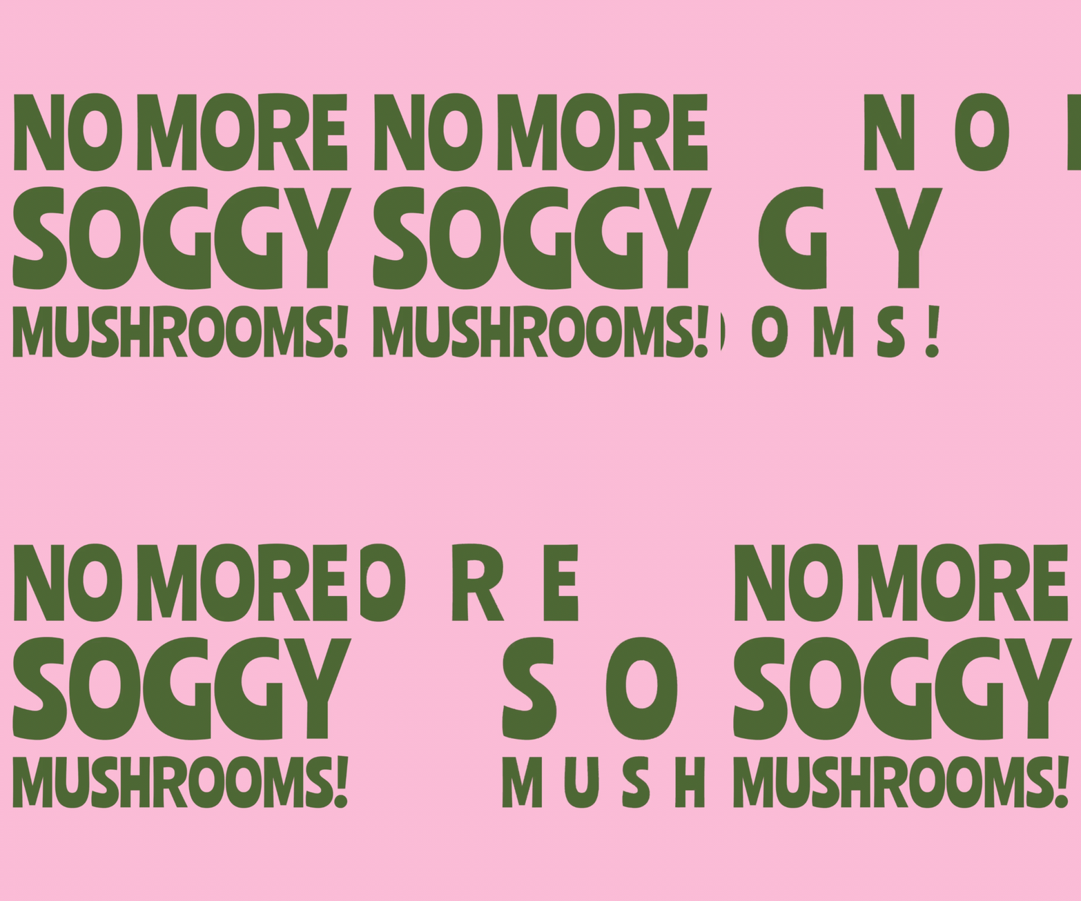
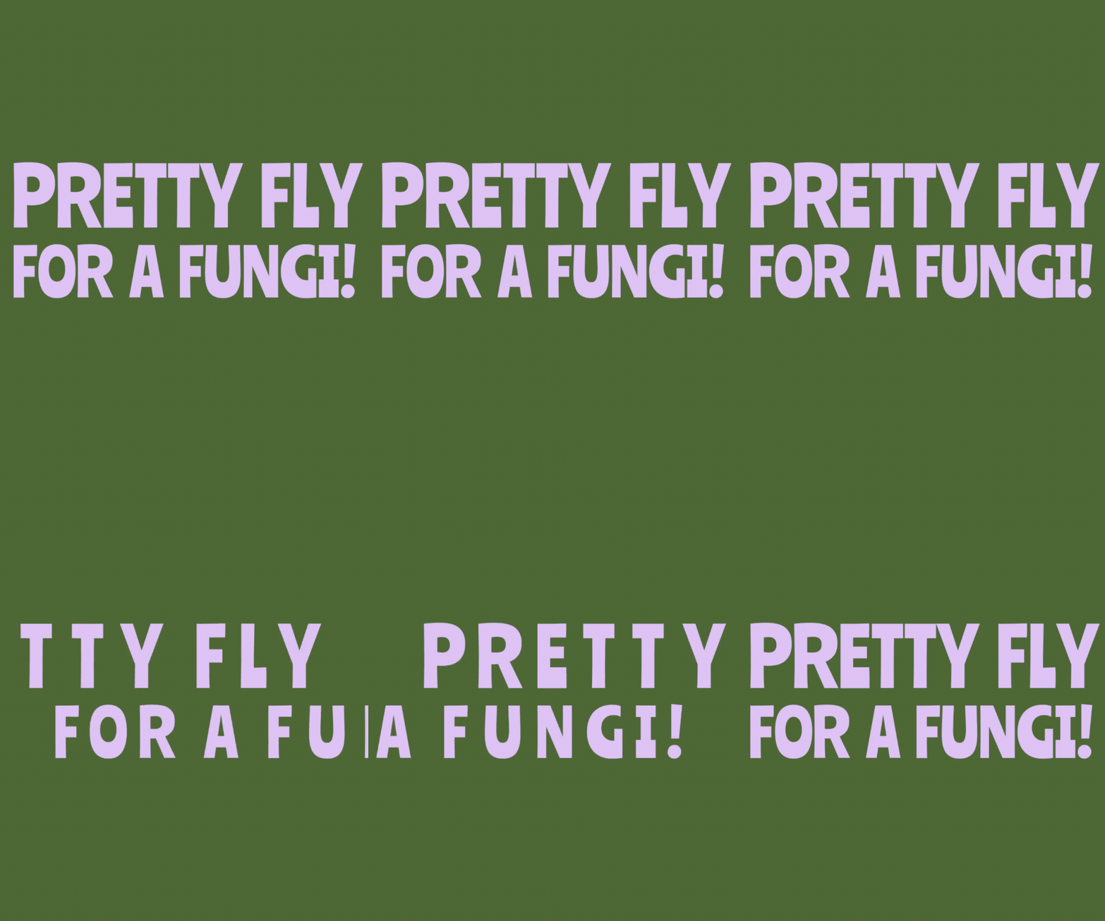
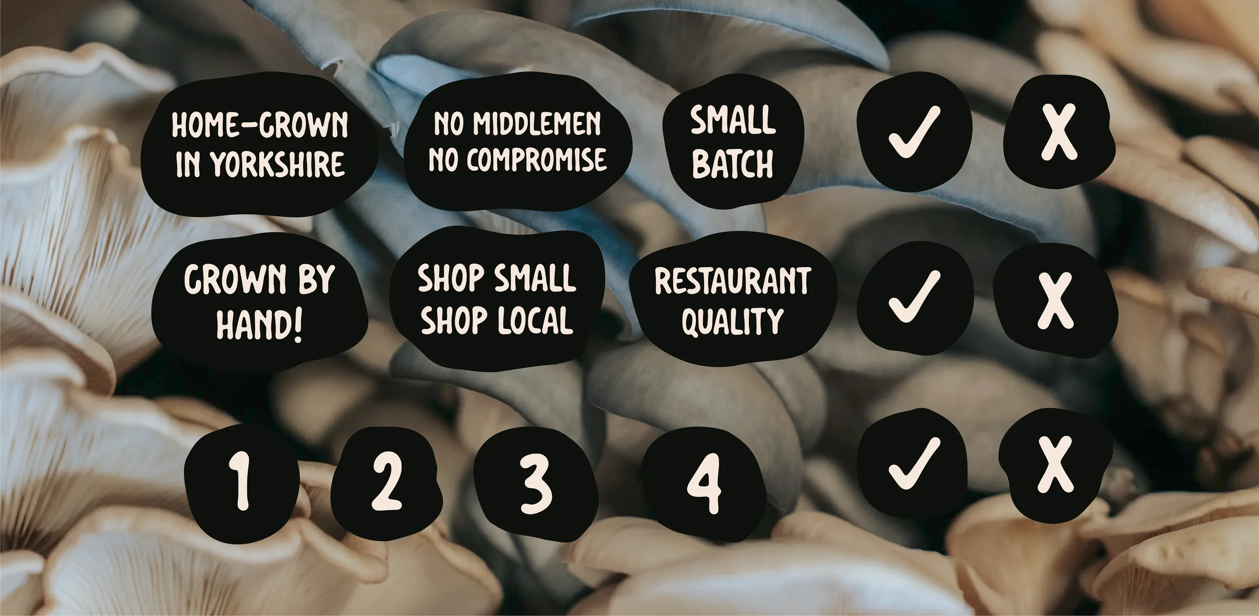
That means taglines we identified in the brand strategy workshop incorporated into lockups and gifs that can be used in content. They’re one-line metaphors for the brand’s mission, and a reminder that people can do better than soggy supermarket mushrooms. I also designed some custom icons and USP stickers, meaning the brand can remain cohesive at even the smallest scale.
Around it sit a stamp loyalty card, gift cards, Canva social templates and full brand guidelines, giving Carly & Ellie a versatile and robust brand identity with which to grow.
GROWING ONLINE
The last piece was the website. They'd put the old one together themselves on Wix, and with the range growing I moved them over to Squarespace. It handles a small shop well and gives them proper room for the pages that aren't products. It also came last on purpose. The new site needed new product photography, and that needed the finished packaging.
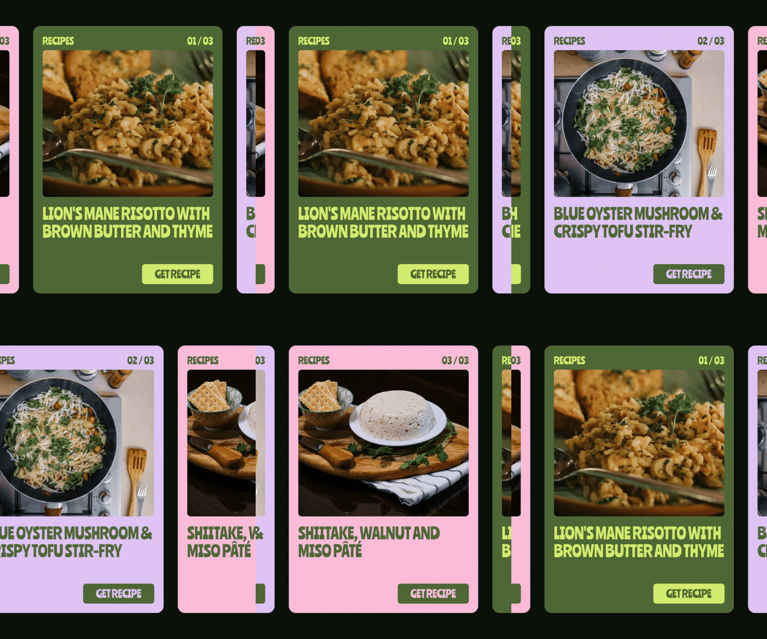
The recipe section was my suggestion. The question they got most at markets was some version of what do I actually do with these, and a recipes page answers it on the days they're not stood there to. I built it as a template, so Carly and Ellie can add a new recipe in a few minutes without having to film a video for every one.
Its main job is selling, grow kits especially, so the shop and the gift cards sit front and centre. Around that it works as a hub for the things people kept asking about at the stall, like market dates and the wholesale info restaurants need. The illustrations carry straight through, so the site feels like the stall. There's a newsletter sign-up in the footer too, because a regular at a market in York should be able to find them again on a Tuesday.