
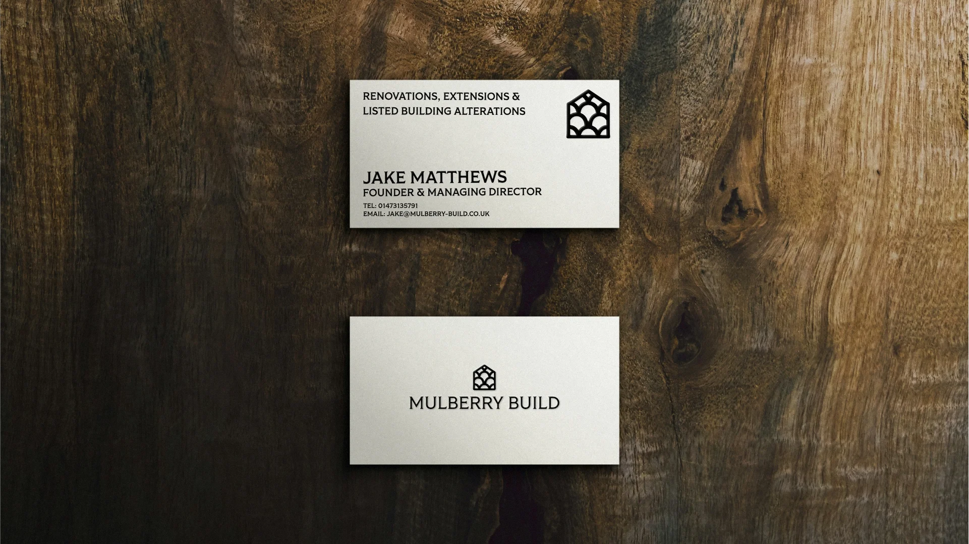
Jake Matthews has been working in rural property for over a decade. Mulberry Build specialises in renovations, extensions and alterations to Grade II listed buildings across Suffolk and the surrounding counties - the kind of work that demands as much patience and knowledge as it does skill. The properties they work on have history and the materials they use reflect that.
Jake came to WDCO wanting a brand that could hold its own with a discerning rural clientele -landowners, estate managers, heritage property owners - while still feeling warm and characterful rather than corporate. The brief was clear: no hard hats and hi-vis clichés, nothing that looked like every other builder's van in the county. Something that felt rooted in the landscape and the craft.
The Approach
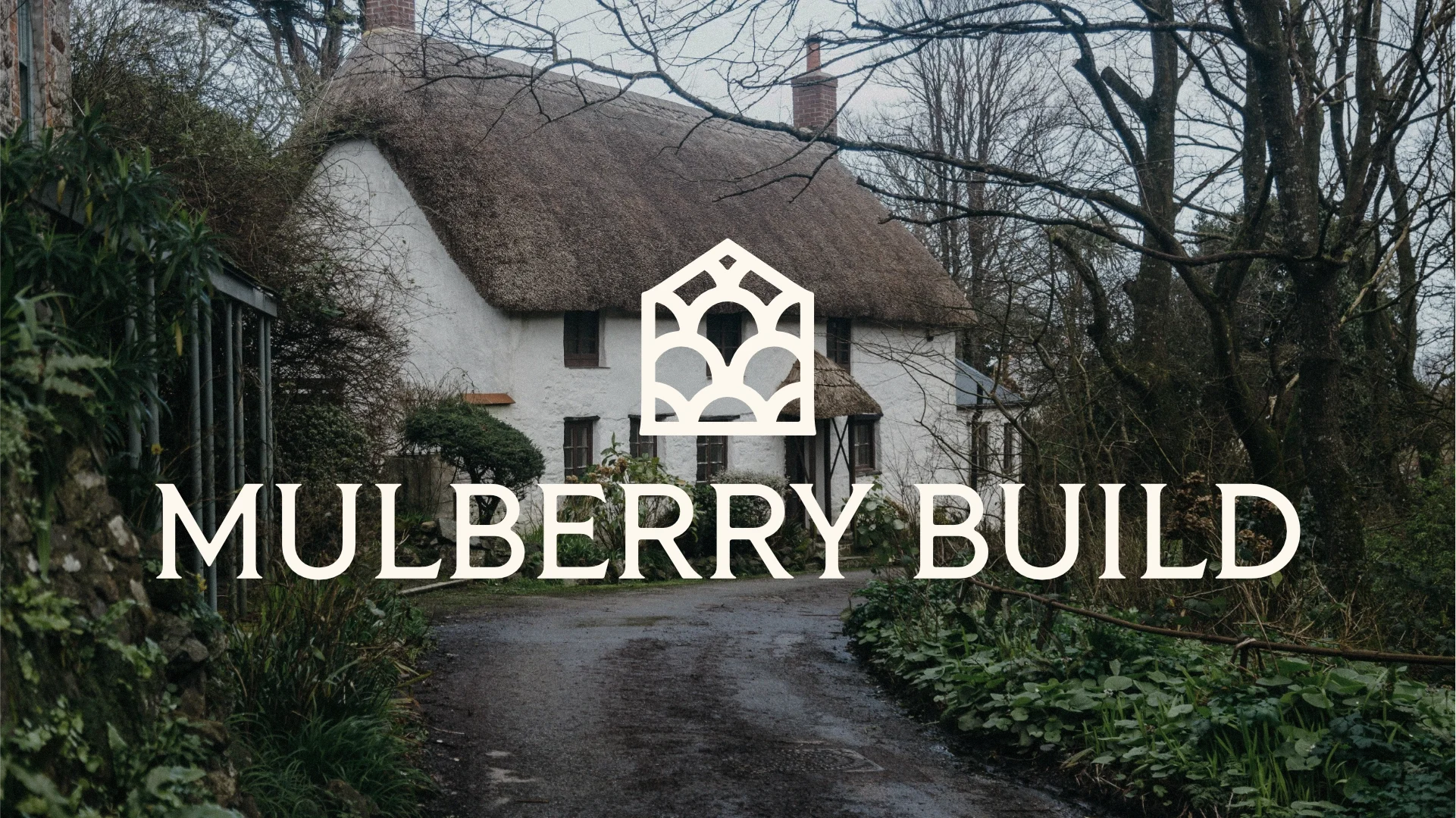
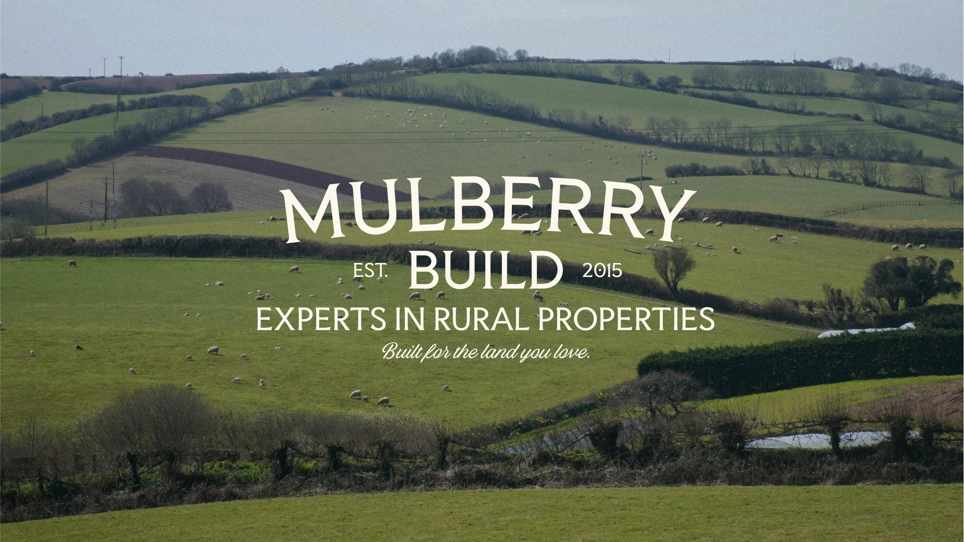
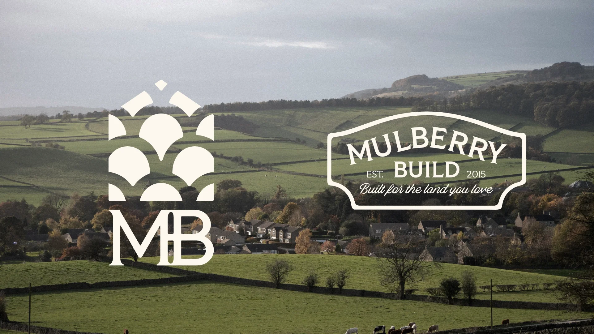
The starting point was the name. Mulberry - a tree with deep roots in the English countryside, slow-growing, long-lived, found in the grounds of manor houses and farmsteads for centuries. It gave us both a visual direction and a tone of voice to build from.
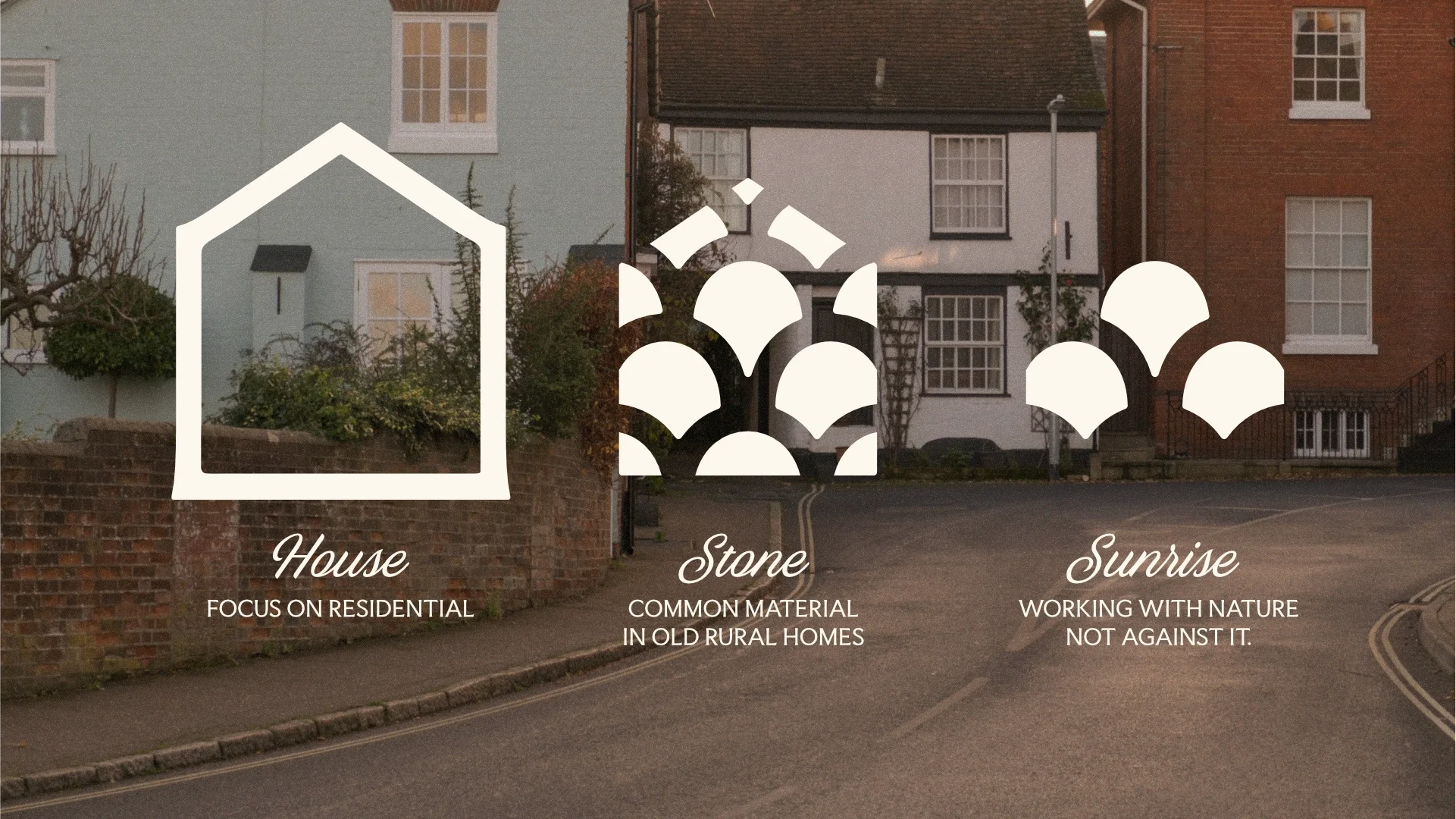
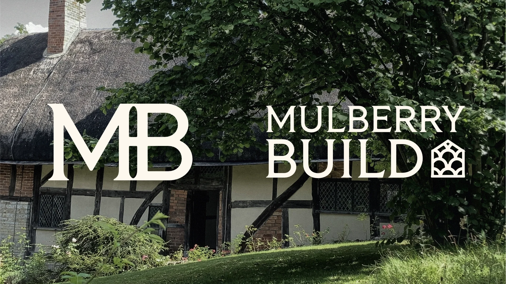
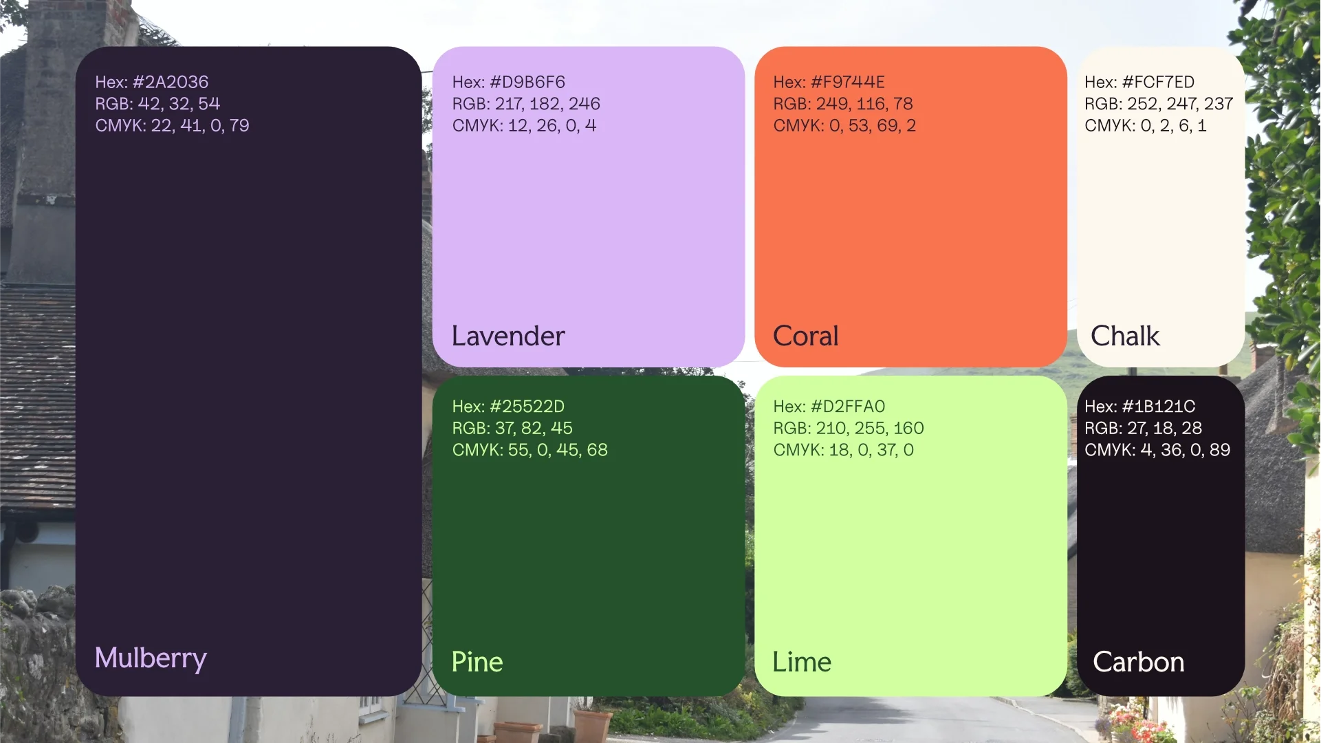
The colour palette was drawn directly from the natural and built environment Mulberry work within. A deep Mulberry purple anchors the identity, offset by Chalk, Carbon and Pine - materials and tones that feel genuinely at home in a Suffolk landscape. Lavender, Coral and Lime add vibrance, warmth and flexibility for supporting applications without pulling the brand into anything too polished or sanitised.
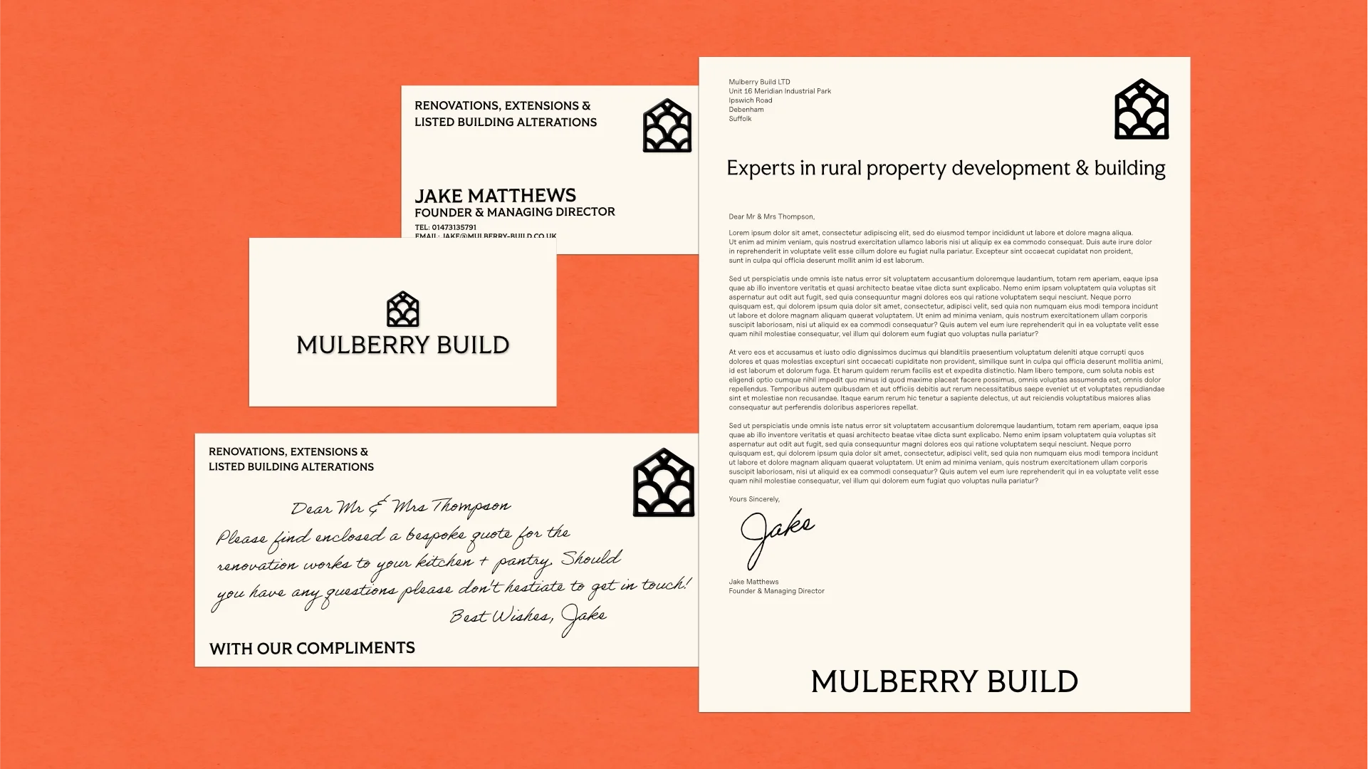
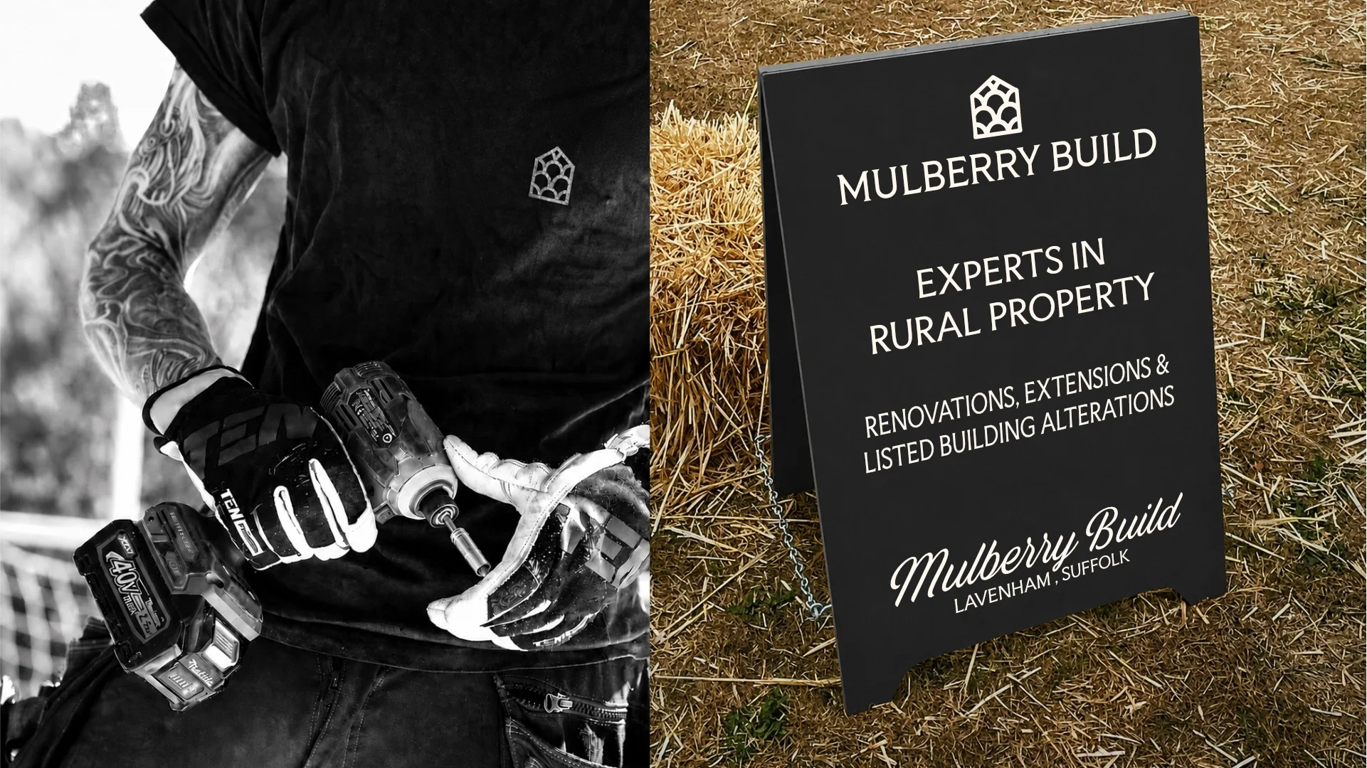
Typography was kept strong and legible - headline fonts with enough presence to carry the brand at scale, paired with clean supporting type that doesn't get in the way of the photography.
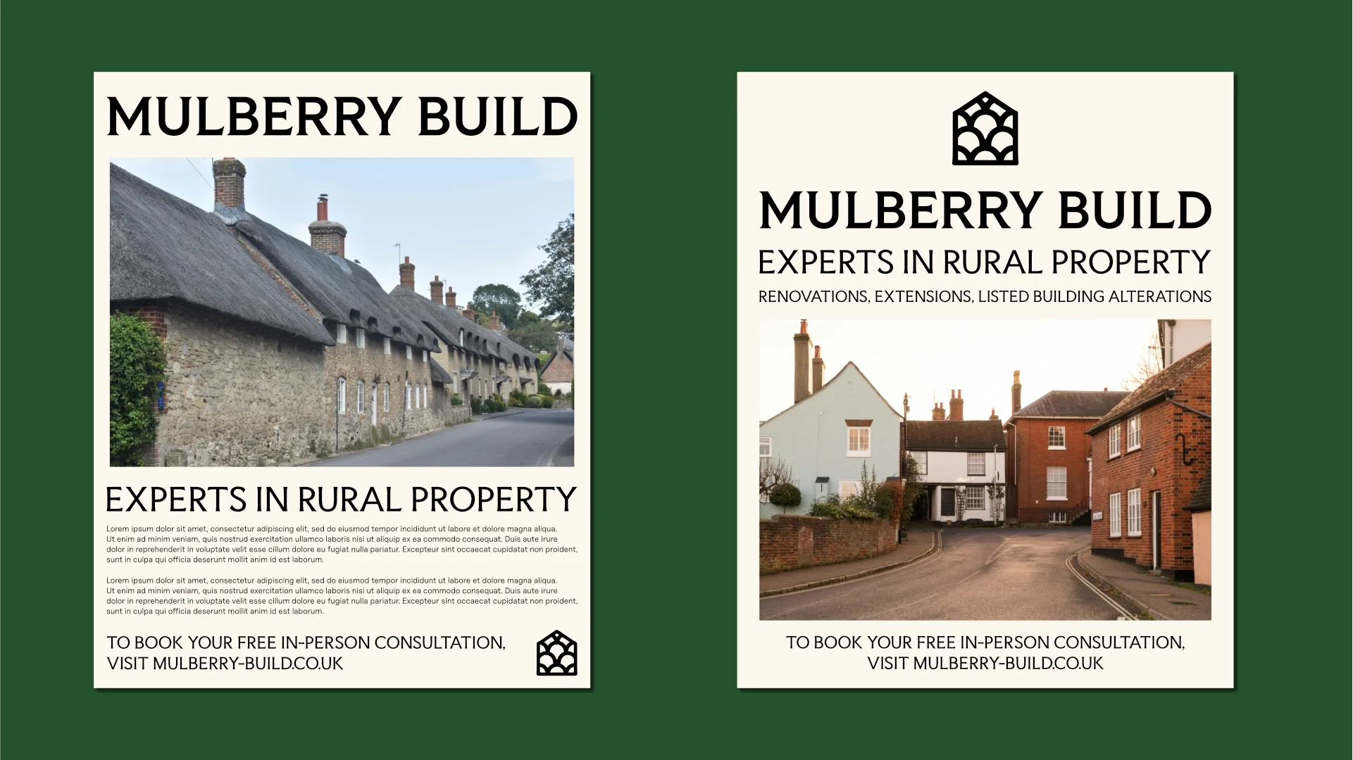
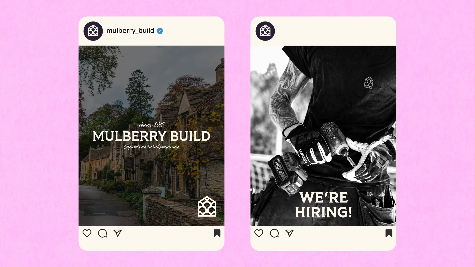
The photography direction was built around the properties themselves. Warm-graded, slightly textured, shot to emphasise the character of old brick, stone and render rather than the sheen of a newly finished modern extension.
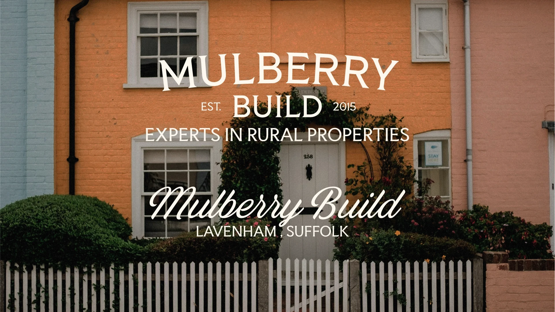
A note on this project
This one didn't make it to market. The project went in a different direction before launch - as sometimes happens - but the work is some of the strongest to come out of the studio and deserved to see the light of day. The logomark is a good one, the wider identity has character, recognisability and charm, and I'm proud of where it landed.
If your business works within the heritage space, with natural materials or clients that are making a big investment and you're after a brand that reflects that honestly - this is the kind of work I'm here to do.