
Living & Lodge
Travis Smith Design had been running for two and a half years, providing expert interior design services across DC, Maryland and Virginia. The name had done its job while the business was just Travis and a client list. It stopped doing the job once there were two distinct sides to the business - the interior design side, and a new service offering cabin design concepts for second-home owners.
Living & Lodge was built to fix that. A brand that could hold interiors and cabins under one roof, move the brand away from being tied to a single person, and give Travis something to grow into rather than out of. It also gave the visuals somewhere to go that "Travis Smith Design" never could, vintage rustic Americana, cosy cabins, the whole rustic-retreat world he'd been collecting references for long before he had a name for it.
Travis Smith Design looked like most interior design sites look. White backgrounds, neutral tones, safe. It photographed the work well, but it didn't say anything about who Travis actually was or what kind of client he wanted to work with.
That was the real issue underneath it. Because the brand wasn't just generic, it was indiscriminate. Travis had been taking any paying client that came along, which meant a portfolio full of jobs that didn't sit together, some of which weren't even the kind of work he wanted to be known for going forward.
He needed a brand that could say no as easily as it said yes. Something with enough personality to do the filtering for him, so the next enquiry that landed in his inbox already knew roughly what it was getting. He also needed a brand identity that spoke to the two very different parts of his business - the interior design side, and the range of cabin concept designs he sells.
There was also a practical problem. Travis Smith Design was tied to him personally, which made it awkward for a business now stretching across two distinct markets, interior work in the DC area and cabin design further afield. He needed a name that could hold both without either one feeling secondary.
THE PROBLEM WITH THE OLD BRAND

FINDING THE RIGHT DIRECTION
The references Travis brought to the table did most of the early work for me. Farrow & Ball colours. Rustic Americana. An English roll-arm sofa he loves so much he has it tattooed on his arm, and which was already sitting in his old logo. Deep, nature-drawn tones, hunter green, navy, mustard, plum. Autumn over spring, every time.
He wanted the brand to feel bespoke and curated rather than luxury. That word specifically was off the table, too snooty, too much of a wall between him and the client. What he wanted instead was accessible premium, warm rather than aspirational, honest rather than polished, a brand full of nostalgia, character and soul.
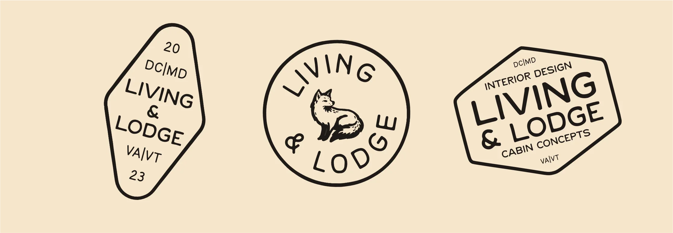
A fox became the mascot early on, and it earns its place. Clever, a bit regal, at home in the woods, comfortable indoors or out. It fit both sides of the business without forcing it.
The name went through a rework too. Travis Smith had decided on Living & Lodge, a name built to carry both the interior work and the cabin work under one identity rather than two competing ones, and to move the brand away from being tied to one person.
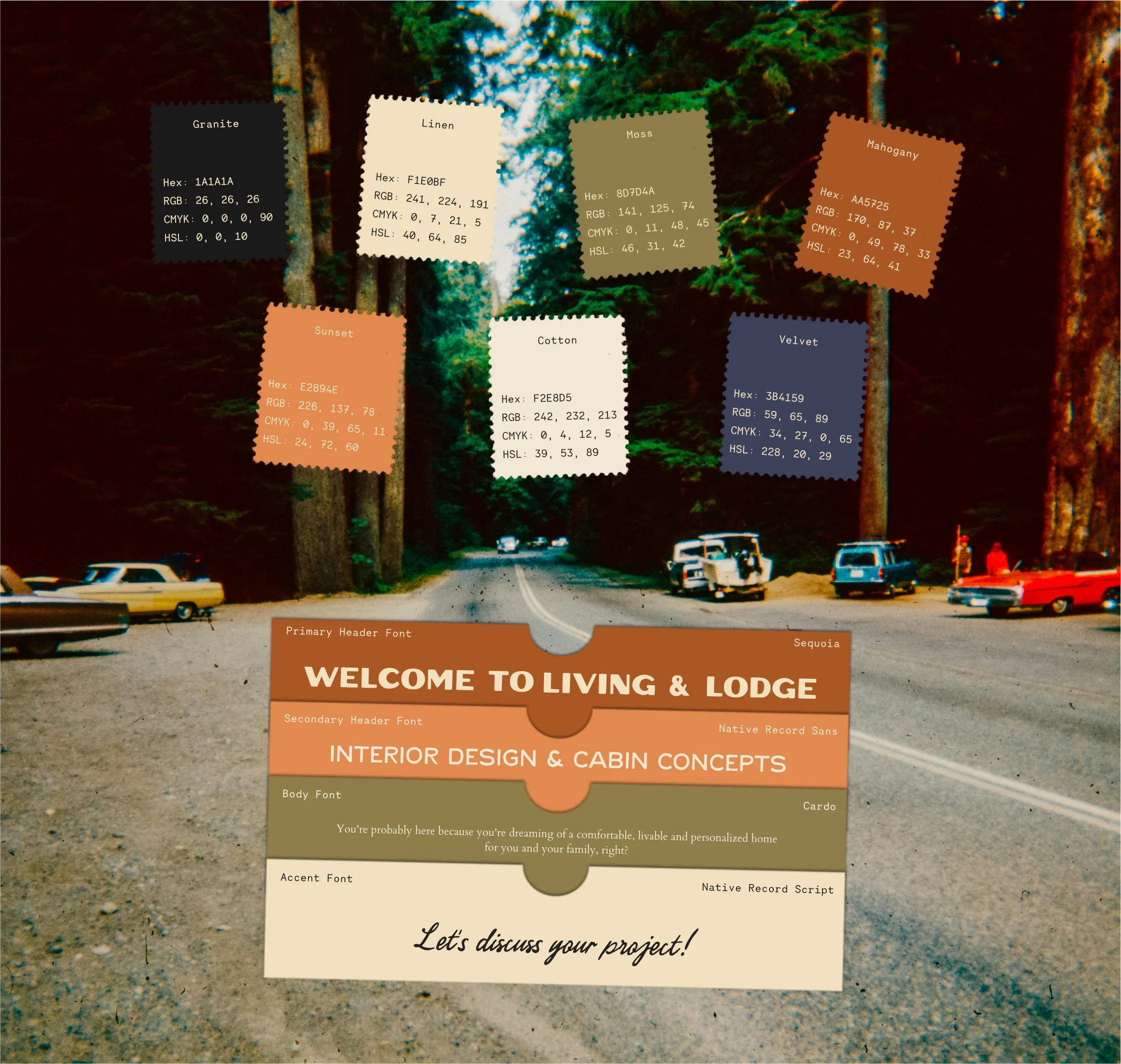
The visual identity followed the same logic that shaped the name. Hand-drawn elements, National Park inspired type, , gallery-wall layouts, vintage flag and banner details, all steering clear of anything too literal.
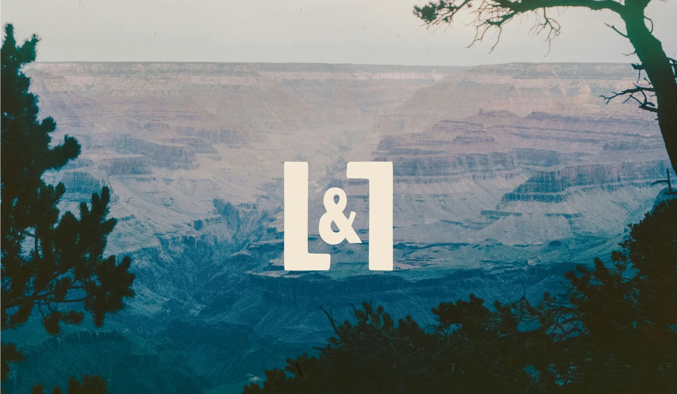
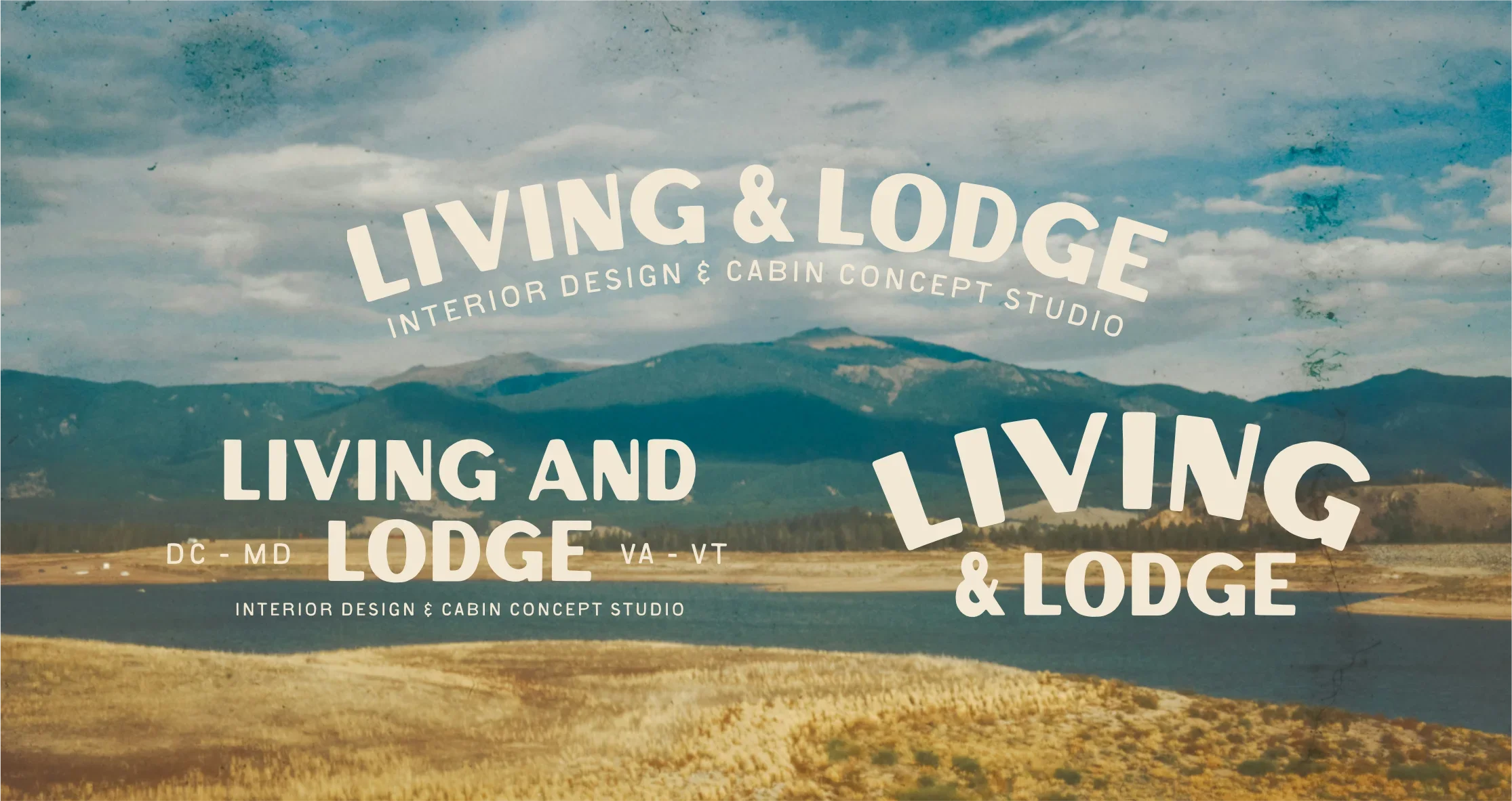
The primary logomark incorporating the two L’s from the name spaced to form a room floorplan, a subtle nod to what the business does - no descriptive logo spelling out "interiors" or "cabins". This is supported by a set of stylised wordmarks that fit cohesively with the rest of the identity and can be used interchangeable when talking about different parts of the business, whilst maintaining a cohesive brand repetition.


BUILDING OUT THE BRAND
With the identity settled, the next job was making sure it actually worked everywhere Travis needed it to. Business cards, email signature, and proposal templates to replace the Canva documents he'd been cobbling together for client pitches. Title blocks for his architectural drawings, so even the technical side of the job carries the brand through.
The website was the biggest piece of the puzzle. Travis had been using Adobe Portfolio, which had done fine as a stopgap but boxed him in on fonts and layout. I moved the whole site over to Squarespace, partly for the custom typography Travis wanted running through it, partly because he's got e-commerce plans down the line, house and cabin plans for sale directly through the site, and Squarespace gives him room to build that out without needing another platform migration, and the ability to edit and update the site himself.
But Squarespace isn’t without its own limitations - without custom imagery, badges and illustrations a Squarespace site can easily look overly-templated. A big no for someone whose whole thing is “bespoke”. We therefore built out the brand ecosystem with a series of badges, illustrations and type lockups that could be used throughout the website to echo the character and personality of the wider brand.

The Result
Living & Lodge now looks like a brand built for the client Travis actually wants, not the client who happens to find him. Thoughtful, warm, more than a little nostalgic, built around a brand promise as simple as helping people live better, and everything from the logo down to the proposal templates was built to back that up.
The name carries both sides of the business without either one feeling like an afterthought, giving Travis one identity to grow into as the cabin work expands, rather than two brands pulling in different directions.
