
Branding & Website Design for CPG BRands
Brand identity and packaging design for independent consumer goods founders who want to look retail-ready and genuinely distinctive - without the agency faff.
CPG branding for independent founders & brands.
Most CPG branding advice is written for brands with serious budgets. Data-driven shelf testing. Consumer research panels. Multi-SKU rollouts with seventeen stakeholders on the call. It's useful if you're a growth-stage brand with a Series A behind you.
If you're an independent founder with a product that's genuinely good and a brand that isn't quite there yet or doesn’t quite show how good your product is, that advice doesn't help you much.
The CPG founders I work with are at an earlier, more interesting stage. They've got a product they believe in. They know the branding needs to do more work. They want something that looks considered, distinctive, and retail-ready - not something that looks like every other independent product brand trying to appear premium. And they don't want to spend six months and fifty thousand pounds getting there.
I'm David, founder of Walker Design Co. - a small branding studio specialising in heritage-influenced, characterful brand identity design for independent businesses. I work with CPG founders across food and drink, home goods, and lifestyle products - at the point where the brand needs to catch up with the quality of what's in the packaging.
-
Brand Mission, Vision & Values
Brand Messaging & Personality
Positioning and Personas
-
Logo Design
Branding Suite
Custom Fonts
Illustration
-
Packaging & Label Design
Flyers & Brochures
Merch and Apparel Design
Signage and Menu Design
Promotional Collateral
-
Brand Illustrations, Characters & Mascots
Brand and Product Photography
Website Design
Social Media Posts & Templates
Case StudyEXBURY MILL
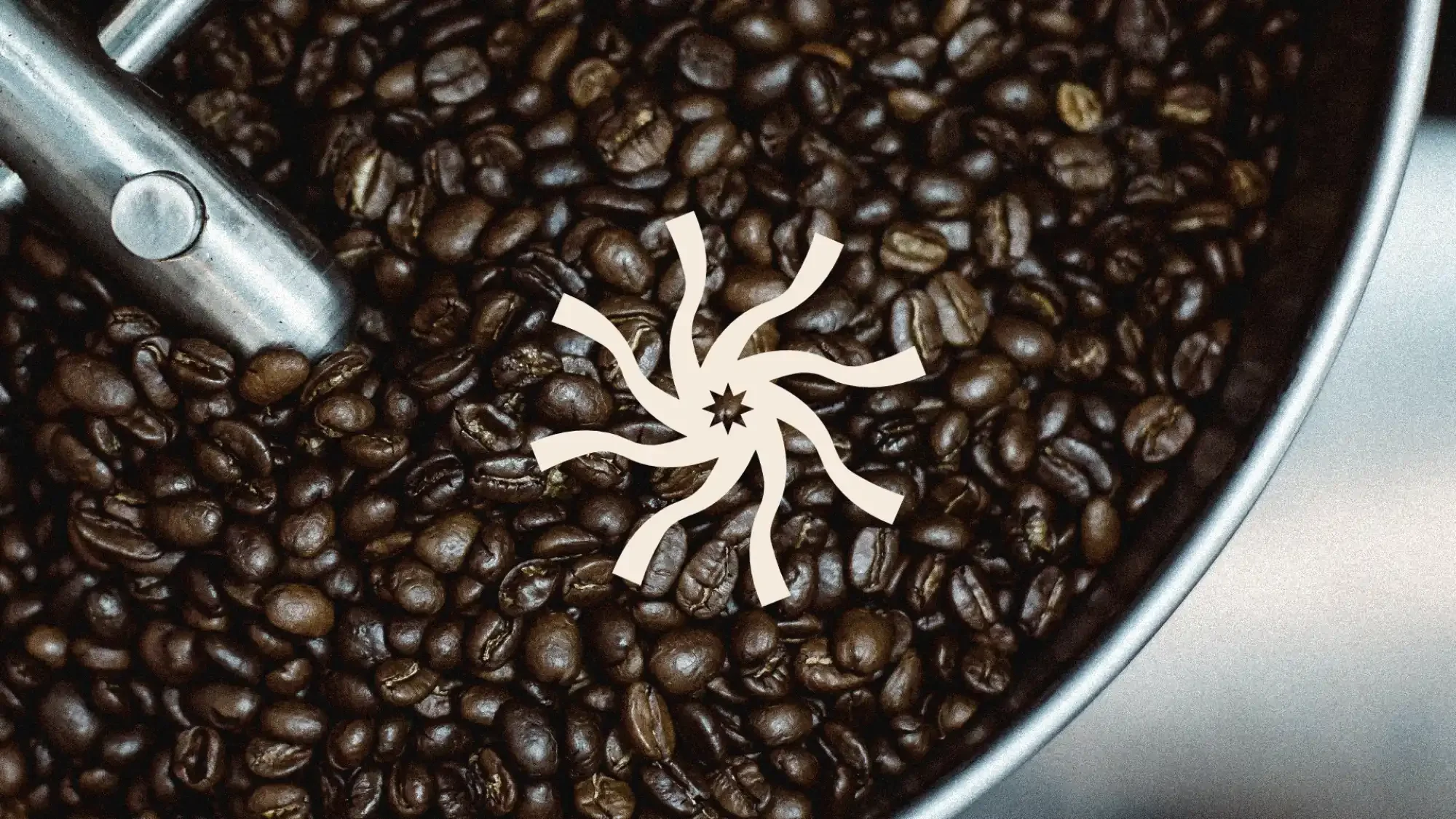
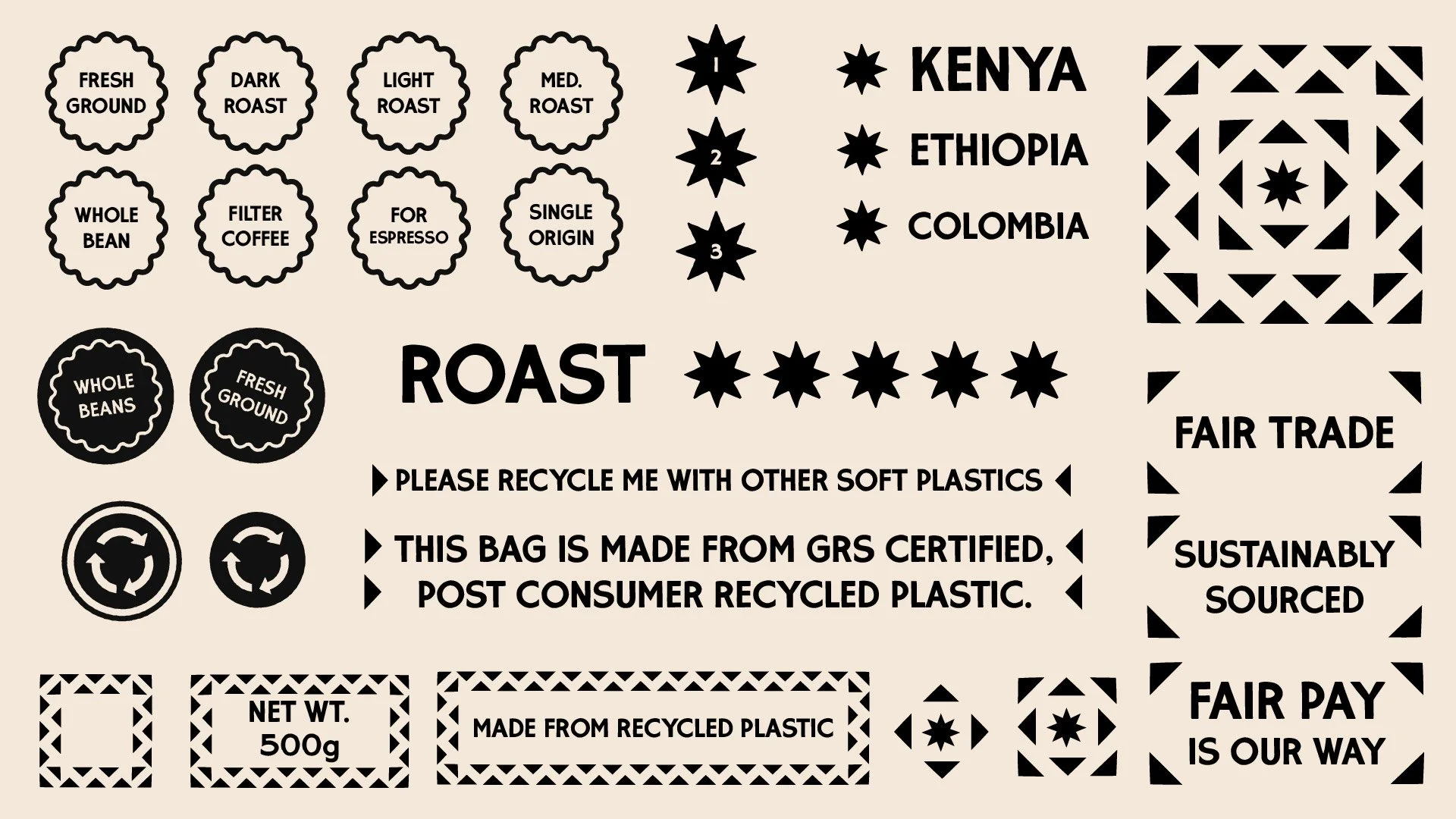
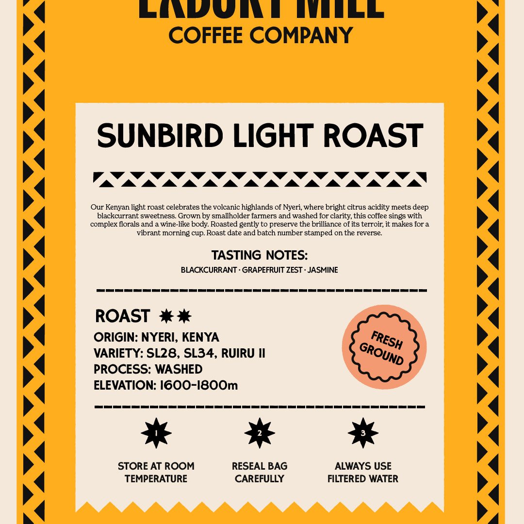
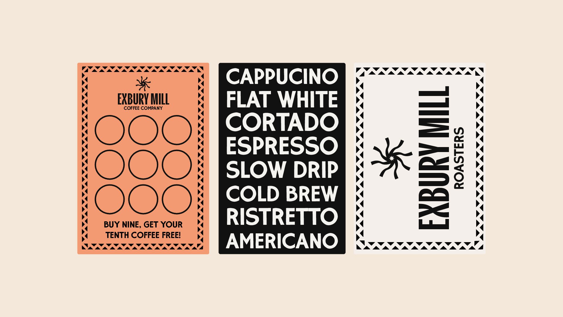
Exbury Mill Coffee Company is a Suffolk-based coffee roaster specialising in ethically-sourced and fairly-paid coffee. The brief was to create a refreshed brand identity and packaging, building a system that felt bold and contemporary while still honouring their roots, and to build a design language that could work across multiple applications - from signage and merchandise through to packaging and digital assets.
The result is a brand identity built around clarity, consistency, and a recognisable mark that reflects both the craft of coffee and the character of the mill it’s named after.
-
![]()
Brand Identity
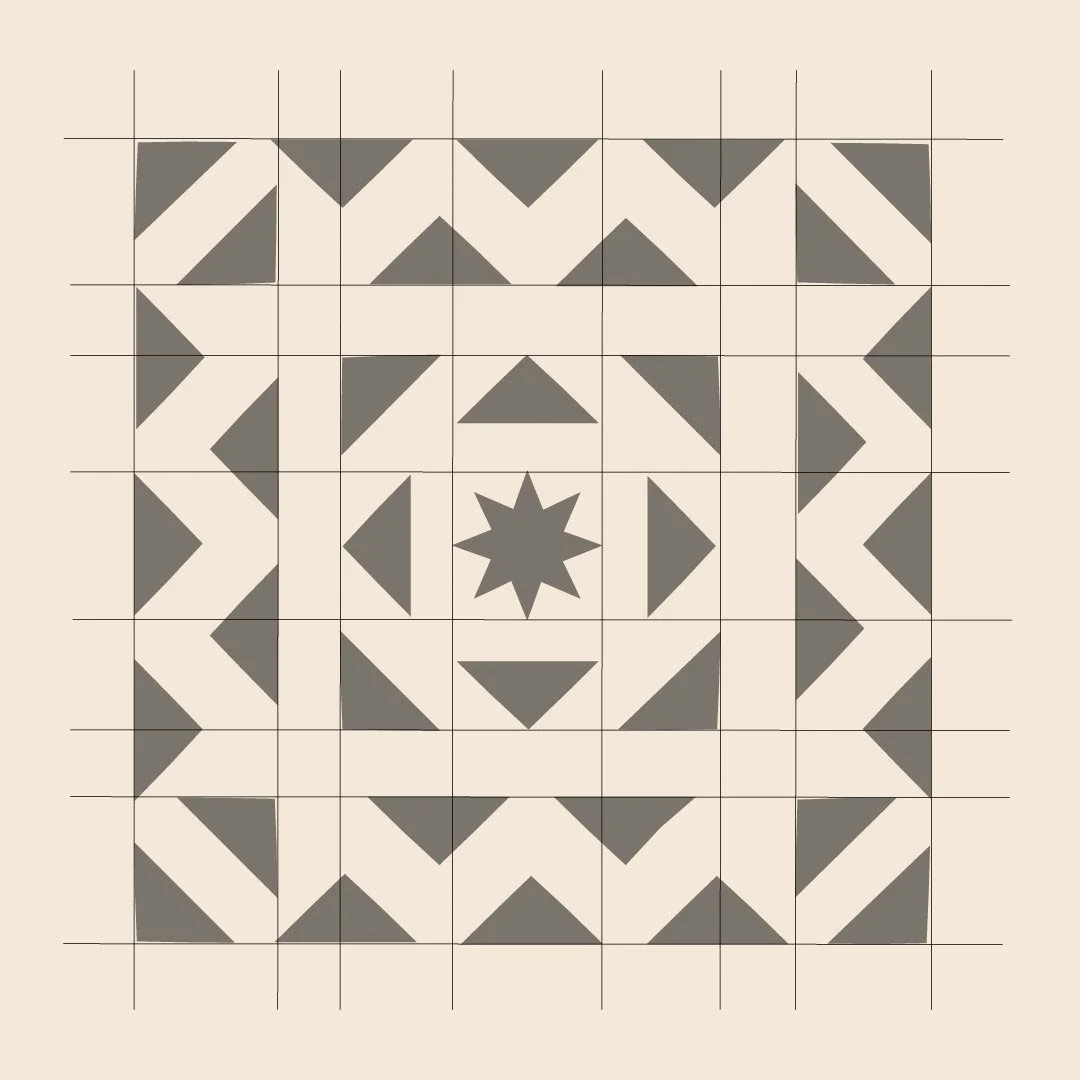
Logo suite, colour palette, typography system, supporting marks and badges, usage guidelines.
-
![]()
Menu Design
Designed to match the identity and work in print. Food menus, drinks menus, specials boards.
-
![]()
Print Touchpoints
Signage, business cards, loyalty cards, packaging, takeaway materials, staff uniforms if needed.
-
![]()
Brand Guidelines
So your brand stays consistent whether you're briefing a printer, a sign maker, or a social media manager.
-
![]()
Website
Custom-designed and built on Squarespace, with SEO and direct bookings in mind.
-
![]()
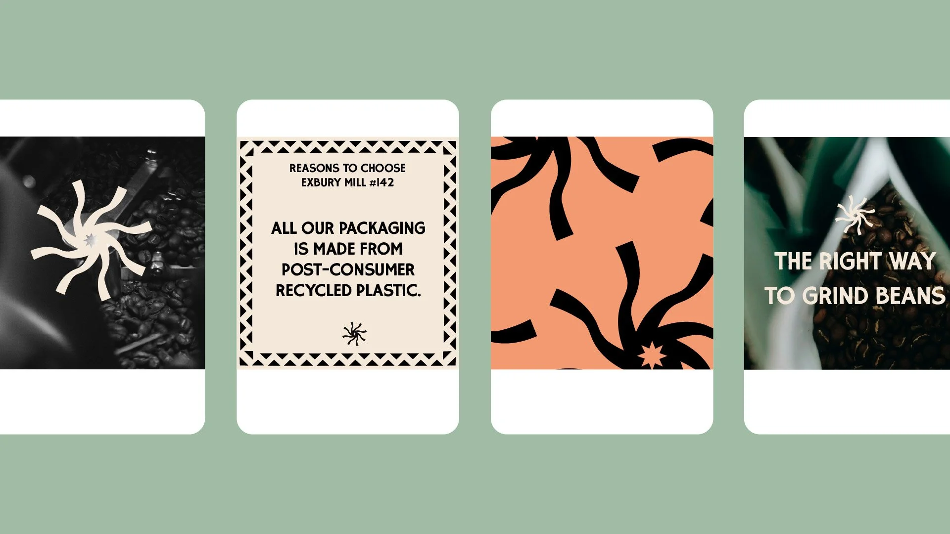
Social & Digital Assets
Profile images, story templates, and content assets for launch.

THE CPG BRANDING PROBLEM
Consumer packaged goods is one of the most visually competitive categories in existence. Your product sits on a shelf or appears on a screen next to dozens of others. The decision to pick it up, click through, or keep scrolling takes about three seconds. Your packaging and brand identity are doing all the work in that window - and if they're not working hard enough, the product doesn't get a chance.
The problem for independent CPG founders is that the options are awkward. A large agency can be expensive, slow, and built for clients with far bigger budgets and more complex briefs. You’ll also often have your welcome call with the agency lead/founder, and then the work will be undertaken by a junior - leaving you with a hefty invoice, and work that might not match it.
A generalist freelancer from a logo marketplace is cheap, fast, and unlikely to understand what makes packaging work on a physical or digital shelf. Using AI if fraught with danger - from copied designs that could land you in hot water to uninspiring, bland copy.
There is a fourth option - a specialist brand designer who understands the CPG world and works directly with founders - is harder to find.
That's the gap I sit in. Not a data-driven agency with a consumer testing lab. Not a Fiverr or AI logo. A considered, specialist approach to CPG brand identity and packaging design - built for independent brands at the stage where the brand needs to start doing serious work.
Why Choose Walker Design Co?
✷ BUILT FOR INDEPENDENT FOUNDERS, NOT ENTERPRISE BRANDS
The big CPG agencies are built for clients with big budgets, multiple stakeholders, and complex briefs. That's not who I work with. My clients are independent founders - one to five products, launching or just starting to scale. I understand the budgets, the timelines, and the pressures of that stage. The process is built around it: clear scope, fixed price, direct communication, no bloat.
✷ PACKAGING AND BRAND IDENTITY AS ONE THING
A lot of designers treat the logo and the packaging as separate jobs. For a CPG brand they're not - the packaging often is the brand, especially at launch when the product is the primary customer touchpoint. For CPG brands, I design both as a single system from the start, which means the packaging doesn't just carry the logo - it expresses the full identity.
✷ SHELF-READY AND SCREEN-READY
Consumer goods packaging needs to work in two very different contexts: physical retail and digital commerce. A label that looks beautiful at full scale on a shelf can disappear on a product thumbnail. A design built for screens can look flat under retail lighting. I design with both contexts in mind from the outset - because most independent CPG brands are selling in both.
✷ ONE PERSON, YOUR PROJECT
No account managers, no junior designers handed the brief. You work directly with me from the first call to the final file. For independent founders making significant decisions about their brand - that directness matters. Faster decisions, cleaner communication, and someone who genuinely cares about whether the product sells.
WHY nostalgia works FOR CPG brands
The dominant aesthetic in independent CPG over the last ten to fifteen years is minimalist. Clean, sans-serif, white space, muted palette. It signals premium. It photographs well. It was distinctive about ten years ago.
Now it's everywhere. Browse the head height shelves of a supermarket, scroll through online, and you'll see it repeated across hundreds of different brands. The aesthetic that was once a differentiator has become a category default - which means it's stopped differentiating.
Nostalgic and characterful design does something different in this context. It communicates craft, provenance, and personality in a way that minimal design deliberately avoids. For independent CPG founders whose products have a genuine story - a family recipe, a specific origin, a founder with a clear point of view - that communication is usually more honest and more effective than another clean white label.
It's also more memorable. A brand with real character gets picked up, examined, photographed, shared. It earns press coverage more easily. It makes the pitch to an independent retailer more interesting. It gives consumers something to feel connected to, which is the foundation of the loyalty that independent brands live or die by.
This is the lane I work in as a CPG brand designer. Not the only valid approach - but the one I do best, and the one that tends to serve independent founders most effectively at the stage where the brand needs to start working harder.
Frequently Asked Questions
-
Most CPG branding projects start with a brand identity - logo suite, colour palette, typography, brand marks, and guidelines. From there the most common additions are packaging design, a website, and trade assets like sell sheets or pitch decks. Every project is scoped and priced clearly before anything starts.
-
A CPG brand designer focuses on brand identity, visual language, and packaging - the strategic and visual foundation the product is built on. A CPG marketing agency typically handles campaign execution, media buying, social, and growth. Both matter, but they're different disciplines. I'm a brand designer, not a marketing agency.
-
Yes, though food and drink has a dedicated page that goes further into the specifics of how I can help that world - particularly around artisan food, coffee, craft drinks, and packaging for those categories. The lines blur and I work across both - get in touch and we'll figure out the right fit.
-
Yes. Launching from scratch is actually a strong position - there's no legacy branding to unpick. Whether you have a clear visual direction or just a product and a positioning, that's enough to start the brand discovery process. Getting the brand right at launch is almost always better than fixing it after the first run.
-
Brand identity projects start from £1,450. Packaging design is usually scoped separately depending on the number of SKUs and formats but I can incorporate a packaging redesign into the project. Combined brand, packaging, and website projects vary - get in touch and I'll put together a clear, fixed-price scope. No hourly billing, no retainers, no surprises.
-
A brand identity typically takes four to six weeks. Add packaging and you're looking at six to ten weeks depending on the number of SKUs. A full brand, packaging, and website project is usually ten to fourteen weeks. You'll get a clear timeline at the outset so you can plan around production schedules, launch dates, or trade show deadlines.
What other clients have said.
★★★★★
“Once again, David has been incredible to collaborate with and I'm already looking for another excuse to employ his talents.
He redesigned my branding and created assets that absolutely nailed the brief.
They capture the essence of our business and our values and I couldn't have asked for a better process overall.”
DAVID
★★★★★
“So excited to start plastering my new logo and branding everywhere.
You’ve taken this, run with it and just smashed it out of the park.
Exactly what I wanted but couldn’t do it myself.
If you’re after someone who gets it, cares deeply about the work, and is genuinely lovely to work with -
David’s your guy.”
OLLIE
★★★★★
My company is young and my "brand" from the outset was a total DIY shoestring job. But after getting established, I wanted to create a look that really embodied my work and also - figure out what the heck my brand was supposed to communicate. Thankfully I found David, whose rare combination of business acumen and artistic skill put my flurry of vague ideas into his expert brain and produced a huge suite of organized and beautiful brand assets.
TRAVIS
Your product is ready. Your brand should be too.
Takes approx. 1 minute